5 Design Principles for Retail Banners That Actually Drive Sales
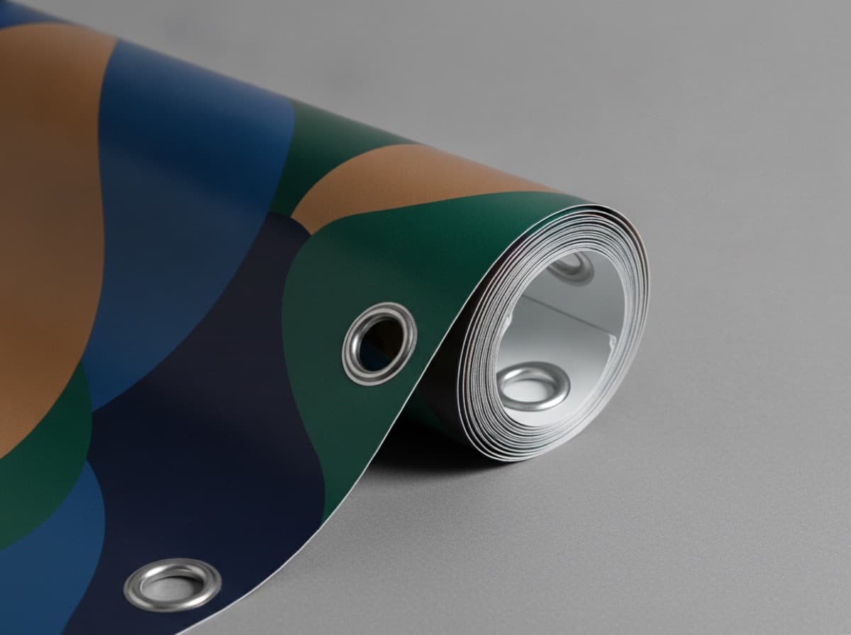
A passerby's gaze lingers on your store banner for just three seconds. If you can't communicate what you sell and what the benefit is within that window, the banner has failed. For retail banners, a design that reads clearly always beats a design that merely looks pretty.

Principle 1. Lead with a Single Headline
Pick the one most important message — a discount, a new product, a grand opening — and make it large. Cramming in too much information means nothing gets read. Short and punchy wins: "30% Off Everything" beats a paragraph every time.
Principle 2. Maximize Color Contrast
The greater the brightness difference between background and text, the more readable the banner is from a distance. Classic high-contrast pairings include black text on yellow and white text on red. Similar tones placed together look muddy and illegible.
Color Combinations to Avoid
- Dark background + dark text (insufficient contrast)
- Red background + green text (inaccessible for color-blind viewers)
- Small text over a gradient (gets lost in the background)
Principle 3. Choose High-Legibility Fonts
Heavy, decorative script fonts look charming up close but fall apart at distance. A bold sans-serif reads far better from across a parking lot. Set body text to bold weight and keep letter spacing comfortable — not too tight.

Principle 4. Design the Visual Flow
People naturally scan top-to-bottom and left-to-right. Structure your layout accordingly: 1) Large headline → 2) Offer details / conditions → 3) Business name and contact. That hierarchy feels intuitive and gets absorbed in one pass.
Principle 5. Embrace White Space
Empty space is not wasted space — it's what focuses the eye on what matters. Rather than filling every inch edge-to-edge, leave breathing room around your key message.
Design Checklist
| Item | Check | |------|-------| | Single core message | Readable within 3 seconds from a distance? | | Color contrast | Sufficient brightness difference? | | Font choice | Bold sans-serif as the primary typeface? | | Hierarchy | Headline clearly the largest element? | | Contact info | Phone number / QR code easy to find? |
Pro tip: Photograph your design mockup, then scale it down on your phone until it fits in your palm. If the headline is still readable at that size, it will read in the real world too.
Frequently Asked Questions
How large should the text be?
As a general rule, text needs to be roughly 12–16 inches (30–40 cm) tall to be read comfortably at 30 feet (10 m). Your headline can occupy a third or more of the banner's height — don't be shy.
Should I include a photo?
If visual appeal is central to the message — a new menu item, a product — a photo can be very effective. Just place a semi-transparent dark overlay behind any text that sits on top of the image so it remains legible.
Can people really scan a QR code on a banner?
Not from a moving vehicle, but pedestrians stopping in front of your store absolutely can. Print the QR code at least 3 inches (8 cm) wide and surround it with clear white space for reliable scanning.
Get 10% off your first order
Join our list for practical printing guides, new finish ideas, and a welcome coupon for your first order.
No spam. Unsubscribe anytime.
Printing posters or paper displays for your event?
Browse Posters & DisplaysWe print posters and paper displays. Vinyl and mesh banners are not in our lineup.
Not sure which option fits? Ask Pro Card Crafters