Business Card Design Trends Worth Following in 2026
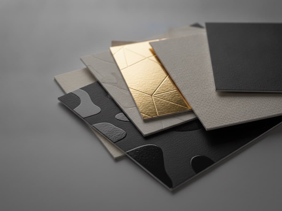
Business cards don't follow trends the way social media does. A card you print this year will be in circulation for two or three years. But some shifts in what clients respond to are worth tracking.
Tactile over visual
For several years, premium cards were about visual effects — more vivid printing, glossier finishes, more colors. The current preference among premium buyers has moved toward tactile differentiation: soft-touch laminate, embossing, raised UV, textured stocks.
The signal: gloss finishes are increasingly associated with commodity printing. Soft-touch and textured surfaces are associated with considered quality.
Restrained color palettes
High-contrast, loud color business cards peaked in the mid-2010s. The current preference in professional and luxury contexts is toward more restrained palettes — cream, off-white, warm gray, deep navy, warm black. These pair well with foil and embossing and feel more timeless.
For creative professionals and consumer brands, color is still a valid differentiator. But for professional service businesses, restraint is increasingly the marker of sophistication.
Minimal information density
The overstuffed business card — 12 elements crammed into 3.5 square inches — is receding. Cards that can be read in two seconds, with one clear name and one clear contact method, are performing better as conversation starters.
This parallels what's happening in digital design: less is more legible, more trustworthy, more premium.
QR codes: normalized, not novel
QR codes were a gimmick pre-2020. They're now standard. Adding one to a card doesn't make you innovative — but not adding one is increasingly leaving a functional step on the table. The trend is toward QR as a utility, not a feature.
Rounded corners as baseline premium
Rounded corners were a premium upgrade five years ago. They're trending toward a baseline expectation in professional card contexts. A sharp-cornered card reads more generic than it used to.
What hasn't changed
- Heavy paper stock still signals quality
- Good typography is still the hardest thing to do well
- The most memorable cards are the ones that are distinctive in exactly one way — not five
Follow the trends that serve your brand. Ignore the ones that don't. A well-executed classic card will always outperform a trend-chasing gimmick.
Get 10% off your first order
Join our list for practical printing guides, new finish ideas, and a welcome coupon for your first order.
No spam. Unsubscribe anytime.