Minimalist Business Card Design Ideas
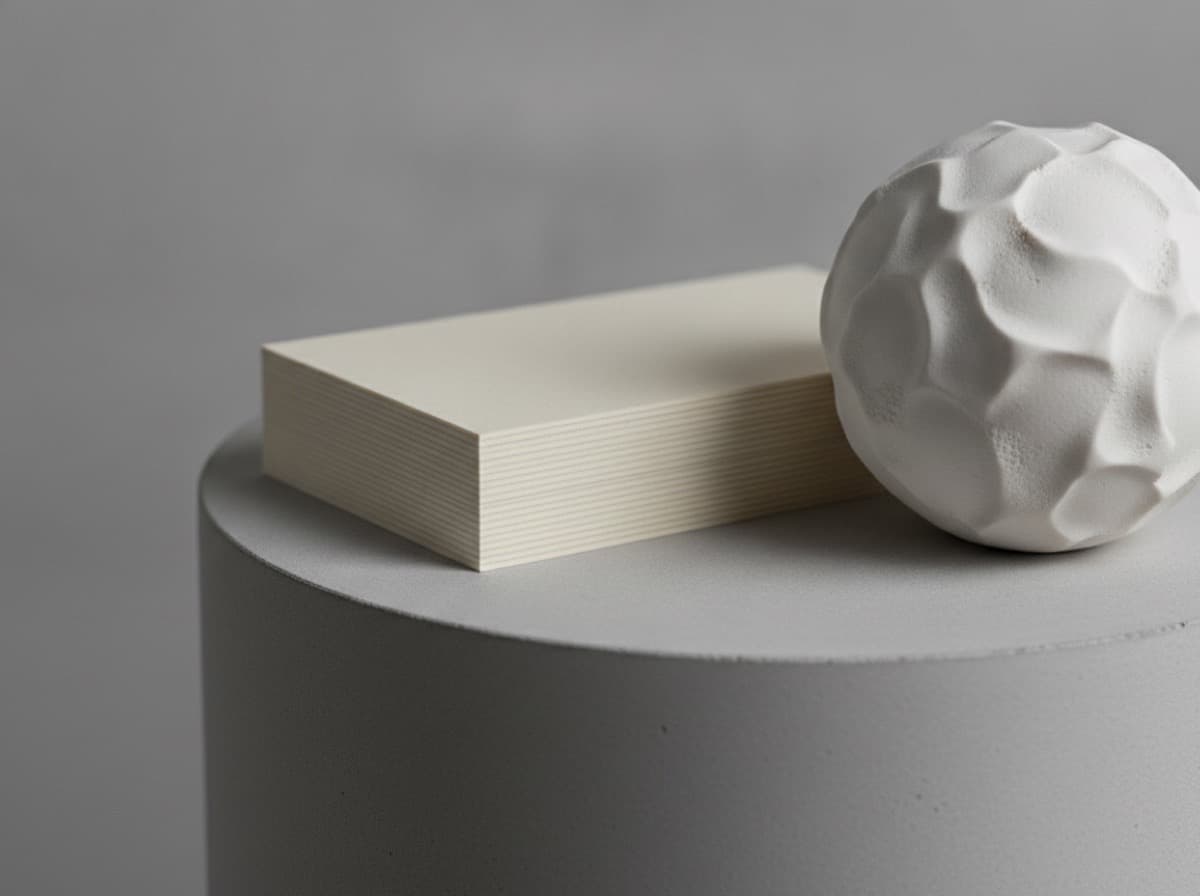
A minimalist business card achieves its impact by removing everything that isn't essential, leaving the remaining elements — usually name, type, and one design decision — with room to breathe. The paradox of minimalism is that it requires more design discipline than a busy card: every remaining element has to be exactly right because there's nothing else to distract from it. This guide covers the core principles of minimalist business card design, specific layout ideas that work, and the finish choices that make a simple card feel genuinely premium rather than merely sparse.
What minimalism on a business card actually means
Minimalism is not the same as bare or cheap. A minimalist card is one where every element present is intentional and every element absent is deliberately omitted. The difference from a poorly designed sparse card is that the minimalist version looks considered; the sparse one looks unfinished.
The four hallmarks of a successful minimalist business card:
- Maximum three typographic elements — name, title, and one contact detail are the common set
- No decorative elements without function — borders, ornaments, and icons earn their place or are cut
- Generous white space — the blank areas of the card are as deliberate as the printed areas
- One premium quality signal — stock, finish, or typography quality that tells the recipient the card is a deliberate choice, not a default
Typography-led minimalism
The most reliable minimalist approach centers the entire card on typography. Choose one strong typeface family — a geometric sans-serif like Futura, Helvetica, or Neue Haas Grotesk for a modern feel, or a refined serif like Caslon or Freight Text for something more classic — and use weight contrast to establish hierarchy.
Layout ideas:
- Name large, details small — name in 14–16pt bold, single line, centered or flush left; contact details in 8pt regular below with significant spacing between them
- Left-aligned stack — all information flush left, with the name in a heavy weight as the top of the stack; this creates a quiet, editorial quality
- Right-aligned contact — name left, contact details right-aligned on the same card; the negative space between them becomes part of the design
A strong typeface on a high-quality stock with a matte finish is often enough. For guidance on pairing typefaces and sizing, our font guide for business cards covers what works in practice.
White space as a design element
White (or negative) space is not wasted space — it's the frame that makes every other element more visible and more weighted. A card with a single, perfectly typeset name at a large size with nothing else on the face, and contact details only on the back, is a genuinely striking card because the blank space commands attention.
Practical rule: if you're looking at your card design and thinking you should "fill in" the empty areas, resist. Try removing elements instead. The discomfort of emptiness is usually a signal that the design is working.
Color in minimalist cards
Two approaches dominate:
Monochrome with one color pop. A white or off-white card with everything in black, plus one element — the name, a small logo, or the card's edge — in a single brand color. The restraint makes that one pop of color feel considered rather than decorative.
Single color block. A solid-color card — matte navy, deep forest green, warm terracotta, or black — with name and contact in white or reversed-out. This is maximally bold for a single-element card and stands out in a pile of white cards.
Our color psychology guide explains how different hues signal industry and personality.
Finish choices for minimalist cards
Minimalism elevates with the right finish. On a busy card, finish is one of many things competing for attention. On a minimal card, it's the primary sensory experience.
- Soft-touch matte — the suede-like feel adds a tactile dimension that makes an otherwise-empty card feel deliberate and premium. It's the finish that makes people comment on the card's feel before they read the name.
- Cotton uncoated stock — the natural texture and weight of cotton paper is itself a finish choice; it signals craft without any coating. Ideal for a letterpress name in one ink on thick stock.
- Spot UV on one element — a name or logo in spot UV over a matte field is a precisely minimal finish: one element given gloss, everything else flat. The contrast is the entire design.
- Foil in one color on a single element — similarly, a name or initial in gold or silver foil on a matte background is both minimal and premium.
For more on how to combine finishes without overcomplicating a simple design, see our premium finishes overview.
Layout ideas to start from
A few minimal structures that consistently work:
- Full-bleed single color on the front, all info on the back — the front is a pure color statement; the back is a quiet list of contact details in one typeface
- Single large initial or logo mark, small contact details below — the mark takes 60–70% of the card; details run in small type at the bottom edge
- Name only on the front, company and contact on the back — forces the recipient to flip the card; works when the name alone is the brand
- Horizontal band — a solid color bar at the top or bottom, name reversed out in white; the rest of the card is white with contact details in dark type
Bottom line
A minimalist business card works when every remaining element is strong enough to stand without support, the negative space is deliberate, and one material or finish decision elevates the physical experience. Start by cutting information until you're uncomfortable, then verify that what remains is perfectly executed — the right typeface, the right size, the right weight, the right stock.
Frequently Asked Questions
What makes a business card minimalist?
A minimalist card limits information to the essential (name, role, one contact method), uses generous negative space around every element, restricts decorative details to those with a purpose, and invests in one quality signal — stock, finish, or typography — rather than accumulating effects.
How much white space should a business card have?
More than feels comfortable. A common rule of thumb is to keep at least 30–40% of the card's face as negative space. If you feel the urge to fill in the empty areas, try removing elements instead — minimalism requires resisting that impulse.
What fonts work best for a minimalist business card?
Geometric sans-serifs (Futura, Helvetica, Montserrat) and refined serifs (Garamond, Caslon) both work well. Use one family with two weights — heavy for the name, light or regular for everything else. Avoid decorative or script fonts unless they're the brand's primary identity.
What is the best finish for a minimalist business card?
Soft-touch matte is widely regarded as the ideal minimalist finish: the suede feel adds a premium sensory dimension that an otherwise simple card earns through its restraint. A single-element spot UV or foil treatment also works — one deliberate accent on a fully flat card.
Should a minimalist card use both sides?
Often yes. Putting the name or logo large on the front and all contact details on the back is a strong minimalist structure: the front is a design statement; the back is a reference. This gives each side a single purpose.
Can a black card with white type be minimalist?
Yes — and it's highly effective. A solid matte black card with white type is both minimalist and distinctive in a pile of white cards. Keep the type sparse (name, title, email), choose a clean typeface, and consider a soft-touch finish on the black base for a card that's immediately recognizable.
Get 10% off your first order
Join our list for practical printing guides, new finish ideas, and a welcome coupon for your first order.
No spam. Unsubscribe anytime.