Core Design Tips for Evocative Postcards
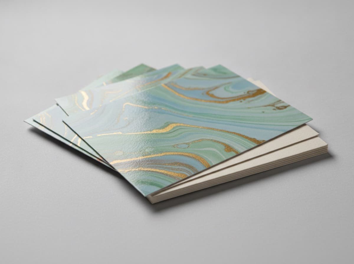
A great postcard communicates through restraint rather than visual noise. A single strong photograph, generous white space, and a harmonious color palette are all you need to leave a lasting impression. This guide walks through how to design an evocative postcard and get a clean, true-to-vision result from the printer.

White Space Creates the Mood
The heart of an evocative postcard is restraint — what you leave out. Filling every corner with elements crowds the eye. Generous white space focuses attention and creates a calm, intentional feel. Build deliberate breathing room between text and image, and between content and the card's edges.
Typography
- Limit yourself to one or two typefaces to maintain visual cohesion
- Script or serif fonts reinforce a warm, personal tone
- Open up letter-spacing and line-height for readability and a sense of ease
- Create emphasis through weight and color contrast rather than drastic size jumps
Setting Your Color Tone
Evocative postcards pair well with muted, toned-down palettes — desaturated hues, pastels, or monochrome. Anchor the design with a single dominant color, then build the rest of the palette around adjacent or complementary tones. Too many colors will read as busy rather than emotional.

Managing the Screen-to-Print Color Shift
RGB (screen) and CMYK (print) have different color gamuts, so colors that look vivid on your monitor can appear darker or flatter in the printed piece.
- Work in CMYK color mode from the very beginning of your project
- Avoid neon and high-saturation colors — they dull significantly in print
- For deep black backgrounds, use rich black (e.g., C40 M30 Y30 K100) instead of K100 alone for added depth
- Whenever possible, request a physical proof and review it before approving the full run
Paper and Finishing Options to Elevate the Feel
| Option | Effect | |--------|--------| | Matte lamination | Quiet, sophisticated texture that resists fingerprints | | Uncoated premium stock | Warm, natural, slightly tactile — feels handmade | | Rounded corners | Softens edges for a friendly, approachable impression | | Embossing | Adds subtle dimensional detail as a design accent |
Design Checklist
- Is the palette unified around a single dominant color?
- Is there enough white space throughout?
- Are you using two or fewer typefaces?
- Is the file in CMYK with rich black applied where needed?
- Are bleed (2–3 mm) and safe zone (5 mm) margins in place?
Frequently Asked Questions
My printed colors look completely different from my screen. How do I fix that?
This is a fundamental RGB-to-CMYK gamut difference. Work in CMYK from the start, reduce high-saturation and fluorescent colors, and always review a physical proof before the full print run — those three steps will close most of the gap.
Is one strong photo enough to carry the whole design?
Absolutely. In fact, the most effective evocative postcards are built around a single compelling image combined with generous white space and a short line of copy. Just make sure your photo is at least 300 DPI at the intended print size.
Get 10% off your first order
Join our list for practical printing guides, new finish ideas, and a welcome coupon for your first order.
No spam. Unsubscribe anytime.