Poster Color Management: RGB to CMYK Conversion and Color Accuracy
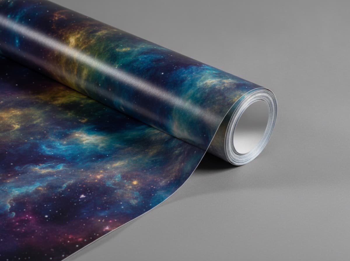
"The blue looked so vivid on my screen — but it printed muddy and dull." This is the most common complaint in poster printing, and the cause is always the same: the gap between the screen's RGB color space and the printer's CMYK color space. Here's how to get the color you're after.

The Fundamental Difference Between RGB and CMYK
RGB is additive color mixing — a monitor emits red, green, and blue light to produce the full spectrum of colors. CMYK is subtractive color mixing — cyan, magenta, yellow, and black inks are laid on paper, absorbing light rather than emitting it.
Because RGB is created with light, its color gamut (the range of colors it can reproduce) is significantly wider than CMYK's ink-based gamut. When a vivid or fluorescent RGB color is converted to CMYK, it often loses punch and appears muted.
Colors to Watch Out For
- Fluorescent / neon shades (neon green, vivid orange)
- Bright royal blue and cyan
- High-saturation purples and violets
Always review these colors after CMYK conversion, and consider spot color (Pantone) printing if faithful reproduction is critical.
Preventing Color Shift During Conversion
Start in CMYK From the Beginning
Wherever possible, set your document's color mode to CMYK before you start designing. Converting from RGB to CMYK at the very end can produce unexpected color changes across the entire file.
Use the Right Color Profile
For commercial printing in the US, U.S. Web Coated (SWOP) v2 or GRACoL 2013 Coated are common standards for coated stock. Ask your printer which profile they use and match it in your file to minimize variation.
Handle Black Carefully
A large area of solid black printed as K 100% alone can look flat and slightly washed out. A rich black mix (e.g., C 40 / M 30 / Y 30 / K 100) adds depth — but keep total ink coverage (TAC) under 300–340% to avoid drying and trapping issues. For small body text, stick with K 100% only to prevent ink spread.
Color Accuracy Options Compared
| Approach | Advantage | Limitation | |----------|-----------|------------| | CMYK 4-color process | Standard, cost-effective | Limited on high-saturation colors | | Spot color (Pantone) | Precise brand color match | Added cost per color | | Press proof | See real printed color before full run | Time and cost involved |
Paper Changes Everything
The same CMYK values will look different depending on the substrate. Coated stock (gloss or matte art paper) keeps ink on the surface, producing sharp, saturated color. Uncoated stock lets ink absorb into the paper fibers, which softens and darkens the overall tone.
This means the same design can look strikingly different across paper types. When doing a press proof, always use the exact paper stock that will be used for the final run — otherwise the proof won't tell you what you need to know.
Lighting Affects Perceived Color
The lighting in the space where your poster will hang is another variable. The same print can look very different under cool white LED, warm incandescent, or natural daylight. The industry standard for evaluating color is a D50 light source (5000 K). If possible, consider the final viewing environment when reviewing proofs.
Color Management Checklist
- Document color mode set to CMYK
- Color profile matches the print shop's profile
- Fluorescent and high-saturation colors reviewed after conversion
- Rich black total ink coverage kept under 340%
- Color proof pulled on the actual print paper
- Final display lighting conditions considered
- Press proof ordered for critical or high-value poster jobs
Frequently Asked Questions
Why does my monitor always look more vibrant than the printed piece?
Monitors emit light using a wide-gamut RGB color space. Print reflects light using a narrower CMYK gamut. Fluorescent and high-saturation colors simply cannot be reproduced in ink at the same intensity you see on screen.
How do I know if my monitor is showing me accurate colors?
Monitor calibration with a hardware colorimeter aligns your display to a known standard, which significantly improves predictability. Even so, a press proof on the actual substrate is the only way to confirm final printed color with certainty.
When should I use spot colors?
Use spot colors (Pantone and similar) when you need an exact, consistent brand color match that CMYK can't achieve reliably, or when your design calls for fluorescent or metallic colors. Each additional spot color adds cost but provides color precision that four-color process cannot match.
Get 10% off your first order
Join our list for practical printing guides, new finish ideas, and a welcome coupon for your first order.
No spam. Unsubscribe anytime.