Logo & Brand Sticker Design: A Practical Guide
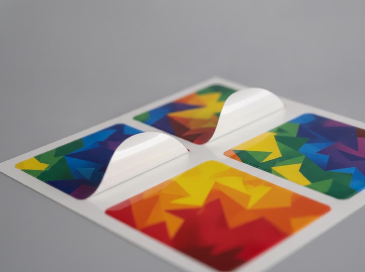
Logo stickers are one of the most affordable yet powerful brand marketing tools available. Whether applied to product packaging, laptops, or envelopes, they put your brand in front of people everywhere. That said, sending a screen-optimized logo straight to print often results in blurry output or color shifts. Here are the design principles you need for print-ready logo stickers.

1. Vector Artwork Is Non-Negotiable
Always prepare your logo in a vector format (AI, SVG, or EPS). Raster images (JPG, PNG) pixelate when scaled up. Vector files stay crisp at any size. If you must use a raster file, it must be at least 300 DPI at the final printed size.
2. Respect the Clear Space
Maintain a minimum exclusion zone around your logo — no other design elements should encroach on it. A common rule of thumb is to keep clear space equal to at least half the height of your logo symbol. Also leave sufficient distance between the design and the die-cut line to absorb any trim variance.
3. Observe Minimum Size Rules
Shrinking a logo too small causes fine lines and small type to fill in and smear. For print, keep hairlines at 0.25 pt or thicker, and body text at 5 pt or larger.
4. Color Consistency: Use Spot Colors
For precise brand color reproduction, a Pantone spot color designation is far more reliable than CMYK mixing. Fluorescent and metallic brand colors cannot be reproduced in CMYK at all — for those, plan on spot color printing or specialty inks.

5. Match the Background and Material
If your logo will go on a dark-colored product, either print a white ink base layer on a clear material, or choose a white stock to ensure contrast. Light colors printed directly on clear film over a dark surface will disappear.
Brand Sticker Design Checklist
- [ ] Original vector file (AI/SVG) ready
- [ ] Clear space maintained around the logo
- [ ] All strokes 0.25 pt or thicker
- [ ] Brand colors specified with Pantone/spot codes
- [ ] Adequate spacing between artwork and die-cut line
- [ ] All fonts converted to outlines
Frequently Asked Questions
My logo is only available as a PNG — can I still print it?
Yes, but it must be at least 300 DPI at the final output size to look sharp. If at all possible, ask your designer for the original vector source file.
My brand color looks different on print than on screen.
Screens use RGB and printing uses CMYK, so the color gamuts differ. For accurate reproduction, specify a Pantone spot color code and, if possible, verify against a physical color swatch.
How should I supply fonts?
To prevent font substitution or missing-font errors, convert all text to outlines (paths) before submitting your file.
Get 10% off your first order
Join our list for practical printing guides, new finish ideas, and a welcome coupon for your first order.
No spam. Unsubscribe anytime.