Premium Business Card Finishes: The Complete Guide (Foil, Spot UV, Letterpress & More)
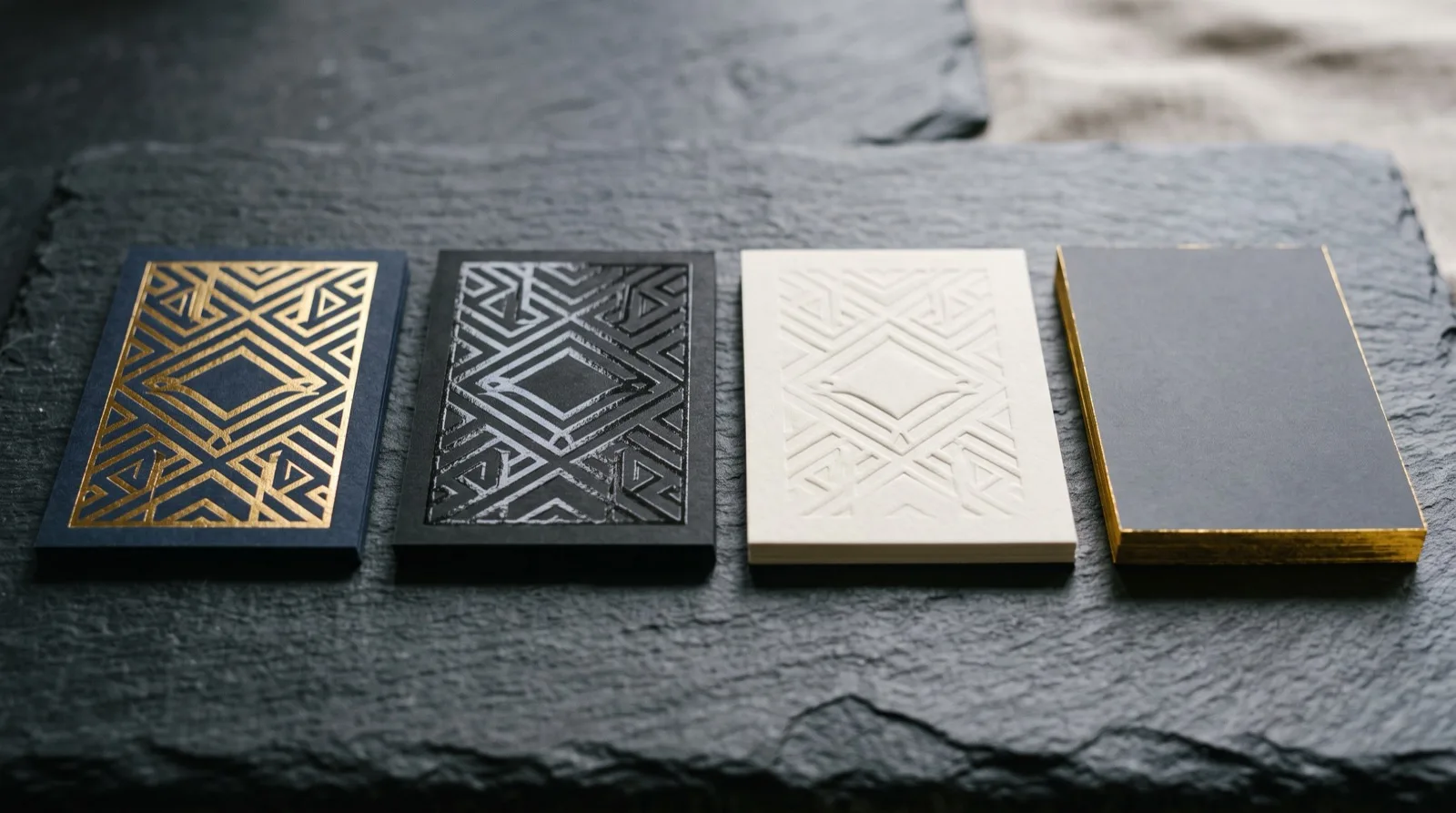
The short answer: a "premium finish" is any post-print treatment — foil, spot UV, letterpress, embossing, edge painting, soft-touch lamination — that changes how a business card feels and catches light, not just how it looks on screen. Below is a complete, practical guide to every mainstream finish, what each one costs you in time and money, which stock it needs, and how to pick the right one for the impression you want to make.
What "premium finish" actually means
Every business card starts as ink on paper. A finish is what happens after the ink — a physical or optical treatment applied to the printed sheet. The reason finishes matter for a networking card is simple: touch and light are the two senses a screen can't reproduce. A recipient forms an impression of your card in the first two seconds of holding it, and that impression is driven almost entirely by weight, texture, and how the surface reacts when they tilt it toward a light.
There are two broad families. Optical finishes change how light behaves on the surface — spot UV, foil, holographic foil, and lamination fall here. Tactile finishes change the surface itself — letterpress, embossing, debossing, edge painting, and soft-touch coatings. The most memorable premium cards usually combine one from each family (for example, soft-touch lamination as the base texture with a single gold-foil logo), because the contrast between the two is what the hand notices.
The finishes, one by one
Foil stamping (hot foil)
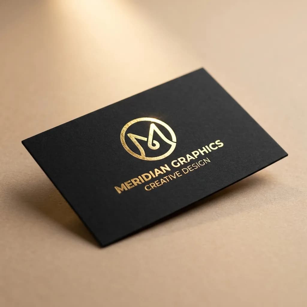
Foil stamping presses a thin metallic or pigmented film onto the card using a heated die. It is the classic "luxury" signal: gold, silver, rose gold, copper, and matte pigment foils are all standard. Foil reflects light directionally, so a foiled logo flashes as the card moves — that motion is what makes it read as expensive.
Use foil for a logo, name, or a single accent rule, not for body text. Fine serifs and text under about 6pt can fill in or break up because the die has to physically emboss the foil into the stock. Foil pairs beautifully with dark, uncoated, or soft-touch stocks where the metal contrasts against a matte field.
Spot UV (raised and flat)
Spot UV is a clear, glossy coating applied to specific areas and cured under ultraviolet light. Flat spot UV sits level with the surface and creates a subtle gloss-on-matte contrast that you see only at an angle — great for a watermark-style pattern behind your name. Raised spot UV (also called raised varnish) builds up a tactile, slightly domed layer you can feel with a fingertip.
Spot UV is the most cost-effective way to add a premium optical effect because it needs no metal die — just a second artwork layer (the "spot mask"). It shines on a matte-laminated base, where the glossy areas pop against the velvety background.
Letterpress, embossing, and debossing
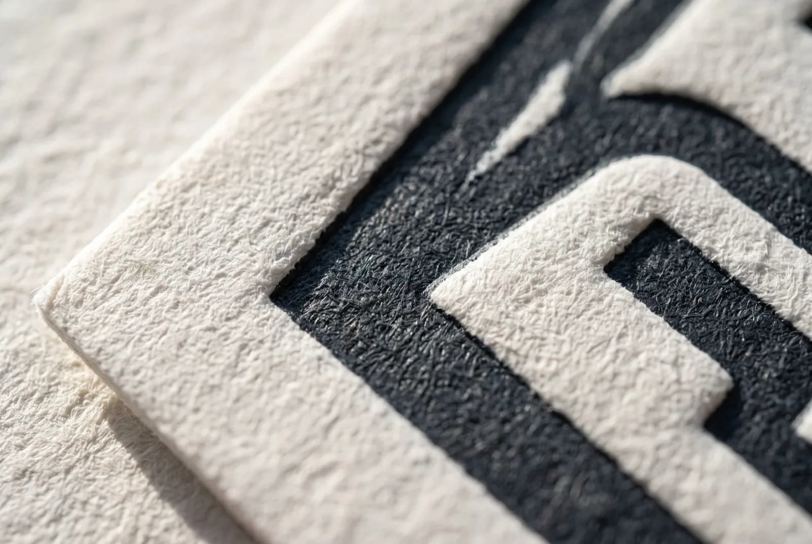
These are the tactile heavyweights. Letterpress presses an inked plate into thick, soft cotton stock, leaving a crisp impression you can feel from both sides. Embossing raises an image above the surface; debossing presses it below. Blind embossing (no ink or foil, just the raised shape) is one of the most understated luxury effects there is.
All three demand thick stock — typically 600gsm and up, often duplexed (two sheets bonded) to give the impression somewhere to go without showing through the back. That stock requirement is why letterpress cards feel substantial before you even register the design.
Edge painting and edge foiling
Edge painting applies a color to the exposed edge of a thick card, creating a bright stripe that frames the whole piece — a neon edge on a black card is unmistakable across a table. Edge foiling does the same with metallic foil. Both only work on cards thick enough to show an edge, so they naturally travel with heavyweight or duplexed stocks.
Soft-touch (suede) lamination
A soft-touch laminate is a matte film with a velvety, almost rubberized hand-feel. It doesn't shout — it's felt. Soft-touch is the ideal base finish because it makes every other treatment on top of it (foil, raised UV) feel more deliberate by contrast, and it resists fingerprints far better than gloss.
Die-cutting and rounded corners
Not a surface finish, but a shape treatment worth grouping here. Rounded corners read as friendly and modern; custom die-cuts (a notch, a rounded tab, a full silhouette) turn the card into an object. Die-cutting is inexpensive relative to its impact, but it adds a tooling step, so plan it into your timeline.
Cost and lead-time at a glance
The table below is a planning tool, not a price list — actual figures depend on stock, quantity, and how many finishes you stack. Relative cost is shown against a standard full-color card as the baseline.
| Finish | Relative cost | Added lead time | Best stock | Best used for | |---|---|---|---|---| | Flat spot UV | Low | Minimal | Matte-laminated | Background patterns, subtle logos | | Raised spot UV | Low–Medium | Short | Matte-laminated | Tactile logo or accent | | Soft-touch lamination | Low–Medium | Short | Coated 400gsm+ | Base texture for whole card | | Foil stamping | Medium | Medium | Dark / uncoated / soft-touch | Logo, name, single rule | | Rounded corners / simple die-cut | Low | Short | Any | Modern silhouette | | Embossing / debossing | Medium–High | Medium | 600gsm+ | Logo, monogram | | Letterpress | High | Longer | Cotton 600gsm+ duplex | All-over impression, luxury brands | | Edge painting / edge foiling | Medium–High | Medium | Thick / duplexed | Framing accent |
How to choose a finish in five steps
- Start from the impression, not the effect. Decide the one word you want the card to communicate — "established," "creative," "clinical," "warm" — and let that pick your family. Established and warm lean tactile (letterpress, soft-touch); creative and modern lean optical (foil, holographic, die-cut).
- Pick one base and at most one accent. The single most common premium-card mistake is stacking three effects that fight each other. A soft-touch base plus one foil element outperforms foil-plus-UV-plus-emboss almost every time.
- Match the stock to the finish, then pick the finish that fits your stock budget. Letterpress and embossing require heavy stock; if your budget caps stock weight, choose a finish that works on lighter coated paper (spot UV, foil).
- Protect legibility. Keep body text, phone numbers, and QR codes in flat, high-contrast ink. Never foil or emboss small text you need people to read or scan.
- Order a physical proof before the full run. Finishes look different in hand than on a monitor. One printed proof prevents the most expensive mistake in premium printing: discovering the foil color is wrong at 500 copies.
Designing files that survive the finish
A great finish dies at the file stage more often than at the press. Three rules cover most failures:
- Supply the finish as its own layer or spot color. Foil, spot UV, and emboss each need a separate mask — usually a 100% spot color (often named for the process) sitting exactly over the areas to be treated. Don't rasterize it into the artwork.
- Respect minimum line weights. Foil and letterpress need heavier hairlines than digital ink; lines under about 0.5pt and text under 6pt are risky.
- Keep finishes inside the safe zone. Edge-to-edge foil or UV that runs into the bleed can lift or chip after cutting; hold treatments a couple of millimeters in from the trim.
If any of that is unfamiliar, the details are worth reading before you build the file — see our companion guides on paper and coating comparison and networking card design that converts, which cover stock selection and layout respectively.
Frequently Asked Questions
What is the most cost-effective premium finish for a business card?
Flat or raised spot UV. It creates a clear gloss-on-matte or tactile effect without the metal die that foil requires, so it adds the least cost while still reading as a deliberate premium touch — especially over a matte-laminated base.
Can I combine multiple finishes on one card?
Yes, and the best premium cards usually pair one tactile base with one optical accent — for example, soft-touch lamination with a single foil logo. The rule is restraint: stacking three or more competing effects tends to look busy rather than expensive, and each added finish increases cost and lead time.
What paper weight do I need for letterpress or embossing?
Both need thick, soft stock so the impression has somewhere to go — typically 600gsm and above, and often duplexed (two sheets bonded together). Lighter coated stocks can't hold a deep impression and may show the mark through the back of the card.
Will foil or embossing damage small text or fine lines?
It can. Foil, letterpress, and embossing physically press the surface, so very fine serifs, lines under roughly 0.5pt, and text under 6pt may fill in or break up. Keep body copy, phone numbers, and QR codes in flat, high-contrast ink and reserve finishes for logos, names, and accents.
How do premium finishes affect QR codes on a card?
Keep QR codes flat and matte with strong contrast. Glossy spot UV or metallic foil over a code can create glare that stops a phone camera from reading it, and embossing distorts the code's geometry. Print the code in plain ink and let the finishes live elsewhere on the card.
Do I need a physical proof before ordering a finished card?
Strongly recommended. Finishes react to light and touch in ways a screen can't show — foil color, the exact gloss level of spot UV, and the depth of an impression all read differently in hand. A single printed proof is the cheapest insurance against reprinting a full run.
Choosing the right finish is the difference between a card that gets pocketed and one that gets kept. Start from the impression you want, pick one base and one accent, match your stock, and proof before you print.
Ready to start your print order?
Browse Printing ProductsNot sure which option fits? Ask Pro Card Crafters