Networking Business Card Design That Converts: Turn Handshakes Into Follow-ups
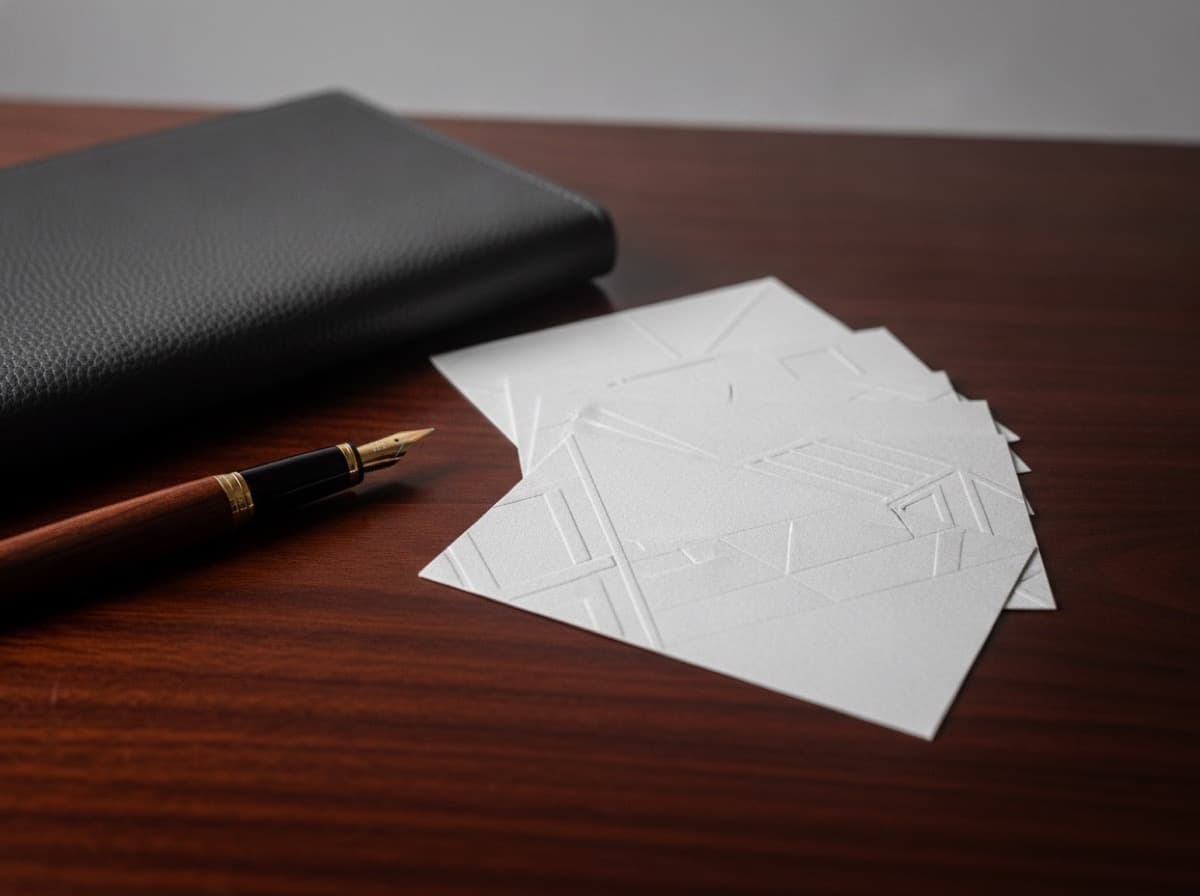
A networking card "converts" when it does one job: it turns a handshake into a follow-up. That means the card has to survive the pocket, be readable in a noisy room, and make the next action — a call, a scan, a saved contact — effortless. This guide breaks down exactly what to put on a card, what to leave off, and how to lay it out so more of the people you meet actually reach back.
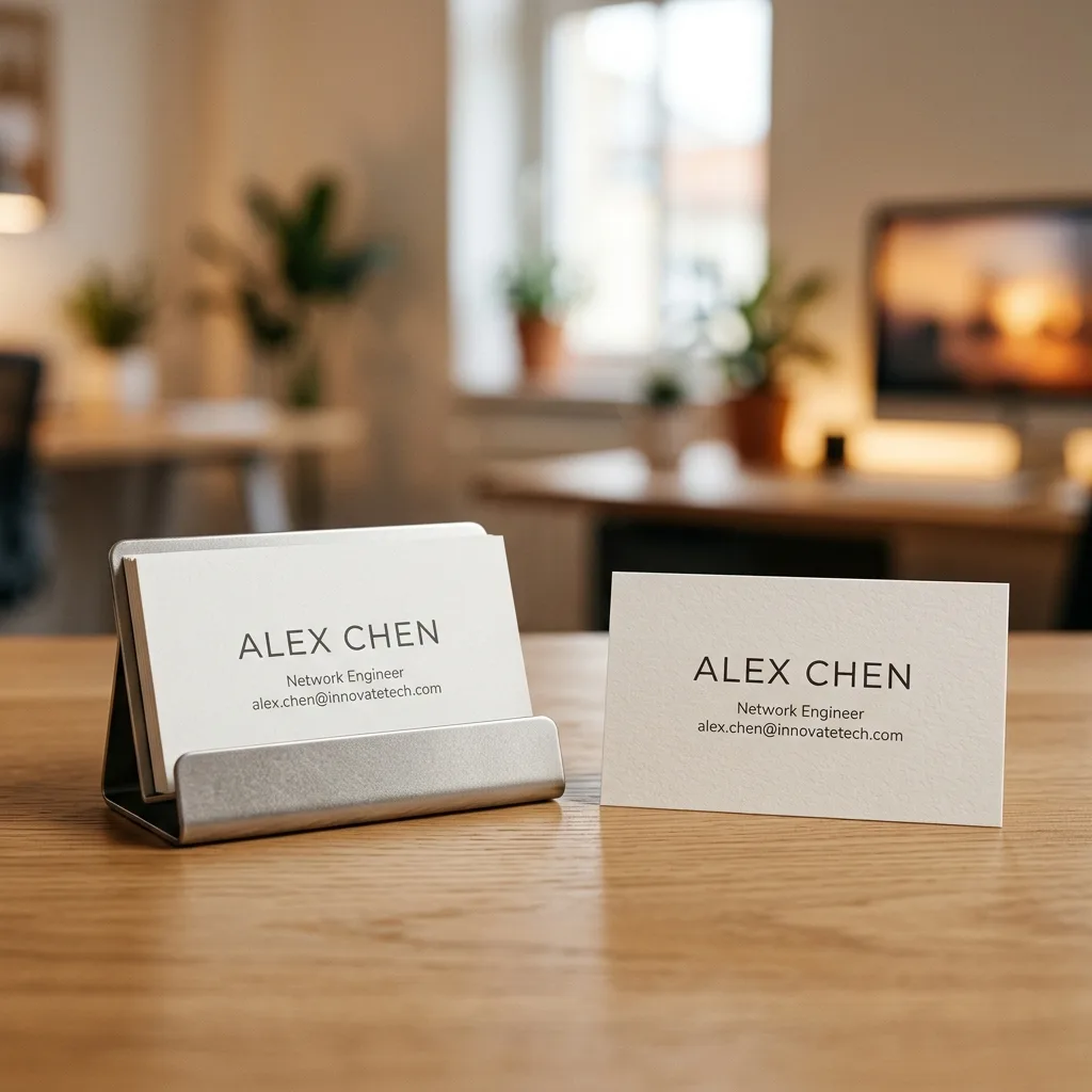
What "conversion" means for a business card
Most design advice treats a card as a mini-poster. That framing is why so many cards fail. A networking card is not an ad; it's a routing device. Its success metric isn't how pretty it looks in your hand — it's how many recipients take the next step after the event. Three things drive that number:
- Recall — can they remember who you are when they find the card three days later?
- Reachability — is the single most useful way to contact you obvious and frictionless?
- Retention — does the card feel worth keeping instead of tossing?
Everything below is in service of those three. If a design choice doesn't help recall, reachability, or retention, it's decoration, and decoration competes with the message.
The one-action rule
The biggest lever on conversion is focus. A card that offers five ways to reach you gets zero of them used, because you've made the recipient do the work of choosing. Decide the one action you most want after a first meeting and design the card around it.
- Want a phone call? Make the phone number the second thing they read, after your name.
- Want them to save your contact? Put a QR code that opens a vCard so one scan adds you to their phone.
- Want them to see your portfolio? A short, memorable URL beats a long one every time.
Secondary details can still appear, but only one action should be visually dominant. A clear hierarchy — one loud element, everything else quiet — is what makes a card feel designed rather than crowded.
The anatomy of a card that converts
Front: identity, fast
The front exists to answer "who is this?" in under two seconds. That means:
- Name — the largest text on the card. This is the recall anchor. If someone remembers one thing, it should be your name.
- Role and company — one line, directly under the name, so context is instant.
- A single visual anchor — a clean logo or a monogram. One mark, not a collage.
Resist putting contact details on a busy front. White space around the name is not wasted; it's what makes the name stick.
Back: the action
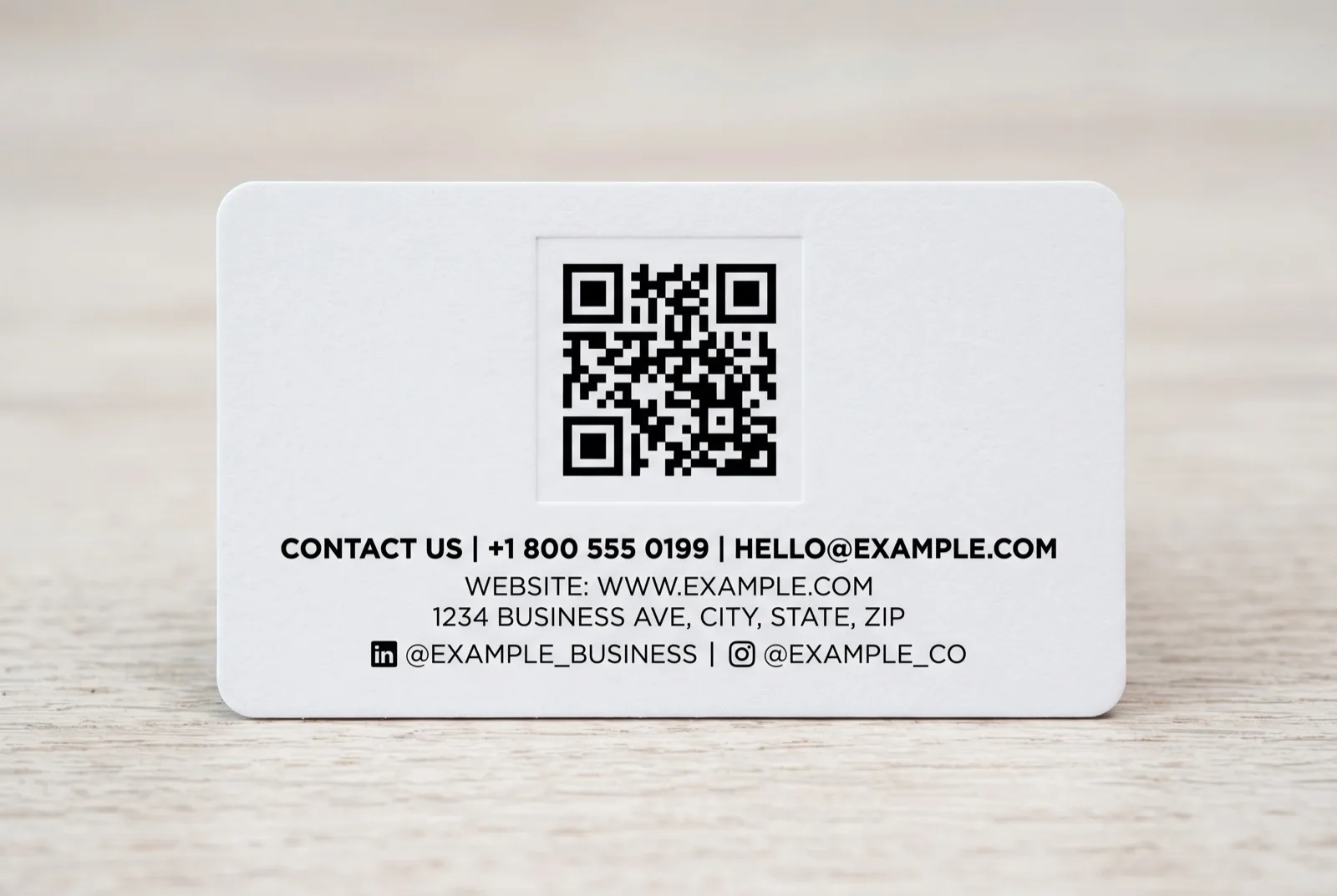
The back is where reachability lives. Give it room to breathe and lead with your one action:
- Primary contact (phone or email — the one you actually answer), sized larger than the rest.
- A QR code linking to a vCard or a single landing page, placed with a quiet-zone margin so phones scan it reliably.
- Supporting details (website, one social handle) in a smaller, consistent size.
Typography and contrast: readable in any room
Networking happens in dim bars and bright convention halls. A card that only reads under perfect light fails exactly when it's used. Practical rules:
- Minimum 8pt for body text, 7pt absolute floor. Below that, phone numbers become guesswork.
- High contrast beats brand-perfect color. Light-grey text on white looks refined on screen and disappears on a table. Aim for a strong dark-on-light or light-on-dark relationship for anything you need read.
- One or two typefaces, maximum. A display face for the name and a clean sans for details is plenty. Three-plus fonts read as noise.
- Left-aligned or cleanly centered. Justified or scattered text slows the eye.
The QR code: your highest-conversion element — if it works
A vCard QR code is the single best conversion tool on a modern card because it collapses "type all my details into my phone" into one scan. But QR codes fail constantly on printed cards, and a broken code is worse than no code. Get these right:
- Keep a quiet zone. Leave clear margin around the code; don't let text or borders crowd it.
- Print it flat and matte. Glossy spot UV or metallic foil over a code creates glare that blocks the camera. (More on finishes in our premium finishes guide.)
- Contrast is non-negotiable. Dark code on a light background scans best; low-contrast "on-brand" colored codes often won't read.
- Point it somewhere durable. Link to a vCard file or a permanent landing page, not a URL you'll retire next quarter.
- Test the printed card, not the screen. Scan the actual proof with two different phones before the full run.
Front-and-back layout checklist
Use this as a pre-print pass:
| Element | Front | Back | Rule | |---|---|---|---| | Name | ✅ largest | — | The recall anchor | | Role + company | ✅ one line | — | Instant context | | Logo / monogram | ✅ single mark | optional | One anchor, not a collage | | Primary contact | — | ✅ emphasized | The one action | | QR / vCard | — | ✅ with quiet zone | Flat, matte, tested | | Secondary details | — | ✅ small, consistent | Present but quiet | | White space | ✅ generous | ✅ generous | Makes the message stick |
Material choices that support conversion
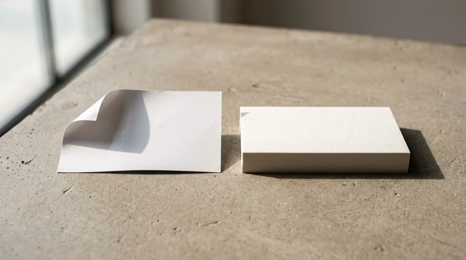
Design doesn't stop at the artwork. Retention — whether the card gets kept — is heavily influenced by how the card feels, and feel is a material decision. A substantial stock and a considered finish signal that you take your work seriously, and people keep things that feel worth keeping. You don't need every premium treatment; a heavier weight and a single tactile cue often do more for retention than an extra color. For a full breakdown of weights and coatings, see our paper and coating comparison.
Common mistakes that kill conversion
- Too many actions. Five contact methods equal decision paralysis. Pick one primary.
- Tiny, low-contrast text. Refined on screen, illegible in the room.
- An untested QR code. A code that doesn't scan destroys trust at the exact moment you wanted it to build.
- A cluttered front. If the name doesn't dominate, recall drops.
- Trend over legibility. Ultra-thin fonts, all-lowercase, and pale palettes look current and read poorly.
- No proof. Skipping a physical proof means you find these problems after 500 copies are printed.
A five-minute pre-print review
- Cover everything except your name — is it still the loudest thing on the card?
- Hand the card to someone across a table in normal light — can they read the phone number without squinting?
- Scan the QR with two phones — does it add your contact or open the right page every time?
- Count your calls to action — is there exactly one dominant one?
- Flex the printed proof — does it feel like something worth keeping?
Frequently Asked Questions
What information should a networking business card include?
At minimum: your name (largest element), your role and company, and one primary way to reach you. Add a QR code linking to a vCard or landing page for one-scan saving. Keep secondary details — website, a single social handle — small and quiet. The goal is one dominant action, not an exhaustive directory.
Should I put a QR code on my business card?
Yes, if it links to a vCard or a permanent landing page and you print it correctly. A vCard QR code lets someone save your full contact with a single scan, which removes the biggest point of friction in following up. Print it flat and matte with a clear quiet zone and strong contrast, and test the printed card with two phones before the full run.
What font size is readable on a business card?
Use at least 8pt for body text, with 7pt as an absolute floor. Below that, phone numbers and emails become hard to read, especially in the dim or crowded settings where cards are actually exchanged. Prioritize high contrast over exact brand color for anything that must be read.
How many contact methods should be on a card?
One dominant method, plus a couple of quiet secondary details at most. Offering five equal contact options forces the recipient to choose and usually results in none being used. Decide the single action you most want — a call, a saved contact, a portfolio visit — and make that element visually loud.
Single-sided or double-sided for a networking card?
Double-sided is usually better for conversion because it lets you separate the two jobs: the front answers "who is this?" with a dominant name, and the back carries the action — primary contact and a QR code — with room to breathe. Crowding both jobs onto one side reduces recall and reachability.
Does card thickness affect whether people keep it?
It does. A heavier, more substantial stock signals seriousness and feels worth keeping, which improves retention — the odds the card survives past the event. You don't need every premium finish; often a heavier weight plus one tactile cue does more for retention than adding another color or effect.
Design a networking card as a routing device, not a poster: one loud name, one dominant action, a QR code that actually scans, and a stock that feels worth keeping. Get those four right and more handshakes turn into follow-ups.
Get 10% off your first order
Join our list for practical printing guides, new finish ideas, and a welcome coupon for your first order.
No spam. Unsubscribe anytime.
Ready to bring this design to life?
Order Premium CardsNot sure which option fits? Ask Pro Card Crafters