Embossing vs Debossing on Business Cards: What's the Difference?
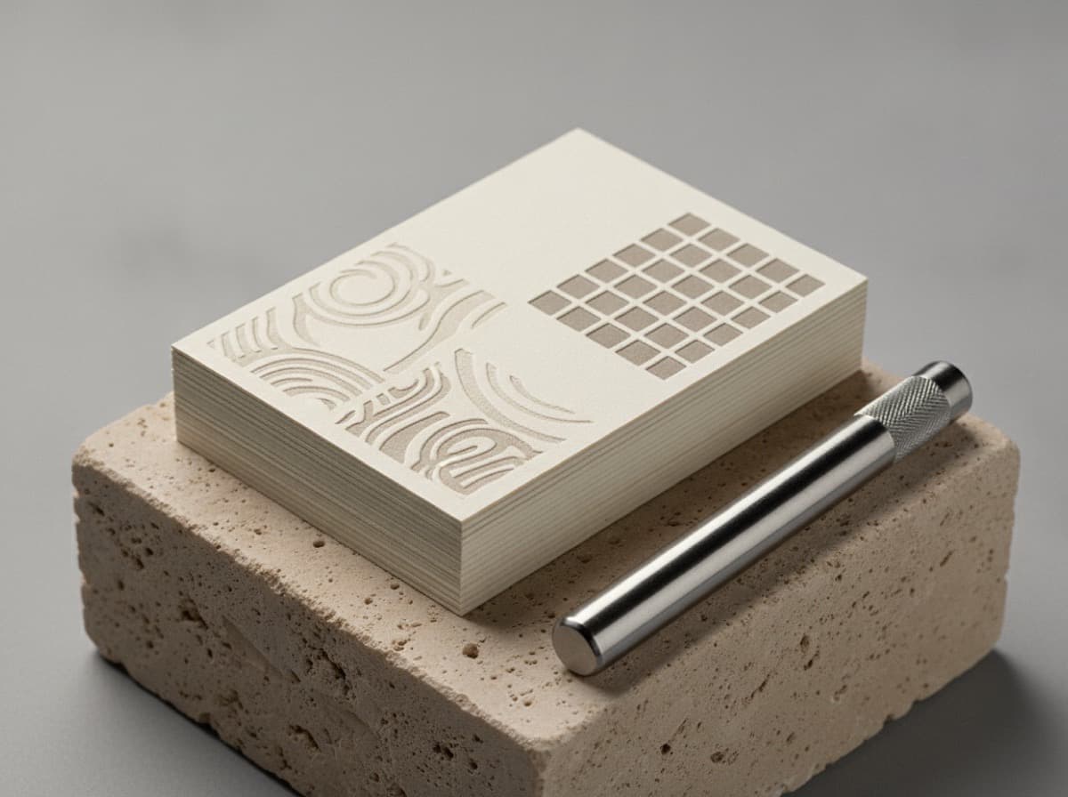
Embossing and debossing are two sides of the same technique — pressing a metal die into card stock to create a raised or recessed image — and the difference comes down to which direction the die moves. Embossing pushes the design upward so it stands above the surface; debossing presses it downward so it sinks into the paper. Both create a tactile effect that flat printing simply cannot replicate, and both work best on thick, uncoated stock that gives the die room to move. This guide explains how each works, when to choose one over the other, and how to combine them with other finishes for maximum impact.
How embossing works
In embossing, a matched pair of dies — one convex (male), one concave (female) — squeezes the card stock between them. The paper is forced upward into the female die, creating a raised, sculptural impression. The effect can be inked (so the raised area carries a color) or left "blind" (no ink, just the dimensional shape revealed by light and shadow).
Blind embossing is the subtler of the two: at arm's length the card looks clean, but up close — or when light rakes across it — the logo or monogram appears. For premium and luxury brands that favor understatement, blind emboss is a signature move.
How debossing works
Debossing uses the same die setup but presses the design down into the stock rather than up. The result is a recessed impression — most often seen in luxury goods branding, notebooks, and leather goods. On a business card, a debossed logo sits just below the surface and catches light in the valleys rather than the peaks.
A "blind deboss" is the same as a "blind emboss," just in the opposite direction. Letterpress printing is a specialized form of debossing: the printing plate presses into soft cotton stock, leaving a characteristic tactile impression alongside the inked design.
Which one looks better?
Neither is categorically better — they create different visual effects that suit different design intentions.
- Embossing reads as bold and assertive. The raised surface catches light from above, creating strong highlight-and-shadow contrast. It suits logos with confident, simple geometry.
- Debossing reads as refined and restrained. The recessed surface creates softer shadows and a quiet depth that rewards close inspection. It's the choice when you want luxury without loudness.
If you're unsure, consider what impression the card should make at first glance versus on closer inspection. Emboss stands out from across a table; deboss reveals itself when someone holds the card and tilts it.
Stock requirements for both
Both techniques need paper that can deform without cracking or tearing. Thin, coated card stock — the standard 14pt or 16pt that most digital cards use — is generally too stiff and too smooth to hold a clean impression. The right stock is:
- Thick and uncoated — at least 32pt, ideally cotton or textured paper that has enough body to push and pull without fracturing.
- Soft enough to compress — cotton stocks (like those used for letterpress) are ideal because the fibers compress and hold the impression rather than springing back.
- Heavy enough not to show through — a strong impression on thin stock can "telegraph" a ghost image on the reverse side; duplexed cards (two sheets bonded) eliminate this.
Our paper and coating comparison covers which stocks work for dimensional techniques and which don't.
Combining embossing or debossing with other finishes
Neither effect stands alone — the best premium cards layer tactile and optical effects:
- Foil + deboss — a foil-stamped logo (metallic, optical) alongside a debossed decorative border (tactile, dimensional) gives each element its own register.
- Emboss + spot UV — a raised logo on a matte card with spot UV gloss over the embossed area creates both height and sheen in the same feature.
- Letterpress + edge paint — the debossed impression of letterpress on thick cotton stock paired with a painted edge on the sides turns the card's cross-section into part of the design.
See our premium finishes guide for how to stack techniques without making a card look cluttered.
Design rules for dimensional techniques
A few practical rules keep the effect clean:
- Keep shapes bold — fine hairlines and tiny type (below about 8pt) can catch unevenly in the die and lose definition. The impression rewards confident, simple geometry.
- Avoid dense copy — embossing or debossing a paragraph of body text produces a muddy, unreadable result. Reserve the technique for logos, monograms, and short taglines.
- Consider registration — if the embossed or debossed element needs to align precisely with a printed element (say, a foil beneath an emboss), tolerance is tight; build some forgiveness into the design.
- Match the finish to the stock — don't specify cotton-depth embossing on a standard coated card; the paper will fight the technique and the result will disappoint.
Bottom line
Embossing raises a design above the surface; debossing presses it in. Both create a tactile dimension that flat printing cannot match, and both require thick, soft stock to work cleanly. Choose embossing when you want bold, prominent relief; choose debossing for quiet, refined depth. Combine either with foil or spot UV for a layered premium card that earns its cost.
Frequently Asked Questions
What is the difference between embossing and debossing on a business card?
Embossing raises the design above the card surface, creating a sculptural, convex relief. Debossing presses the design into the card, creating a recessed, concave impression. Both use a matched pair of dies and work best on thick, soft stock.
Which is better for a business card — embossing or debossing?
It depends on the effect you want. Embossing is bolder and more immediately noticeable; debossing is subtler and reveals itself on closer inspection. For understated luxury, debossing is more common; for a logo that asserts itself, embossing works well.
Can you emboss or deboss on any business card stock?
No. Both techniques require thick, soft, ideally uncoated stock — at least 32pt, preferably cotton. Standard thin coated card stock is too stiff and won't hold a clean impression without cracking or showing through to the back.
What is a blind emboss or blind deboss?
A blind emboss or deboss uses no ink — the die creates the impression in the paper's surface alone, so the effect is seen through light and shadow rather than color. It's popular for logos and monograms where understated luxury is the goal.
How much does embossing or debossing add to the cost?
Both techniques add tooling cost (the metal die) and a press setup step, making them more expensive than flat-printed or laminated cards. The die is a one-time cost, so longer runs spread it more efficiently. Combined finishes (foil + emboss) add further cost but are still achievable for premium runs.
Can embossing and debossing be combined on the same card?
Yes — opposite-direction dies on the same card can create a sculptural bas-relief effect, where different design elements rise and fall. This is a high-end technique that requires precise registration and very thick stock.
Get 10% off your first order
Join our list for practical printing guides, new finish ideas, and a welcome coupon for your first order.
No spam. Unsubscribe anytime.