Matte vs Glossy Business Cards: Which Finish Should You Choose?
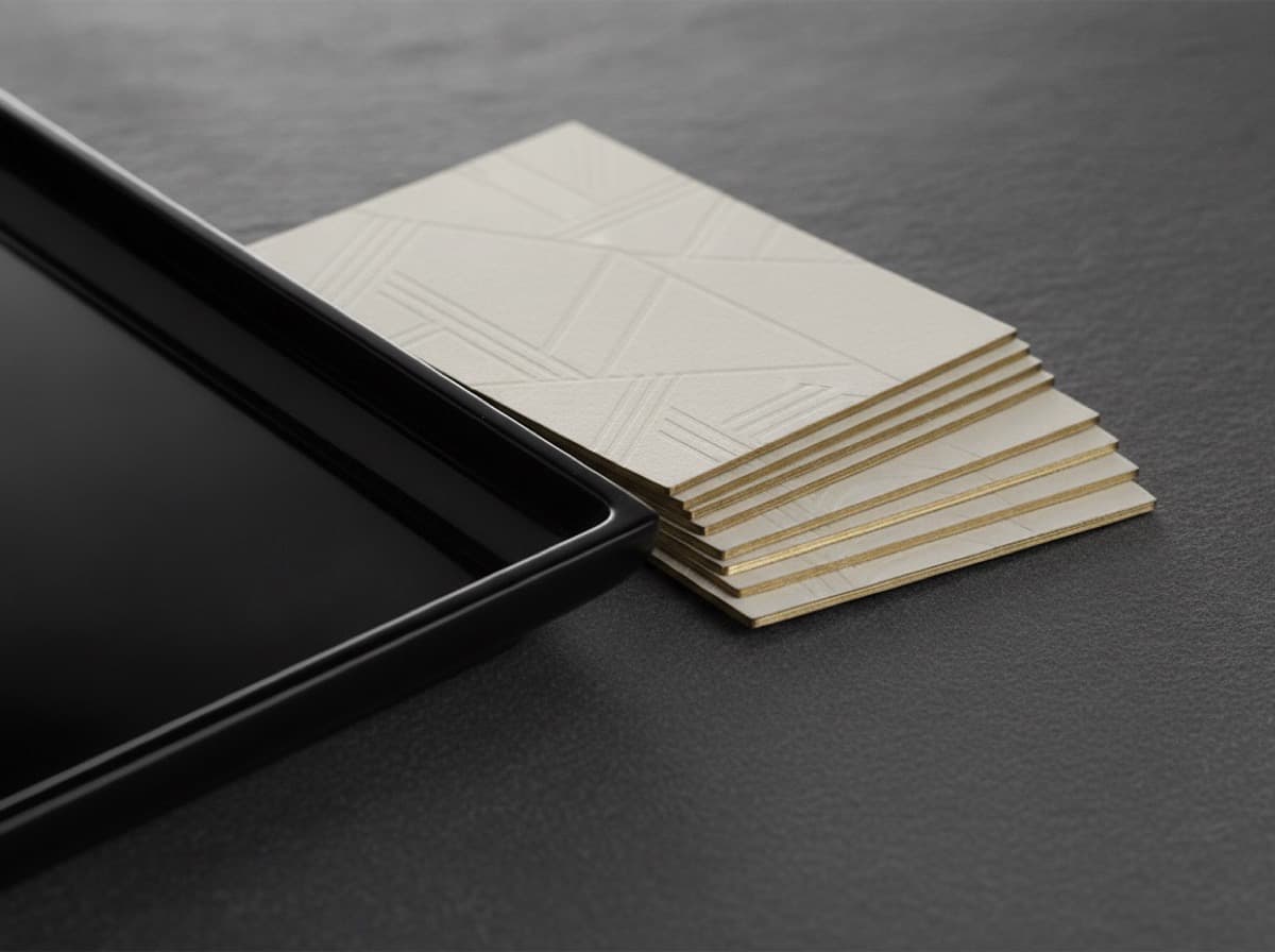
The choice between matte vs glossy business cards comes down to two things: how the card feels in the hand and whether people need to write on it. Matte cards have a smooth, non-reflective finish that looks understated and modern, hides fingerprints, and accepts pen; glossy cards have a shiny, light-reflecting coating that makes colors and photos pop but shows smudges and resists ink. Neither is "better" — the right finish depends on your design, your industry, and how the card will be used. This guide compares the two on look, feel, durability, and cost so you can choose with confidence.
What's the difference between matte and glossy?
Both matte and gloss are lamination or coating finishes applied over the printed card. The difference is how the surface handles light.
- Matte scatters light, producing a flat, even, low-sheen surface. It reads as elegant and restrained and gives the card a soft, smooth feel.
- Glossy reflects light, producing a bright, vivid surface. It makes colors look saturated and deep and gives photographs extra punch.
If you're still deciding on the underlying stock and coating family — including soft-touch, which is a specialized matte — our paper and coating comparison lays out all the options side by side.
Matte business cards: pros and cons
Strengths:
- Sophisticated, modern, understated look that suits professional and luxury brands.
- Hides fingerprints and minor scuffs, so cards stay clean-looking in a wallet or cardholder.
- You can write on them with most pens — useful for adding a note, an appointment, or a direct line.
- A matte base is the ideal canvas for contrast finishes like spot UV and foil, which pop against the flat surface.
Trade-offs:
- Colors look slightly more muted than on gloss, so highly saturated designs lose a little vibrancy.
- Dark, heavy ink coverage can occasionally show light scuffing on very cheap matte stocks (quality lamination minimizes this).
Glossy business cards: pros and cons
Strengths:
- Vivid, high-contrast color and standout photographic reproduction — great for visual brands, food, real estate, and photography.
- A protective, wipe-clean surface that resists moisture and light wear.
- Often the most economical premium-looking finish.
Trade-offs:
- Shows fingerprints, smudges, and glare, which can distract from the design.
- Hard to write on — most ballpoint and gel inks smear or won't dry, so gloss is a poor choice if anyone needs to jot on the card.
- Reflections can interfere with QR codes; if you include one, keep that area matte (see QR codes on business cards).
Which industries suit each finish?
There's no rule, but some patterns hold:
- Matte tends to fit law, finance, consulting, architecture, wellness, and premium or minimalist brands — anywhere restraint signals quality. It also pairs naturally with a minimalist design.
- Glossy tends to fit photography, real estate, food and hospitality, events, and retail — anywhere vivid imagery does the selling.
Durability and everyday use
Both finishes are laminated and hold up well to normal handling. Gloss shrugs off moisture and is easy to wipe clean, but its shine makes every fingerprint visible. Matte resists visible smudging and feels more premium, though a bargain matte with heavy dark ink can show the occasional scuff. For a card that will live in a wallet and take abuse, thickness matters as much as finish — a heavier stock resists bending regardless of coating, as covered in our thickness guide.
Matte vs glossy at a glance
| Factor | Matte | Glossy | |---|---|---| | Look | Understated, modern | Vivid, high-contrast | | Feel | Smooth, soft | Slick, shiny | | Color pop | Slightly muted | Maximized | | Fingerprints | Hides them | Shows them | | Writable | Yes (most pens) | No (ink smears) | | Pairs with foil/spot UV | Excellent | Poor contrast | | Relative cost | Comparable | Comparable / slightly lower |
How to choose
Run through four quick questions:
- Will anyone write on the card? If yes, choose matte.
- Is your design photo-heavy or color-saturated? If yes, gloss makes it sing.
- Do you plan to add spot UV or foil? If yes, you need a matte base for contrast.
- What impression do you want? Restrained and premium leans matte; bold and vivid leans gloss.
When it's a close call, matte is the safer default for a professional card — it looks premium, stays clean, and leaves the door open to adding a finish later. Whichever you pick, a strong layout matters more than the coating; our guide to networking card design that converts covers the hierarchy and legibility that actually turn a card into a follow-up.
Bottom line
Choose matte for an understated, fingerprint-resistant, writable card that pairs beautifully with foil or spot UV. Choose gloss when vivid color and photographic punch are the priority and no one needs to write on the surface. Both are durable and similarly priced, so let your design and how the card will be used make the call — and default to matte when you're unsure.
Frequently Asked Questions
Are matte or glossy business cards better?
Neither is universally better. Matte looks understated, hides fingerprints, and can be written on; glossy makes colors and photos pop but shows smudges and resists pen ink. The best choice depends on your design and how the card will be used.
Can you write on glossy business cards?
Usually not well. Glossy lamination resists ink, so most ballpoint and gel pens smear or won't dry on the surface. If you or your contacts need to write notes on the card, choose matte instead.
Do matte business cards look more expensive?
Often, yes. The flat, non-reflective surface reads as understated and premium, which is why law firms, consultancies, and luxury brands frequently choose matte. It also provides the ideal contrast base for foil and spot UV accents.
Which finish is better for photos and bright colors?
Glossy. Its reflective coating deepens contrast and saturation, making photographic imagery and vivid color designs stand out. Matte slightly mutes color, so photo-heavy cards typically look punchier in gloss.
Does matte or glossy cost more?
The two are usually comparable, with gloss occasionally a touch cheaper as a standard finish. Cost is driven more by stock weight, quantity, and any added finishes than by the choice between matte and gloss.
Can I combine matte and gloss on one card?
Yes — that's essentially what spot UV does. A matte-laminated card with glossy spot UV on the logo or a pattern gives you both a soft base and shiny accents, using the contrast between the two finishes as the design feature.
Get 10% off your first order
Join our list for practical printing guides, new finish ideas, and a welcome coupon for your first order.
No spam. Unsubscribe anytime.