Letterpress Business Cards: Are They Worth It?
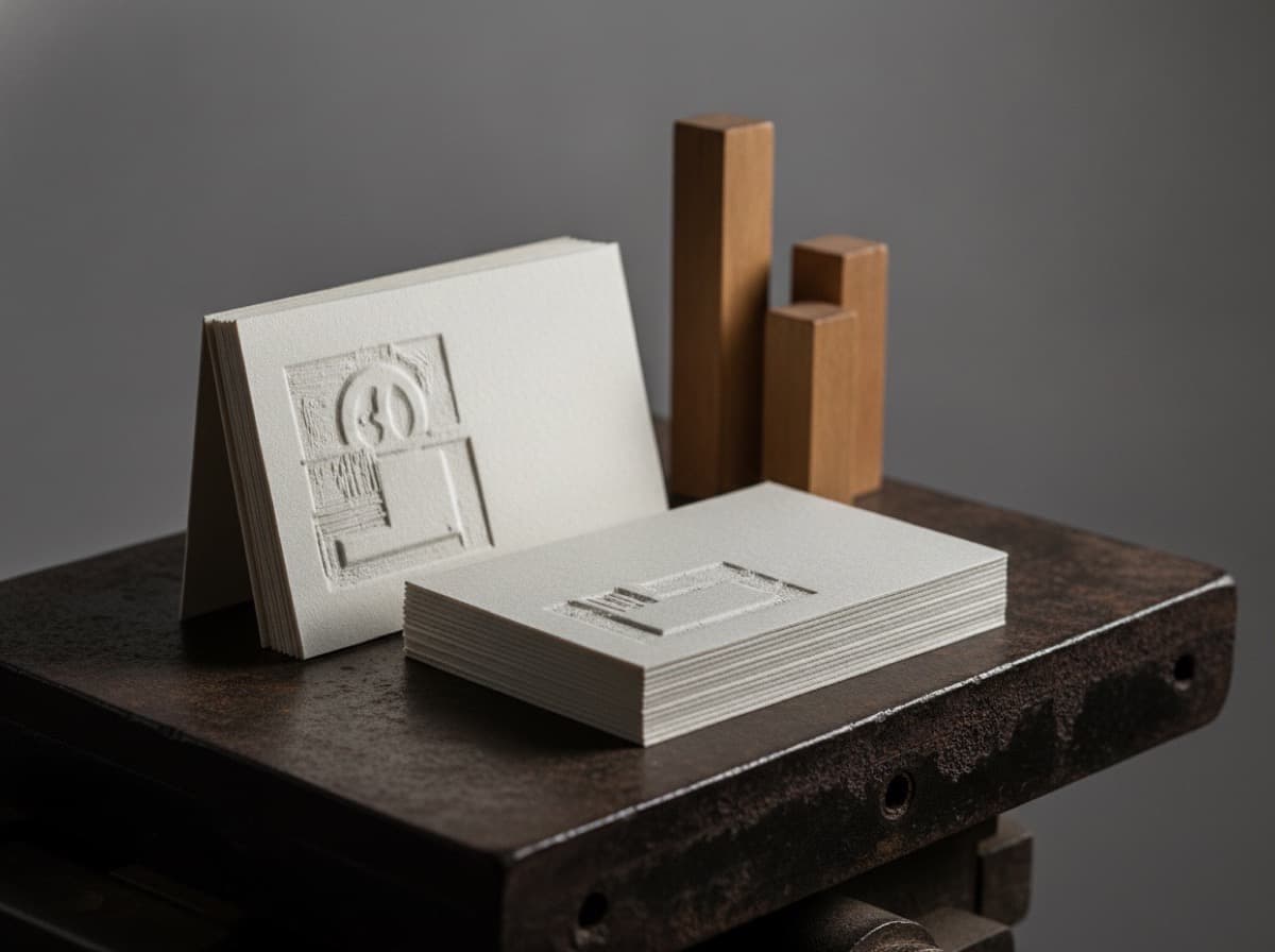
Letterpress business cards are printed by pressing an inked plate firmly into thick, soft cotton stock, leaving a crisp impression you can feel from both sides of the card. Are they worth it? For a personal brand, a design studio, or anyone whose card is the pitch, letterpress business cards usually are — the weight and the tactile deboss signal craft in a way flat printing can't. For a card you'll hand out by the hundreds where cost per piece matters most, a lighter premium finish may serve you better. This guide explains what letterpress is, what it costs in money and time, where it shines, and how to decide.
What are letterpress business cards?
Letterpress is one of the oldest printing methods still in use. A design is etched onto a plate (usually photopolymer today), the plate is inked, and it's pressed into the paper under heavy pressure. On a modern letterpress card the goal isn't just to transfer ink — it's the impression: the type and artwork are pushed slightly into the surface, creating a debossed feel and a subtle play of light along the edges of each letter.
That impression needs somewhere to go, which is why letterpress lives on thick, soft stock — typically heavyweight cotton, often duplexed (two sheets bonded together) so the press mark doesn't show through the back. The stock is half the experience: a letterpress card feels substantial before you've read a word. If you're weighing materials generally, our paper and coating comparison covers cotton and other premium stocks, and our guide to business card thickness explains why weight matters so much here.
How much do letterpress business cards cost?
Letterpress sits at the higher end of business card pricing, and there are clear reasons:
- Plates. Each color needs its own plate, so a one- or two-color design is far more economical than a full-color one. Every added ink color adds a plate and a press pass.
- Thick cotton stock. The heavy, often duplexed paper costs more than standard coated card stock.
- Slower, hands-on press work. Letterpress is a more manual process than digital printing, so setup and run time are longer.
Because of the plate cost, letterpress rewards restraint: a design built around one or two ink colors on a beautiful stock delivers the classic look without multiplying the price. It also means small runs carry a lot of fixed setup per card, so the effect is most economical when you order enough to spread that setup out — think in ranges rather than a fixed minimum.
Where letterpress shines
Letterpress is at its best when the card itself is part of the impression you're selling:
- Personal and professional brands — consultants, attorneys, architects, designers — where a memorable, high-touch card supports a premium positioning.
- One- or two-color designs with strong typography, a monogram, or a clean logo. Letterpress makes good type look exceptional.
- Blind deboss (an impression with no ink at all) for an understated, tactile mark that reads as quiet luxury.
- Pairings — letterpress combines beautifully with edge painting on thick duplexed stock, or with a single foil accent for contrast between matte impression and metallic shine.
Where letterpress is the wrong choice
It's worth being honest about when to skip it:
- Full-color photography or gradients. Letterpress is a spot-color process; it can't reproduce photographic images. If your design needs full color, digital or offset printing is the right route — see our digital vs offset comparison.
- Tiny type and fine hairlines. Very small text and ultra-thin lines can deboss unevenly. Keep body copy at a readable size and avoid hairline rules in the impression.
- Lowest possible cost per card. If you distribute cards in high volume and price is the priority, a matte or spot UV card gives a premium feel for less.
Designing for letterpress
A few rules keep a letterpress card crisp:
Limit your colors
Design around one or two ink colors, or go inkless with a blind deboss. Each color is a plate and a pass, so restraint is both a design virtue and a cost lever.
Mind minimum weights
Keep type at a comfortable reading size and avoid extremely fine lines and small reversed-out details, which can fill or deboss inconsistently. Bold, confident shapes press cleanly.
Plan the stock and the back
Choose a thick, soft stock — cotton is the classic — and decide early whether you want a duplexed card and what happens on the back. A second impression on the reverse can show slightly on the front if the stock is too thin, which is exactly why duplexing exists.
Set expectations for the impression
Slight variation is part of the handmade character of letterpress; it's a feature, not a defect. If you need perfectly uniform, flush printing, letterpress isn't the technique.
Is letterpress worth it? A quick decision guide
Ask three questions. First, does your positioning benefit from a card that feels crafted and expensive? Second, can your design work in one or two colors (or a blind deboss)? Third, is a higher cost per card acceptable in exchange for impact? If you answered yes to all three, letterpress is very likely worth it. If your design needs full color, or if cost per card is the deciding factor, look at a matte or spot UV card first — and reserve letterpress for a smaller run of high-stakes cards.
Bottom line
Letterpress business cards buy you two things flat printing can't: heft and touch. They're worth it when the card carries your brand at close range and your design suits one or two colors on thick cotton stock. They're not worth it for full-color artwork or for high-volume, cost-first distribution. Match the method to the job, keep the design restrained, and a letterpress card becomes the one people keep.
Frequently Asked Questions
Why are letterpress business cards so expensive?
Three things drive the cost: each ink color needs its own engraved plate, the thick cotton stock (often duplexed) is pricier than standard card stock, and the press work is slower and more hands-on than digital printing. Designs with one or two colors are far more economical than full-color ones.
What paper is used for letterpress business cards?
Thick, soft stock — most often heavyweight cotton — because the impression needs room to press in without showing through the back. Cards are frequently duplexed, meaning two sheets are bonded to create extra thickness for a deep, clean deboss.
Can letterpress print full-color photos?
No. Letterpress is a spot-color process that presses one plate per color, so it can't reproduce photographs or gradients. If your card needs full-color imagery, digital or offset printing is the right choice instead.
What is a blind deboss on a letterpress card?
A blind deboss is an impression made with no ink at all — the plate presses the design into the paper so it's felt and seen through light and shadow rather than color. It's a subtle, understated effect popular for logos and monograms.
Is letterpress worth it for a small business?
It can be, especially for consultants, studios, and professionals whose card supports a premium image. If your design works in one or two colors and you value a memorable, tactile card, letterpress delivers. If you need full color or the lowest cost per card, a matte or spot UV card may fit better.
Can letterpress be combined with other finishes?
Yes. Letterpress pairs well with edge painting on thick duplexed stock and with a single foil accent, which contrasts the inked or blind impression with metallic shine. Combining one tactile and one optical effect is a common way to make a premium card without overloading it.
Get 10% off your first order
Join our list for practical printing guides, new finish ideas, and a welcome coupon for your first order.
No spam. Unsubscribe anytime.
Ready to start your print order?
Browse Printing ProductsNot sure which option fits? Ask Pro Card Crafters