Vertical vs Horizontal Business Cards
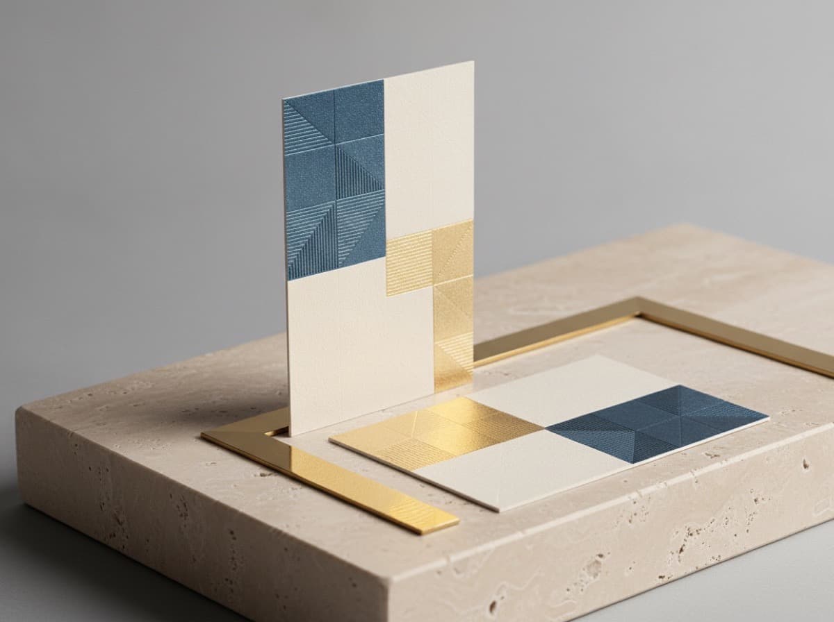
Vertical business cards and horizontal business cards contain identical information but make a fundamentally different first impression — and that difference starts before anyone reads a word. Horizontal (landscape) is the default because it matches how most people hand and receive cards, fits standard cardholders, and aligns with the reading direction of Western text. Vertical (portrait) stands out precisely because it breaks the convention, which is a deliberate brand signal some industries use to their advantage. This guide explains when each orientation works, what layout considerations each requires, and how to decide without making the choice feel arbitrary.
The case for horizontal (landscape)
Horizontal is the default for good reason. The 3.5 × 2 inch standard US business card is wider than it is tall, which means landscape orientation gives you more space along the natural reading axis — left to right — for your name and contact details. Most cardholders and cases are designed for landscape cards, so a landscape card fits neatly where someone will look for it.
For most professional contexts — financial services, law, corporate, medical, technology, and general business networking — landscape is the expected format. Meeting that expectation is not boring; it's removing friction. A recipient doesn't have to rotate the card to read it, doesn't have to turn it sideways to file it, and doesn't need to make a mental note about the unusual format. The content does the work.
Landscape also gives you the widest range of layout flexibility. Name and title can run the full width; a logo can anchor the left while contact details align right; information can be organized in horizontal bands. If you're considering a minimalist business card design, landscape is typically the more versatile canvas.
The case for vertical (portrait)
A portrait card stands out in a stack of landscape cards. That's the strongest argument for it: when dozens of cards end up in a pile after an event, a vertical card is immediately distinctive. The recipient doesn't have to recall whose card it was — they can see which one is different.
The industries where portrait cards are most common are ones where visual differentiation is part of the professional identity: photography, fashion, interior design, architecture, graphic design, beauty, and creative agencies. These are industries where the card is expected to communicate a visual sensibility before it communicates contact details.
Portrait layout works best when:
- The primary content element is tall rather than wide — a long name, a vertical logo or monogram, a single large graphic
- The design is minimal — portrait cards become cramped when overloaded with content
- The brand aesthetic rewards asymmetry or unconventional choices
One real practical constraint: most standard cardholders don't accommodate vertical cards well. A portrait card in a standard holder sticks up above the other cards and can be bent or creased. If recipients are likely to file cards in standard plastic holders, this is worth factoring in.
Layout differences between landscape and portrait
Name placement: In landscape, the name typically runs across the full width at the top or center. In portrait, the name most naturally runs vertically (top to bottom of the tall dimension) at a larger size, or horizontally at the shorter dimension — which limits available character width.
Contact details: Portrait cards have narrower columns for horizontal text, which means long email addresses and phone numbers can wrap unexpectedly. Plan text layout carefully and consider whether each piece of contact information fits in the available line width.
Logo position: In landscape, a logo usually anchors a corner or runs along the left side. In portrait, a centered logo at the top with information below is the most natural hierarchy.
For setting up your file correctly in either orientation, the bleed and safe zone requirements are the same — 3mm around all edges. See our file setup guide for specifics.
The hybrid option: landscape card with portrait design zones
Some cards use a landscape base but design elements as if they were portrait — a vertical stripe of solid color on the left third with white type, a vertical dividing rule that splits the card into portrait-proportion zones. This captures some of the vertical distinctiveness within a conventional-fitting format.
Making the decision
Three questions determine the right orientation:
- Does your industry have a strong convention? If yes, break it only if you have a specific reason — standing out for its own sake is a reason, but only if the rest of the card supports the differentiation.
- Does your primary design element (logo, name, image) work better in tall or wide proportion? Match the orientation to the content.
- Where will recipients store the card? Standard cardholders, rotary files, and wallet slots favor landscape. If your audience is very likely to use one of these, landscape has a practical advantage.
When in doubt, test both designs on paper at actual card size before deciding. The choice often becomes obvious once the designs are physical rather than on-screen.
Bottom line
Landscape cards are the professional standard for good reasons: they fit cardholders, meet expectations, and give the widest layout flexibility. Portrait cards stand out and suit industries where visual differentiation is part of the brand. Make the choice intentionally — based on your industry, your design, and how your cards will be stored — and whichever you pick, commit to a design that earns the format.
Frequently Asked Questions
Are vertical or horizontal business cards more professional?
Both can be professional. Horizontal (landscape) is the standard in most industries; it meets expectations and fits cardholders. Vertical (portrait) stands out and suits visual/creative industries where differentiation is part of the brand. "Professional" depends on context, not orientation.
Do standard cardholders fit vertical business cards?
Most standard cardholders and plastic filing sleeves are designed for landscape cards. A portrait card will stick above the others in a standard holder and may be bent. If recipients are likely to use standard holders, landscape is more practical.
What is the standard business card size?
In the US, 3.5 inches wide × 2 inches tall (89 × 51mm). This is a landscape proportion — wider than tall. A vertical card is the same physical dimensions, simply designed to be read with the 2-inch dimension as the base.
When should I use a vertical business card?
When visual differentiation is a priority and your industry supports unconventional choices: photography, design, fashion, architecture, beauty, and creative agencies. When your primary design element is tall rather than wide. When the entire brand aesthetic favors breaking conventions.
Can I design a vertical card and a horizontal card for the same brand?
Yes — some businesses order both: a portrait card for events and first impressions, a landscape card for filing and everyday networking. They share the same design elements but adapted to each proportion. This is an option worth considering if you operate in both formal and creative contexts.
Is there a cost difference between vertical and horizontal business cards?
No. The physical card dimensions are the same; the orientation is only a design choice. Production cost, paper stock, and finishing options are identical regardless of which way the design is oriented.
Get 10% off your first order
Join our list for practical printing guides, new finish ideas, and a welcome coupon for your first order.
No spam. Unsubscribe anytime.