Color Psychology for Business Cards: What Your Color Choices Communicate
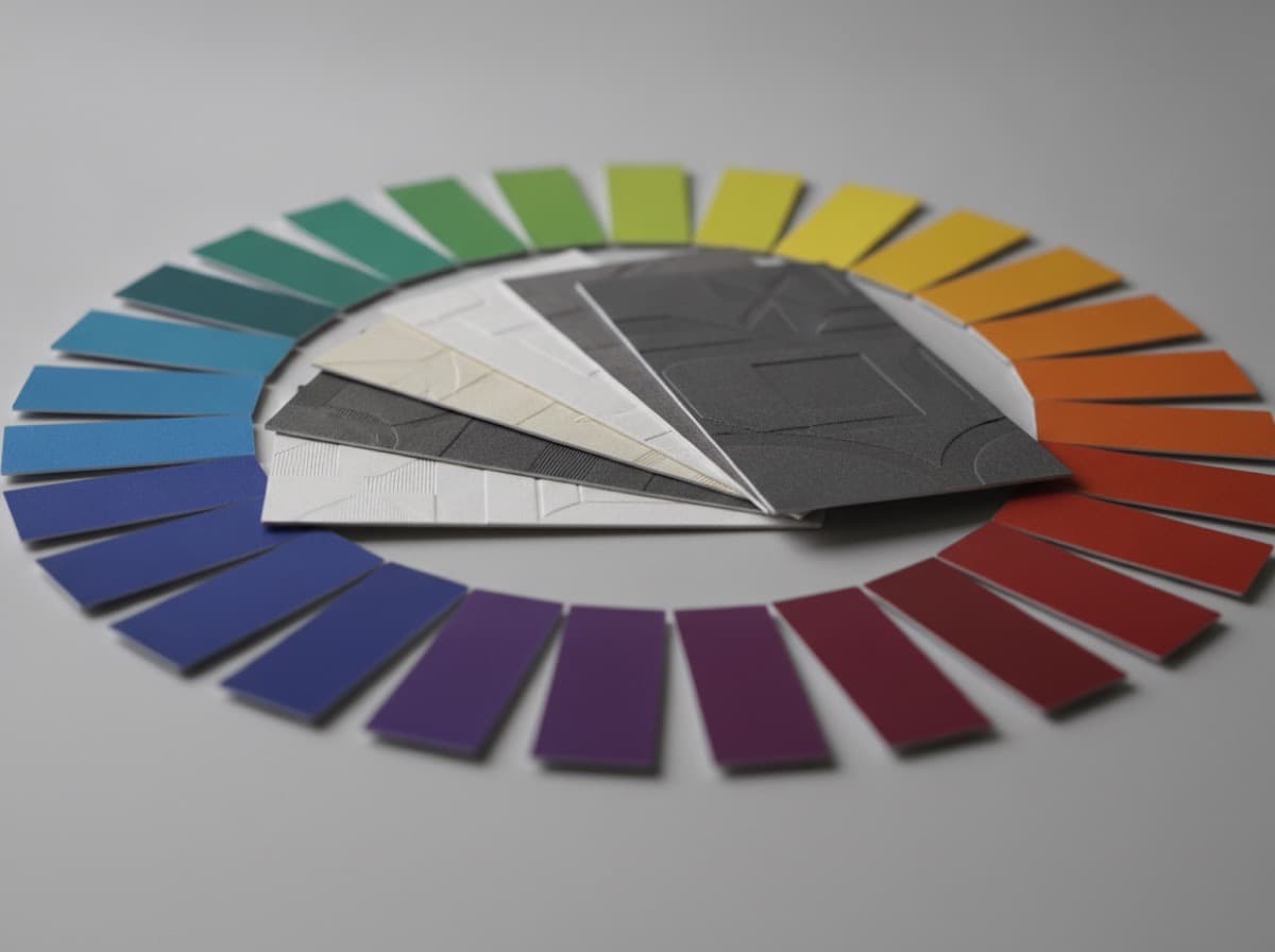
Color is processed before text, before imagery, before anything is consciously read. In the second before someone reads your card, they've already formed an emotional impression based on the colors in front of them. Understanding color psychology helps you make that first impression deliberate.
Why Color Matters on Business Cards
Your color choices communicate:
- Industry alignment: Navy communicates financial services; medical practices use teal or blue; law firms use navy and cream
- Positioning: Matte black with gold signals premium; bright primary colors signal accessible and energetic
- Personality: Warm colors suggest warmth and approachability; cool colors suggest calm and precision
- Differentiation: Choosing an unexpected color in your industry can make you memorable (a construction company in dusty pink vs. all the orange-and-navy competition)
The Psychology of Specific Colors
Navy Blue
Communicates: Trust, authority, stability, professionalism, tradition Industries: Finance, legal, insurance, corporate, healthcare, government Effect: The most universally trusted color in professional contexts. Rarely wrong. Caution: Can feel generic if not handled with distinctive execution
Royal Blue / Bright Blue
Communicates: Technology, confidence, communication, accessibility Industries: Tech companies, healthcare, education, social media Effect: Energetic and optimistic while remaining professional. More contemporary than navy.
Forest Green
Communicates: Growth, nature, health, sustainability, calm Industries: Environmental, outdoor recreation, agriculture, wellness, finance (growth), organic/natural Effect: Increasingly used outside traditional "nature" industries as sustainable positioning grows
Sage / Muted Green
Communicates: Calm, wellness, contemporary, thoughtful Industries: Beauty, wellness, therapy, yoga, natural products, real estate Effect: Very on-trend in wellness and beauty. Calmer and more sophisticated than bright green.
Black (Matte)
Communicates: Premium, luxury, sophistication, authority, exclusivity Industries: Luxury goods, fashion, creative professionals, premium services, high-end hospitality Effect: The definitive luxury signal. Matte black + metallic foil is a premium combination. Caution: Can feel heavy or cold if not executed with intentional warmth elements
Charcoal / Dark Grey
Communicates: Modern professionalism, sophistication, neutrality Industries: Creative agencies, architecture, consulting, modern professional services Effect: More contemporary than black, more distinctive than white. Works in nearly any professional context.
White / Cream
Communicates: Clean, simple, pure, open, luxury, medical Industries: Healthcare, luxury, minimal design, bridal, spa Effect: Maximum visual space. White backgrounds make other colors pop. Caution: Can feel stark or empty without strong typographic or accent treatment
Gold / Warm Yellow
Communicates: Success, premium, warmth, optimism, value, creativity As accent on dark: Premium, luxury, celebratory As primary on white: Energy, optimism, accessible Industries: Finance (success), luxury, creative industries, food and hospitality
Red / Burgundy
Red (bright): Energy, urgency, passion, attention — used in food, retail, emergency services Burgundy/Deep Red: Luxury, authority, tradition, sophistication — more appropriate for professional services Caution: Bright red can be aggressive; use as accent rather than dominant color in professional contexts
Orange
Communicates: Energy, creativity, enthusiasm, accessibility, construction/trades Industries: Construction trades, food, retail, creative industries, tech Effect: High energy and visible. Used by trades companies (high-visibility association), food brands, and tech companies seeking accessible warmth.
Purple / Violet
Deep purple/violet: Luxury, creativity, wisdom, ambition Lavender/light purple: Feminine, calm, spiritual, creative Industries: Beauty, wellness, creative, luxury, education Effect: Less used in corporate contexts than blue. More distinctive when well-executed.
Pink
Hot pink: Bold, fashion, energy, unconventional Blush/dusty rose: Feminine, soft, modern, beauty, lifestyle Industries: Beauty, fashion, bridal, wellness Effect: Increasingly acceptable across industries as a contemporary brand signal. Dusty rose + charcoal is a sophisticated palette.
Teal
Communicates: Balance, healing, clarity, sophistication, contemporary Industries: Healthcare, mental health, wellness, spa, communication technology Effect: Straddles blue (trust) and green (growth). Popular in healthcare and wellness for this balance.
Color Combination Principles
Monochromatic (One Hue, Multiple Values)
Example: Navy + light blue + cream Effect: Cohesive, sophisticated, focused Best for: Professional services, luxury, minimalist brands
Complementary (Opposite Colors on Color Wheel)
Example: Navy + warm gold; deep green + burgundy Effect: High contrast, energetic, visually striking Best for: When you want the card to stand out
Analogous (Adjacent Colors)
Example: Blue + teal + green; orange + red + warm yellow Effect: Harmonious, cohesive, natural Best for: Lifestyle brands, nature-adjacent businesses, warm and approachable
Neutral + One Accent
Example: Charcoal + rust orange; White + sage green; Black + gold Effect: The most common premium business card formula — one neutral anchors, one accent provides personality Best for: Nearly all professional contexts
Practical Color Rules
The 60/30/10 Rule
- 60% dominant color (usually background or large areas)
- 30% secondary color (main type, secondary elements)
- 10% accent color (a key highlight, icons, borders)
High Contrast Always
Low contrast between text and background is a common mistake:
- Light grey text on white background: hard to read
- Dark navy background with black type: invisible
- Test your card design by printing it to confirm legibility
Industry Alignment vs. Differentiation
Tension between matching industry expectations and standing out:
- Match expectations when trust and credibility are the primary purchase drivers (legal, medical, finance)
- Differentiate when creativity and distinction are the product (creative services, fashion, entertainment)
- Split the difference with a distinctive version of your industry's expected palette (deep jade instead of predictable teal for a spa; slate blue instead of navy for a financial advisor)
Print Color Reality
Colors print differently than they appear on screen:
- Screen: RGB color (additive light)
- Print: CMYK color (subtractive ink)
- Vivid screen colors (electric blues, bright greens) will appear duller in print
- Convert to CMYK early and proof before final print run
- Request a hard proof for important color-matching projects
Color on Different Card Stocks
- Glossy coating: Colors appear more saturated and vivid
- Matte coating: Colors appear slightly flatter but more sophisticated
- Soft-touch: Colors appear similar to matte but with deeper saturation due to the laminate
- Uncoated: Colors appear softer and warmer — similar to newspaper vs. magazine
Checklist
- [ ] Primary color chosen intentionally (communicates what you want)
- [ ] Color combination follows 60/30/10 principle
- [ ] High contrast between text and background
- [ ] Brand colors converted to CMYK for accurate print
- [ ] Color appropriate for industry context and positioning
- [ ] Request proof before full print run for color-critical designs
Get 10% off your first order
Join our list for practical printing guides, new finish ideas, and a welcome coupon for your first order.
No spam. Unsubscribe anytime.
Ready to bring this design to life?
Order Premium CardsNot sure which option fits? Ask Pro Card Crafters