Custom Color Business Cards A Complete Guide to Color Printing Options for Professional Cards
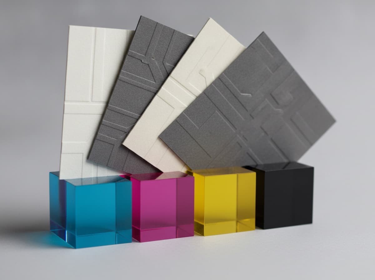
Color is often the first thing people notice about a business card — before they read the name, before they understand the logo, color communicates a gut-level impression about who you are, what you do, and whether your card is worth holding onto. Getting color right in business card printing requires understanding both the design principles that make color effective and the technical printing processes that determine how accurately and consistently your colors will reproduce.
The Two Color Printing Systems
CMYK (Process Color) — The Default for Full-Color Cards
CMYK stands for Cyan, Magenta, Yellow, and Key (Black) — the four ink colors that are layered in varying percentages to create the full spectrum of colors in offset and digital printing.
How CMYK works:
- Each color (C, M, Y, K) is expressed as a percentage from 0–100%
- Overlapping percentages of these four inks create the appearance of thousands of different colors
- A rich navy blue might be C:100 M:60 Y:0 K:40
- A warm red might be C:0 M:90 Y:85 K:0
CMYK is best for:
- Full-color cards with photographs, gradients, or complex multi-color designs
- Cards with many different colors
- Most digital printing and offset printing processes
- Cards where color matching flexibility matters more than absolute precision
CMYK limitations:
- Some colors are difficult to achieve precisely in CMYK — particularly vivid oranges, saturated pinks, and deep purples
- The same CMYK formula can produce slightly different results on different printers, papers, and printing runs
- Neon and metallic colors cannot be reproduced in CMYK at all
Design requirement: Always design for print in CMYK color mode, not RGB. RGB (red, green, blue) is for screens, and converting from RGB to CMYK often causes color shifts — vivid screen colors become duller or different when printed. Design in CMYK from the start.
Pantone / PMS (Spot Color) — Precision Brand Color Matching
Pantone Matching System (PMS) colors are standardized, pre-mixed inks that are formulated to produce exact color results across different printers, papers, and runs.
How Pantone works:
- Pantone colors are identified by number (e.g., Pantone 286 C is a specific royal blue; Pantone 7680 C is a specific deep navy)
- The "C" in Pantone numbers indicates coated paper; "U" indicates uncoated paper; "M" is matte
- Pantone ink is mixed to a precise formula and applied as a separate ink layer
When to use Pantone colors:
- When brand color consistency across all print materials is critical (your logo color must match exactly on business cards, letterhead, brochures, signage, and vehicle wraps)
- When your brand identity specifies Pantone colors
- When you're printing a limited number of ink colors (1 or 2 spot colors are often more economical than full CMYK for simple designs)
- When you need metallic colors (Pantone Metallics) or neon/fluorescent colors (Pantone Fluorescents)
Pantone limitations:
- More expensive when used for designs with many colors (each spot color adds cost)
- Not available through most digital printing processes (digital presses use CMYK; Pantone requires offset printing)
- For complex full-color designs, CMYK is more practical
Pantone + CMYK combination: Some professional cards use both — printing in 4-color CMYK plus one or two Pantone spot colors for elements (like a logo) where exact color matching is critical.
Color Printing Techniques and Effects
Full Bleed Color
Full bleed printing means color (or background image) extends to all four edges of the card with no white border. Full bleed requires the printer to print slightly beyond the card edge and then trim the card, which is why full bleed designs include a bleed area (typically 1/8" or 3mm beyond the intended card edge) to prevent white edges after trimming.
Why full bleed matters:
- Creates more visual impact than cards with white borders
- Allows the card's background color or image to fill the entire visual field
- Professional and modern aesthetic
- Requires careful setup: ensure your design includes the proper bleed and keep critical text and elements at least 1/8" inside the trim line
Full bleed color options:
- Solid color background (most common — a rich navy, deep green, or vibrant teal fills the entire card)
- Photo or texture background at full bleed
- Gradient background at full bleed
Digital Color Printing
Digital printing (laser or inkjet) is the most common process for short-run business card printing. CMYK toner or ink is applied directly to the paper in a single pass.
Advantages: Fast turnaround; no plate setup fees; economical for quantities under 1,000; easy to print variable data (different names on each card)
Considerations: Color consistency between runs may vary slightly; not suitable for true Pantone spot colors; coating applied after printing (matte or glossy laminate) rather than varnish
Offset Printing (Lithography)
Offset printing uses metal plates and transfers ink to a rubber blanket before applying to paper. Produces exceptional color consistency and quality for larger runs.
Advantages: More consistent color; can use Pantone spot colors; better color on coated stocks; cost-effective for quantities 1,000+
Considerations: Setup costs; longer turnaround; minimum quantities
Metallic Colors
Gold, silver, copper, and other metallic colors cannot be reproduced with CMYK inks — they require one of these special techniques:
- Metallic Pantone ink — Pantone Metallics are actual metallic inks with metal powder suspended in the ink base; applied as a spot color in offset printing
- Hot foil stamping (foil blocking) — metallic foil is applied to the card surface using a heated die; creates a mirror-bright metallic effect; available for gold, silver, copper, rose gold, holographic, and hundreds of specialty foils
- Cold foil — metallic foil applied with UV-cured adhesive; slightly less brilliant than hot foil but more compatible with digital printing workflows
Neon and Fluorescent Colors
Fluorescent neon colors cannot be reproduced accurately in standard CMYK — CMYK inks cannot achieve the brightness of neon. Achieving true neon colors requires:
- Pantone Fluorescent inks (e.g., Pantone 801 C through 814 C for fluorescents)
- UV fluorescent inks — special inks that glow under UV/blacklight; popular for nightclub, entertainment, and creative industry professionals
Special Color Effects
Gradients and ombre: Smooth color transitions from one hue to another; fully reproducible in CMYK; ideal for modern tech and design aesthetic
Duotone: Using two colors (often one Pantone + black) to create tonal variation; classic, sophisticated look; popular in architectural and design firm cards
Color on color (reversed out): White or light text on dark color background; creates maximum contrast and visual impact; technically a subtraction of ink rather than an addition
Soft touch with color: Soft-touch laminate over vivid color creates a luxurious matte surface that contrasts with the card's printed color; very tactile and memorable
Color Psychology for Business Cards
Colors communicate personality and professional values before a word is read:
Navy blue: Trustworthiness, authority, stability, professionalism — law firms, finance, healthcare, government, corporate Royal blue: Confidence, technology, communication — tech companies, media, communications Green: Growth, health, environmental responsibility, finance (money) — healthcare, environmental, financial advisory, wellness Teal: Balance, modernity, creativity — design agencies, healthcare tech, professional services Red: Energy, urgency, passion, appetite — restaurants, entertainment, real estate, retail, sports Orange: Enthusiasm, friendliness, creativity, affordability — contractors, consumer brands, fitness Purple: Creativity, luxury, wisdom, spirituality — beauty, wellness, spiritual, entertainment, luxury Gold/yellow: Optimism, wealth, premium — finance, real estate, luxury goods Black: Sophistication, elegance, power, exclusivity — luxury, fashion, high-end professional services White: Cleanliness, simplicity, modernity — healthcare, tech, premium minimalist brands
Setting Up Color Files for Card Printing
File format: PDF (for most printers); TIFF or EPS also accepted by many printers
Color mode: CMYK (never RGB for print)
Resolution: 300 dpi minimum for all images and raster elements
Bleed: 1/8" (0.125") on all four sides for full bleed designs; 3mm for metric-based printers
Safety margin: Keep all critical text and design elements 1/8" inside the trim line (not just bleed line) to prevent trimming into important elements
Black: Use Rich Black (C:60 M:40 Y:40 K:100) for large solid black areas for deeper, richer black; use 100% K only for small text
White: Pure white (0/0/0/0 in CMYK) is the absence of ink — the paper shows through as white; do not add ink to represent white
Color Consistency Across Batches
One practical consideration: if you order business cards in multiple batches over months or years, slight color variation between batches is normal in digital printing. For mission-critical brand color consistency:
- Order larger initial quantities to minimize reprints
- Request the printer save your file settings (some professional printers do this)
- Use Pantone spot colors for critical brand elements
- Request a press proof (for offset) or a printed proof (for digital) before large runs
Choosing Your Color Approach
| Goal | Recommended Color Approach | |------|---------------------------| | Simple 1–2 color design; precise brand matching | Pantone spot colors | | Full-color photo or complex multi-color design | CMYK full color | | Maximum color vibrancy and impact | CMYK + soft touch laminate | | Gold/silver metallic elements | Foil stamping (hot foil) | | Deep sophisticated look | Dark full bleed + matte laminate | | Neon pop | Pantone Fluorescent or UV ink | | Brand consistency across all materials | Pantone-defined color system |
Get 10% off your first order
Join our list for practical printing guides, new finish ideas, and a welcome coupon for your first order.
No spam. Unsubscribe anytime.
Ready to bring this design to life?
Order Premium CardsNot sure which option fits? Ask Pro Card Crafters