Business Card Typography Guide How to Choose the Right Fonts for Professional Card Design
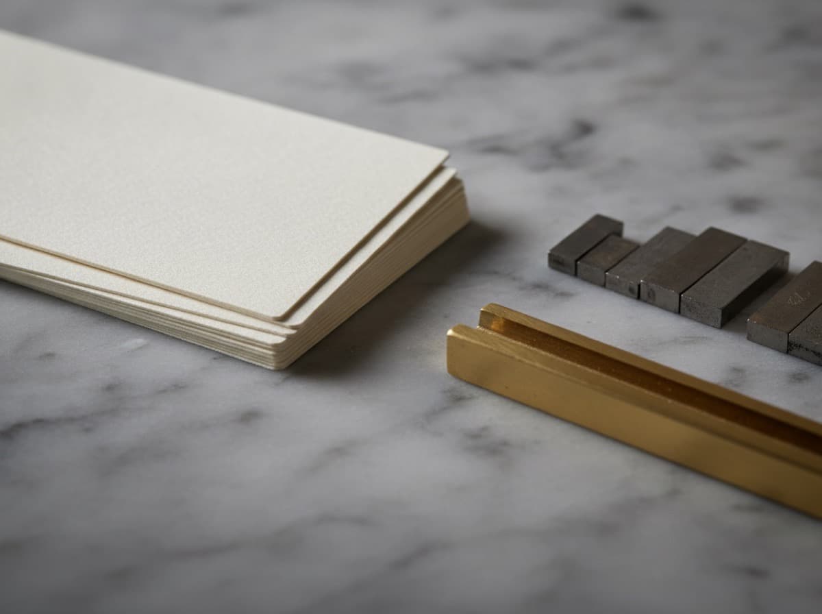
Typography — the selection and arrangement of typefaces, font sizes, weights, and spacing — is one of the most important design decisions in business card creation. The fonts you choose communicate your professional identity at a visceral, pre-conscious level: a serif font signals tradition and authority; a geometric sans-serif signals modern and technical; a script communicates elegance and creativity. Getting typography right makes a card feel professional and coherent; getting it wrong makes even excellent information hard to read and trust.
Understanding Type Categories
Serif Typefaces
Serif fonts have small finishing strokes (serifs) at the ends of letterform strokes. These details were originally carved into stone inscriptions to finish the letterforms cleanly.
Characteristics:
- Traditional, established, authoritative
- High readability in body text (the serifs guide the eye along the baseline)
- Associated with: law, finance, academia, publishing, luxury goods, established institutions
Classic serif typefaces:
- Times New Roman / Times — ubiquitous; works but feels default; better to use less common serifs
- Georgia — designed for screen legibility; slightly informal for print
- Garamond — classical French Renaissance type; elegant and refined; excellent for luxury and creative professions
- Palatino — humanist serif; warm and readable; good for academic and healthcare contexts
- Caslon — American historical serif; "When in doubt, use Caslon"; excellent for traditional professional contexts
- Bodoni — high contrast serif with dramatic thin strokes; luxury fashion and editorial aesthetic
- Didot — similar to Bodoni; extremely high contrast; French elegance; beauty, fashion, luxury
- Playfair Display — modern revival of 18th-century types; editorial and magazine aesthetic; pairs well with simple sans-serifs
- Merriweather — designed for screen and print readability; contemporary and accessible
Sans-Serif Typefaces
Sans-serif fonts lack the finishing strokes of serif types — clean, unadorned letterforms.
Characteristics:
- Modern, clean, technical, approachable
- Excellent at small sizes (no serif detail to lose)
- Associated with: technology, design, architecture, healthcare, startups, modern professional services
Categories of sans-serif:
Grotesque / Neo-grotesque: Classic early sans-serif style; slightly irregular and humanist
- Helvetica / Helvetica Neue — the most famous typeface in the world; neutral, authoritative; overused but always professional
- Arial — ubiquitous Helvetica substitute; serviceable but generic
- Univers — systematic and precise; excellent for technical and corporate use
Geometric: Constructed from precise geometric forms (circles, squares)
- Futura — the iconic geometric sans; modern, technical, precise; used by tech companies and architecture firms
- Circular (Lineto) — contemporary geometric; popular in tech branding
- Nunito — rounded geometric; friendly and approachable
- Brandon Grotesque — popular for its balanced combination of geometric and humanist qualities
Humanist: Sans-serif letters with human-drawn proportions and letterforms
- Gill Sans — slightly humanist; warm sans; British corporate and institutional feel
- Optima — distinctive; slightly flared strokes; between serif and sans; medical and luxury
- Frutiger — excellent legibility; originally designed for airport signage; healthcare, wayfinding
- Myriad Pro — clean humanist sans; Apple's former brand typeface; professional and versatile
- Lato — popular web/print sans; warm and professional; widely used
- Open Sans — extremely legible; very widely used; neutral and professional
Script and Display Typefaces
Scripts: Letterforms based on cursive handwriting
- Great Vibes, Pacifico, Alex Brush — flowing script typefaces for elegant or casual brands
- Playfair Display (italic) — in italic form, serif typefaces approach script elegance while remaining highly legible
- Use case: Very selectively; name only or tagline in a script; pairing a script with a sans-serif for contrast
Display typefaces: Designed for headlines and large sizes; often too complex or decorative for small sizes
- Use case: Company name or your name only, at sufficient size that the decorative detail is legible; avoid for contact information
Font Pairing Principles
Most professional business card designs use 2 typefaces (occasionally 3):
Primary typeface: Used for your name and primary heading — typically the most distinctive or weighted element. Can be serif, sans-serif, script, or display.
Secondary typeface: Used for titles, company name, and body information — typically more neutral and highly legible. Usually sans-serif for versatility and readability.
Classic pairing patterns:
- Serif + Sans-Serif (most versatile):
- Playfair Display (name) + Lato (contact info)
- Garamond (company) + Gill Sans (details)
- Palatino (name) + Futura (body)
- This is the most reliably professional combination: the serif adds character and authority; the sans-serif provides readable contrast for details
- Sans-Serif + Sans-Serif:
- Futura (name, bold) + Futura (contact, light weight) — same family, different weights
- Circular (company) + Open Sans (details)
- Works well when the visual contrast comes from weight rather than type style
- Script + Sans-Serif:
- Alex Brush (name in script) + Lato (contact information)
- Great Vibes (brand name) + Futura (details)
- Effective for beauty, wellness, wedding, and elegant consumer-facing brands
Pairing mistakes to avoid:
- Two decorative or display typefaces competing for attention
- Two serif typefaces that are too similar in weight and style
- Script typeface for any information that needs to be quickly readable (phone numbers, addresses)
- Too many typefaces (3 max; 2 is almost always better)
Type Hierarchy for Business Cards
A business card is an exercise in typographic hierarchy: guiding the reader through information in the order it matters. The hierarchy should work visually before any word is read.
Typical hierarchy on a business card:
Level 1 — Name (highest visual weight):
- Your name should be the first thing the eye lands on
- Largest text on the card, or highest visual weight through font choice
- Bold weight or distinctive typeface choice
Level 2 — Title/Company (second visual weight):
- Clearly subordinate to name but still prominent
- May be same typeface in smaller size or lighter weight
- Or contrasting typeface (serif name → sans title)
Level 3 — Contact Information (supporting text):
- Phone, email, website, address
- Legible but visually subordinate
- Consistent font, size, and weight; no element larger than Level 2
Level 4 — Supplementary (minimal):
- Tagline, certifications, social handles
- Smallest text; should not compete with Level 1–3
Making hierarchy work:
- Size: The most common way to create hierarchy; 2–4 point size difference between levels is sufficient
- Weight: Bold vs. regular vs. light within the same family creates hierarchy without changing typeface
- Case: ALL CAPS for a title or label creates visual distinction and formality without size increase; use sparingly
- Color: A secondary color for Level 2 elements (company name or title in brand color; contact info in neutral gray) creates hierarchy through color while keeping font consistent
- Spacing: More space above a heading than below; generous line spacing; tight tracking (letter spacing) for headlines, looser for text
Minimum Font Sizes for Business Card Print
Fonts that look readable on screen at 72 dpi may be illegible when printed at 300 dpi due to the difference in physical size:
Safe minimum sizes for standard business cards:
- Body text / contact information: 7 pt minimum; 8–9 pt recommended
- Secondary information / fine print: 6 pt minimum; legibility is marginal
- Very small labels (email prefix, etc.): Never below 5.5 pt; avoid
- Name (primary heading): 12–18 pt typical; larger works if it fits
- Company/title: 10–14 pt typical
Critical rule: Print test proof before final order. A font that looks fine at 8 pt in Illustrator may be difficult to read in print depending on weight, stroke contrast, and paper stock. Always proof on actual card-stock paper.
Font weight and print interaction:
- Light and ultra-thin fonts can lose stroke definition in printing, especially on uncoated or textured stocks; test carefully before using very light weights
- Bold and heavy weights print with excellent density and readability
- Regular/medium weight is the most reliable for body text
Font Licensing for Print
Important: Not all fonts are free to use in commercial projects and print materials. Font licensing varies:
- Free for commercial use: Many Google Fonts (Lato, Open Sans, Roboto, Merriweather, etc.); always verify the license
- Paid desktop licenses: Adobe Fonts, premium typefaces from foundries (Klim, Commercial Type, Hoefler&Co, Grilli Type); desktop licenses typically cover print use
- Web-only licenses: Some font licenses cover web use only; not valid for print; check the license terms
- Custom fonts: Some large companies have proprietary typefaces that are only licensed for use within the company
Safe approach: Use Google Fonts for free, fully licensed options; or use Adobe Fonts with an active Creative Cloud subscription (Adobe Fonts licenses cover print use).
Embedding Fonts in Print Files
When you submit a PDF or other print-ready file to a printer, fonts must be either embedded in the file or outlined (converted to paths):
Embedding fonts in PDF: Most PDF export settings from design software (Illustrator, InDesign) have an option to embed fonts; always enable this
Outlining fonts: In Illustrator: Select All → Type → Create Outlines. This converts font outlines to vectors and eliminates font dependency entirely. The disadvantage: you can no longer edit the text after outlining.
Best practice: Create a "print-ready" export copy with fonts outlined; keep your original working file with live text for future edits.
Typeface Recommendations by Profession
| Profession | Recommended Typefaces | |-----------|----------------------| | Law firm / Attorney | Garamond, Caslon, Cormorant Garamond serif | | Finance / Banking | Bodoni, Helvetica Neue, Playfair Display + Lato | | Healthcare / Medical | Optima, Myriad Pro, Frutiger, Open Sans | | Technology / Software | Futura, Circular, Roboto, Inter | | Architecture | Gill Sans, Univers, Helvetica Neue | | Design / Creative agency | Playfair + Futura; Didot + Gill Sans; custom pairings | | Luxury retail / Fashion | Bodoni, Didot, Futura (caps) | | Wellness / Yoga / Spa | Script + clean sans; Great Vibes + Lato | | Real estate | Clean sans-serif; contemporary serifs | | Contractor / Trades | Bold, clear sans-serif; legibility over style | | Wedding professional | Elegant script + clean serif or sans |
Get 10% off your first order
Join our list for practical printing guides, new finish ideas, and a welcome coupon for your first order.
No spam. Unsubscribe anytime.
Ready to bring this design to life?
Order Premium CardsNot sure which option fits? Ask Pro Card Crafters