Design Tips
Make your business cards, stickers, and flyers look their best from the first proof.
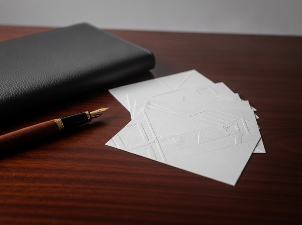
Networking Business Card Design That Converts: Turn Handshakes Into Follow-ups
A networking card "converts" when it does one job: it turns a handshake into a follow-up. That means the card has to survive the pocket, be readable in a noisy room, and make the next action — a…
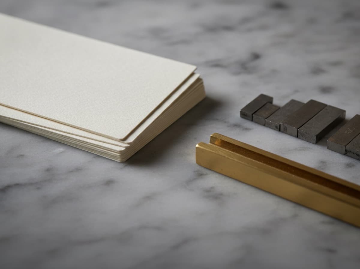
Business Card Typography Guide How to Choose the Right Fonts for Professional Card Design
Typography is one of the most impactful design decisions in business card printing — the fonts you choose communicate personality, professionalism, and brand identity before the recipient consciously processes the words. This complete typography guide for business cards covers how to choose fonts that match your professional identity, the difference between serif and sans-serif typefaces, font pairing principles, type hierarchy on small-format cards, and the technical requirements for fonts in print-ready business card files.
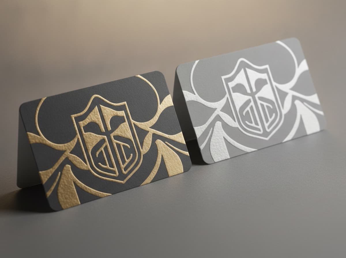
Double Sided Business Cards A Complete Guide to Designing and Printing Two Sided Professional Cards
Double-sided business cards maximize the physical real estate of a 3.5 x 2 inch card — giving you a front face for core identity information and a full back panel for service menus, portfolios, maps, testimonials, QR codes, or supplementary content that makes your card more useful than a simple name-and-number card. This guide covers when to use both sides, how to design front and back panels that work together, and the technical considerations for two-sided business card printing.
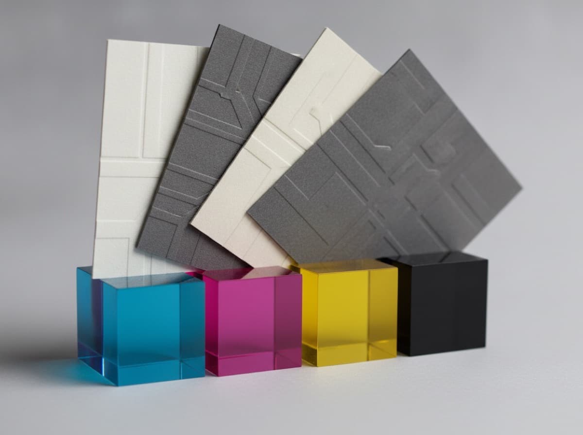
Custom Color Business Cards A Complete Guide to Color Printing Options for Professional Cards
Color is one of the most powerful design elements in business card printing — the right color palette communicates your brand personality, creates emotional associations, and makes your card immediately recognizable in a stack of plain white cards. This complete guide to custom color business card printing covers CMYK full-color printing, Pantone spot color matching, full bleed printing, color psychology for professional cards, and how to choose the color approach that makes your card stand out.
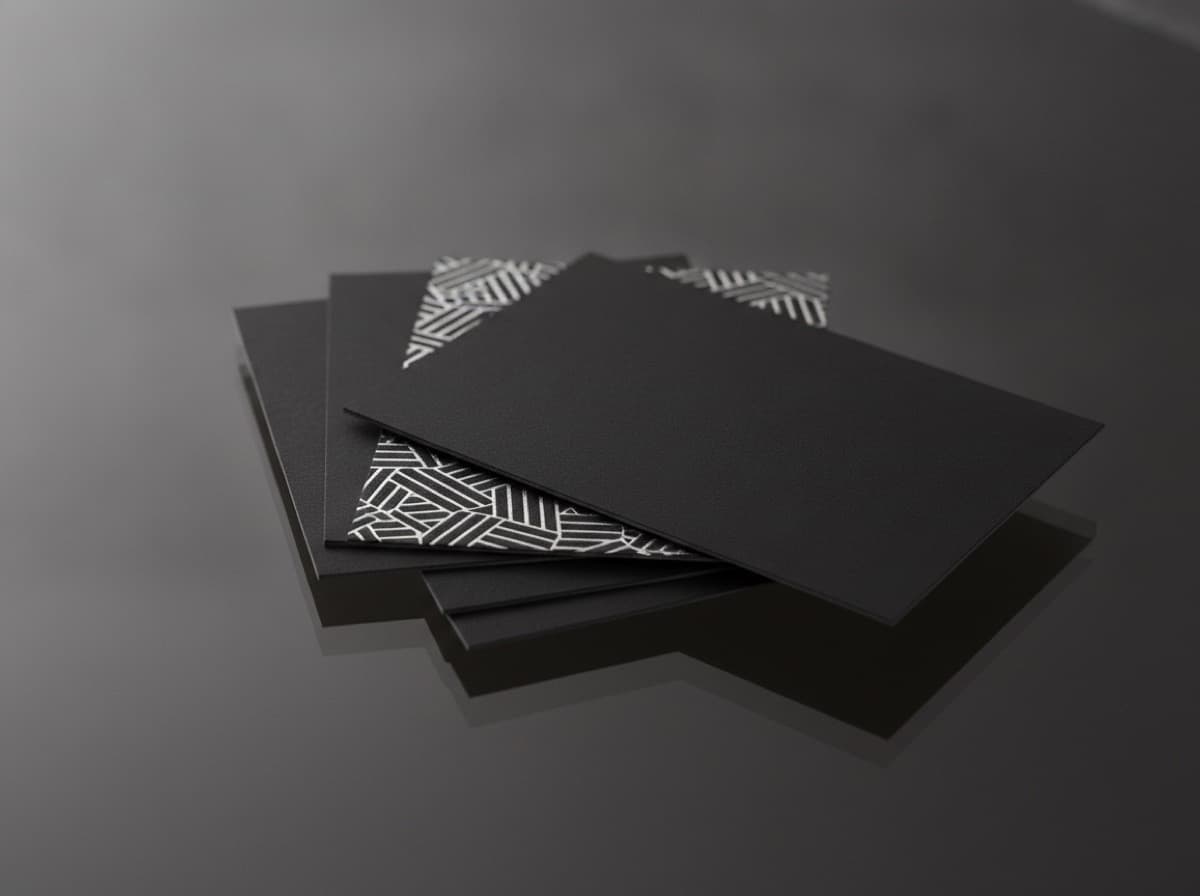
Two-Sided Business Card Design Guide: How to Use Both Sides of Your Card Effectively
Two-sided (duplex) business card printing is the default for most professional card printing, but the back of a business card is one of the most underutilized real estate opportunities in professional marketing — often left blank, printed in a single color, or filled with a logo that could appear on the front. This complete guide covers how to use both sides of a business card with maximum impact, what information belongs on each side, creative approaches for the back, and the printing and paper considerations that affect two-sided card design.
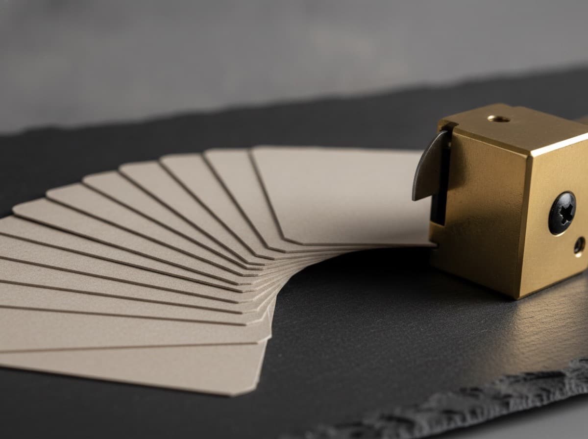
Round Corner vs. Square Corner Business Cards: Which Should You Choose?
The choice between rounded corners and square corners on your business cards is one of the most underrated design decisions — affecting the professional impression, perceived brand personality, and tactile feel of your card before a word is read. This guide breaks down the practical differences between round corner and square corner business cards, the professional and brand contexts where each performs best, the cost implications, and how to decide which corner style is right for your professional identity.

QR Code Business Card Design: Best Practices for Adding QR Codes to Professional Business Cards
QR codes on business cards transform static contact information into a digital bridge — linking to portfolio websites, LinkedIn profiles, product demos, video introductions, booking pages, and digital contact cards (vCards) that make following up as simple as scanning a phone at the moment of card exchange. This complete guide covers how to design QR codes that work reliably on business cards, what to link to, the right size and placement, design integration, and the common mistakes that result in QR codes that fail to scan.
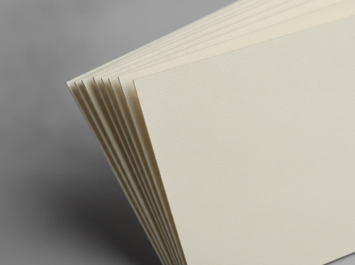
Matching Business Card, Letterhead, and Stationery Suite Design Guide
A matching stationery suite — coordinating business cards, letterhead, envelopes, notecards, and presentation folders — creates a unified brand presence that signals professionalism and intentionality across every client touchpoint. This guide explains how to design a cohesive stationery suite, what elements create visual consistency, and when investing in a full suite is worth it.
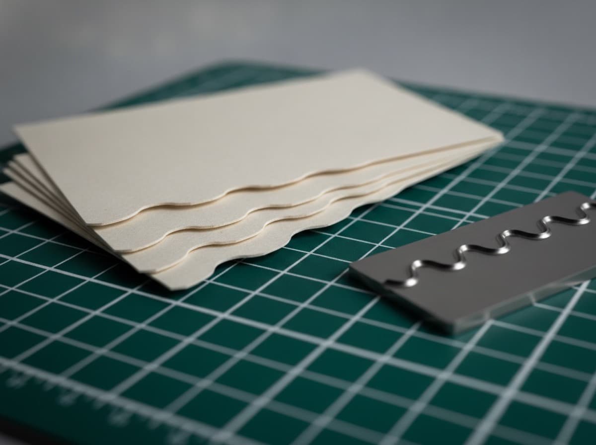
Die-Cut Business Cards: Shaped Card Design Guide for Non-Rectangle Formats
Die-cut business cards go beyond the standard rectangle — offering custom shapes that reinforce your brand, create visual distinction, and make an instant impression. From simple rounded corners to fully custom silhouettes, die-cutting opens up business card design possibilities that standard cards can't achieve. This guide explains how die-cutting works, what shapes are available, how to design for custom shapes, and when a shaped card is worth the investment.
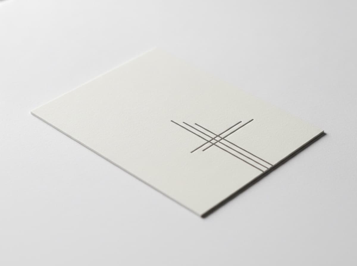
Minimalist Business Card Design: The Power of Whitespace and Less
Minimalist business cards use restraint, negative space, and typographic precision to make a powerful impression with less — fewer elements, more whitespace, a single font family, and deliberate simplicity that communicates confidence and premium positioning. This guide explains minimalist design principles for business cards, when minimalism works best, and how to achieve true minimalism rather than just an underfilled card.

Square Business Cards: Design Guide for 2.5 × 2.5 Inch Format
Square business cards (2.5 × 2.5 inches) break the visual convention of the standard rectangle — standing out in a stack of cards while presenting a distinct design canvas with equal proportions on all sides. This guide explains how to design for square business cards, what to change from a standard card layout, and who benefits most from the square format.
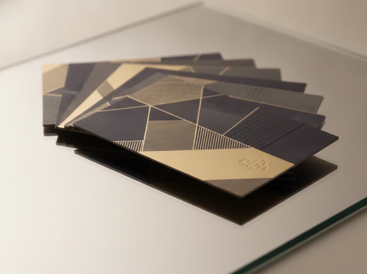
Two-Sided Business Cards: How to Design the Front and Back of Your Card
Printing both sides of your business card doubles your communication space — letting you put identity information on the front and services, credentials, portfolio imagery, or a booking QR code on the back. This guide explains what to put on the front and back of a business card, how to design each side effectively, and the common mistakes that waste valuable duplex printing space.

Typography and Font Selection Guide for Business Cards
Typography is the single most important design choice on a business card — the wrong font undermines every other design decision, while the right font communicates your brand's personality instantly. This guide explains how to choose business card fonts: serif vs. sans-serif, font pairing, readability at small sizes, font categories by brand personality, and common typography mistakes to avoid.
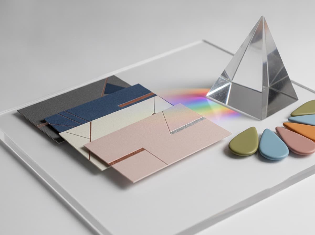
Color Psychology for Business Cards: What Your Card Colors Communicate
The colors on your business card communicate before a single word is read — triggering associations with industry, personality, trust, energy, and authority that shape how recipients perceive you before the ink is processed. This guide covers color psychology for business cards, what each color communicates, which colors work for which industries, and how to build a color palette that reinforces your brand message.
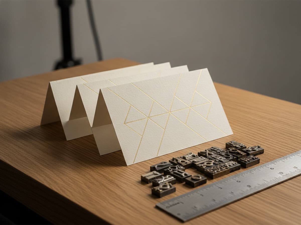
Typography and Fonts for Business Cards: A Complete Design Guide
The typeface you choose for your business card is the single most powerful design decision after layout — it sets the tone, establishes your brand personality, communicates whether you are traditional or modern, and determines whether your card is legible at the small sizes that business card printing demands. This guide covers type selection, font pairing, minimum sizes, legibility, and the typography mistakes that ruin otherwise strong card designs.
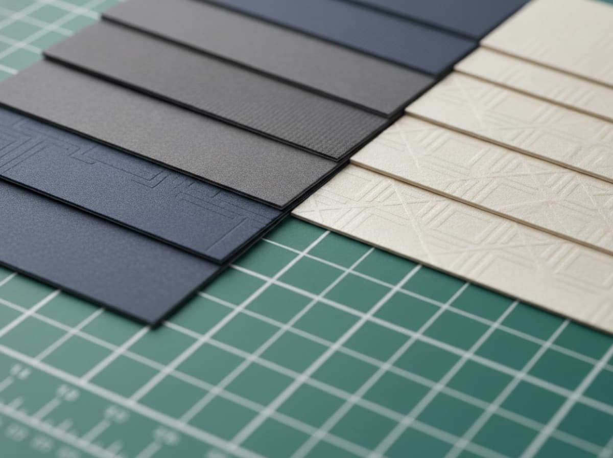
Horizontal vs. Vertical Business Cards: Which Orientation Works for Your Brand
The choice between horizontal and vertical card orientation is a design decision that affects how information flows, how the card feels in hand, and what your brand communicates before a word is read. This guide compares landscape and portrait card orientations across different professional contexts, shows you who uses vertical cards effectively, and explains what to consider when choosing orientation for your card.
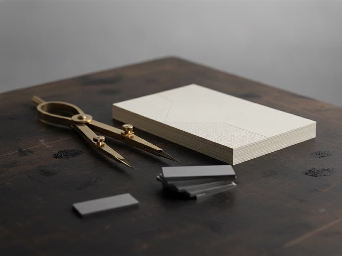
Typography Guide for Business Cards: Choosing Fonts That Work in Print
Typography is the silent voice of your business card — the font you choose communicates personality, authority, and professionalism before a single word is consciously read. This guide covers how to choose fonts for business card printing, which font characteristics work at small sizes, and the most common typographic pitfalls that cause business cards to fail at the moment of impression.
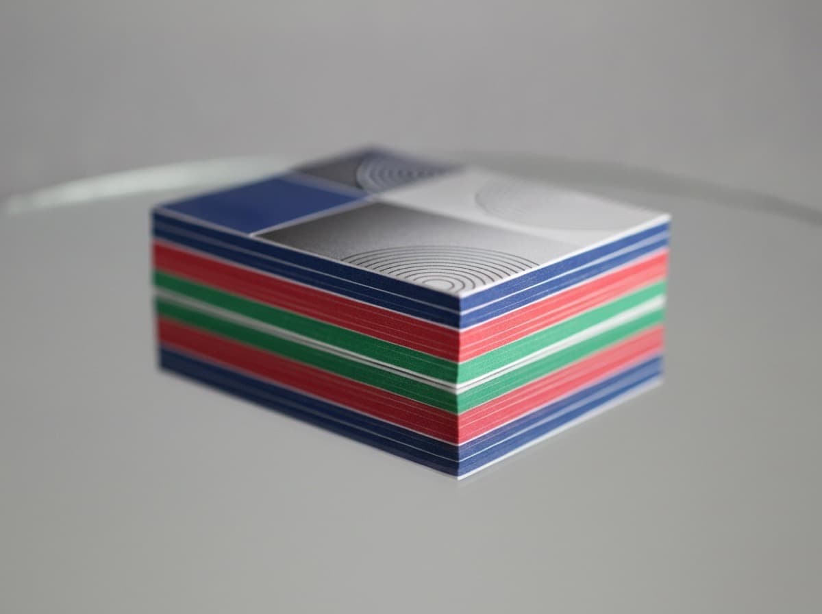
Duplex and Double-Sided Business Card Design: Using Both Sides Effectively
A double-sided business card doubles your canvas — but only if you use both sides intentionally. This guide covers the front-back information architecture that works, the design approaches that make each side purposeful, and the printing specifications you need to know before designing a card with content on both sides.

5 Sticker Design Mistakes to Avoid
Bleed, safe zones, and resolution — the small details that ruin a sticker print. Here's how to get them right the first time.

Typography Rules for Business Cards: Font Size, Hierarchy, and What to Leave Out
Most business card text problems come from squeezing in too much. Here are the type rules that make cards readable, professional, and easy to hand over.
White Space in Business Card Design: Why Less Really Is More
The instinct to fill every inch of a business card usually backfires. Here's why white space makes cards more readable, more memorable, and more premium.
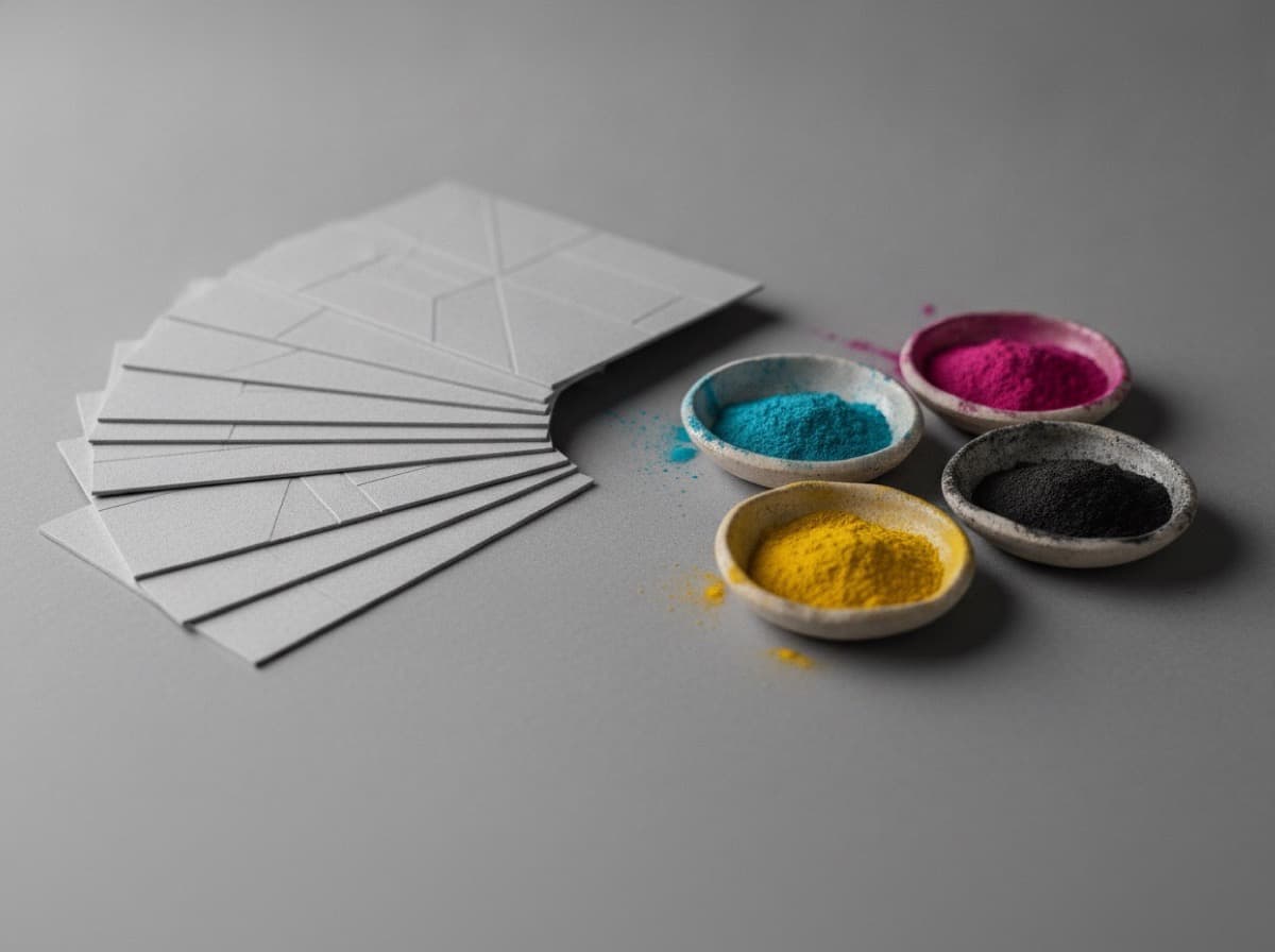
Choosing Colors for Print vs Screen: Why Your Brand Colors May Look Different on a Card
The color on your monitor is not the color on your card. Here's why RGB and CMYK are different — and how to choose colors that hold up in print.
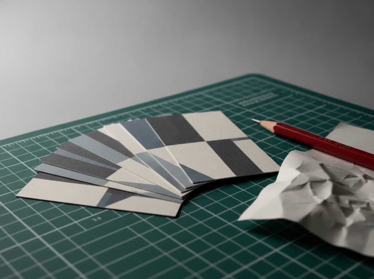
10 Business Card Design Mistakes That Undermine Your Professional Image
Great content on a poorly designed card is invisible. These are the ten most common business card design mistakes — including font size errors, clutter, low-contrast choices, missing information, and printing-unfriendly designs — with specific guidance on how to fix each one before you send your file to print.
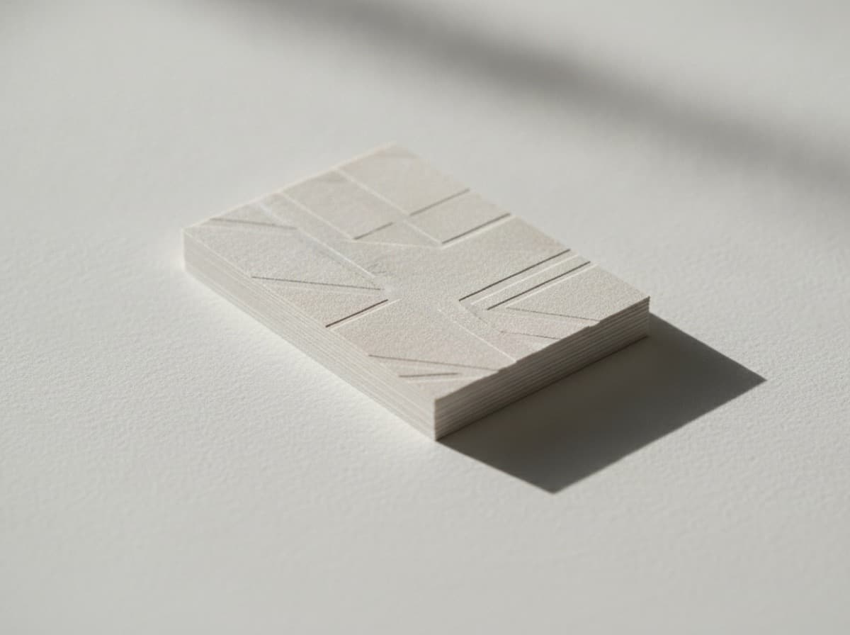
White Space in Business Card Design: Why Less Is More on a 3.5" × 2" Card
White space — the empty area around and between design elements — is one of the most powerful tools in business card design. Designers who understand negative space create cards that feel premium, professional, and focused. Designers who fear empty space create cluttered cards that communicate nothing clearly and feel unprofessional. This guide explains how to use white space strategically on a business card.

Choosing Fonts for Business Cards: A Typography Guide for Professional Cards
Typography is one of the most important design decisions on a business card — fonts communicate personality, industry, and professionalism before the reader processes a single word. This guide covers font pairing for business cards, the best professional typefaces, what your font choice communicates about your brand, and how to avoid the most common typography mistakes.
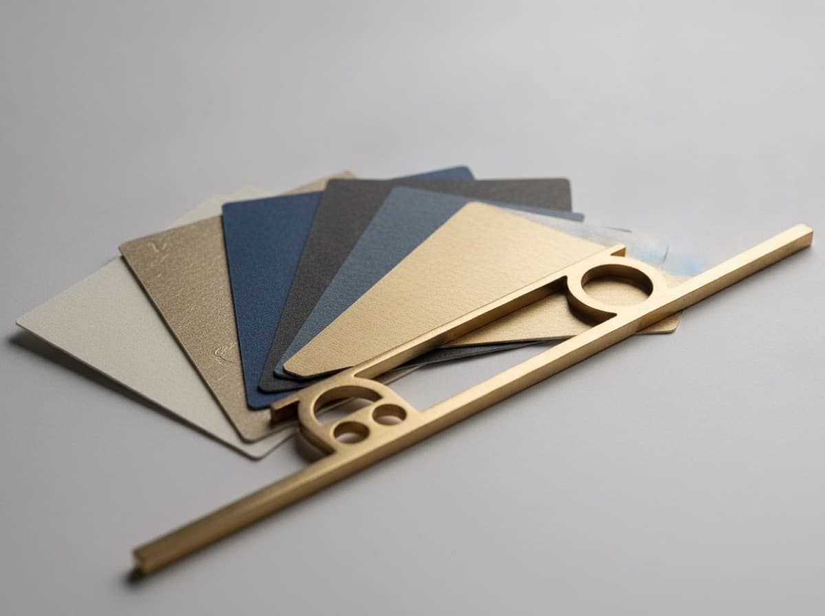
Logo Placement on Business Cards: Where to Put Your Logo for Maximum Impact
Where you place your logo on a business card dramatically affects how your brand reads — whether it commands attention, creates balance, or gets lost. This guide covers the most effective logo placement strategies, when to lead with your logo versus your name, and how to design a card where both work together to create a professional, memorable impression.
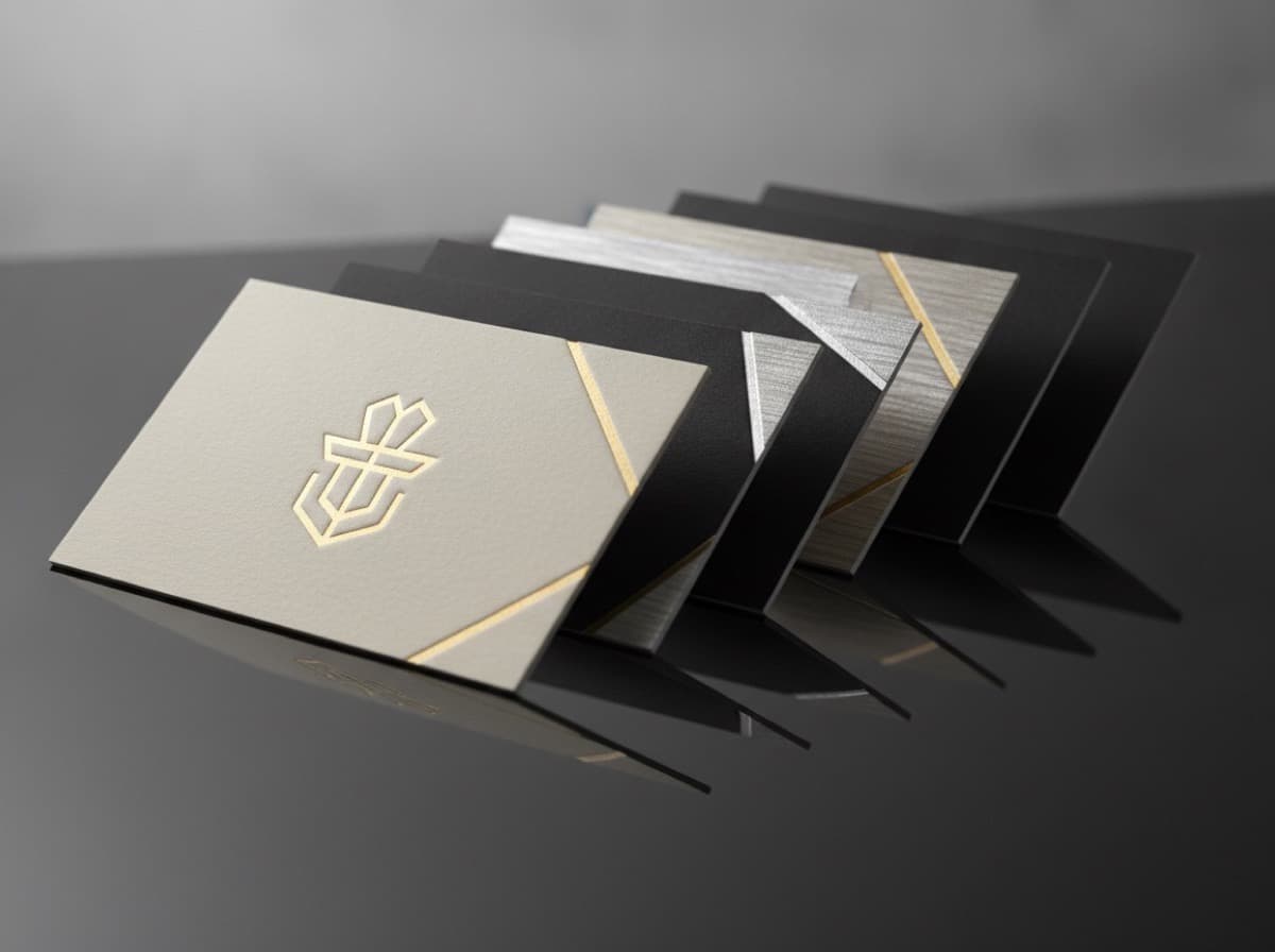
Double-Sided Business Cards: How to Use the Back of Your Card Effectively
The back of your business card is free real estate — but most people leave it blank or waste it on a logo repeat. This guide shows you how to use the back of your business card strategically to add value, extend your professional story, and give the person who receives your card a reason to turn it over and keep it.
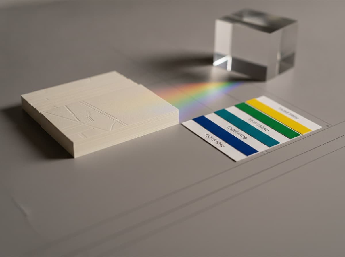
Color Psychology in Business Card Design: What Your Card Colors Say About Your Brand
The colors you choose for your business card communicate as much as the words do — evoking trust, energy, creativity, calm, or authority before the recipient reads a single word. This guide explains the psychology behind each major color choice and how to select a palette that reinforces your professional brand.
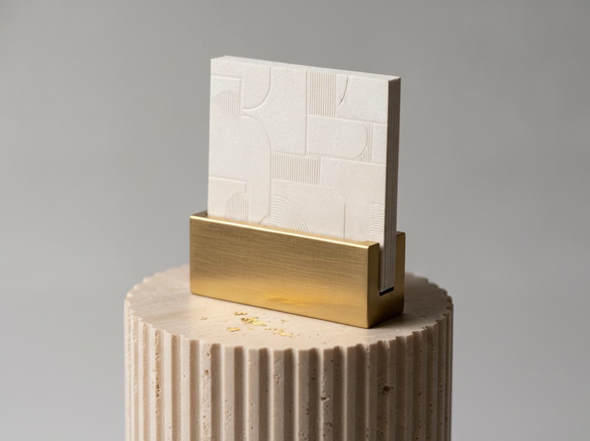
Vertical Business Cards: When to Use Portrait Orientation and How to Design One
Vertical business cards flip the standard landscape orientation to portrait, creating a distinctive format that stands out in any card stack. This guide covers when portrait orientation works, how to adapt your layout, and industries where vertical cards have the strongest impact.
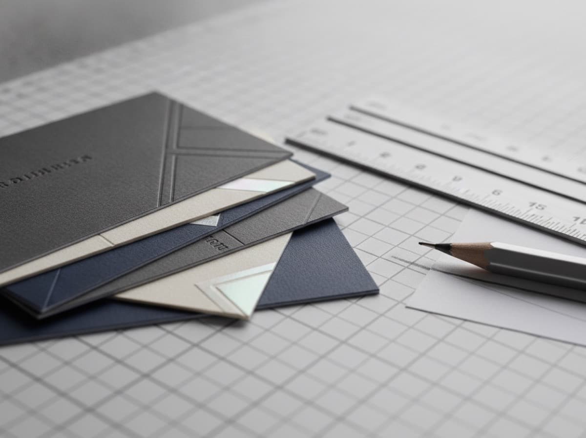
How to Design Business Cards: A Complete Guide from Concept to Print
Designing an effective business card requires balancing brand identity, essential information, readability, and print specifications. This complete guide walks through every step — card size, typography, hierarchy, color, file setup, and choosing a printer.
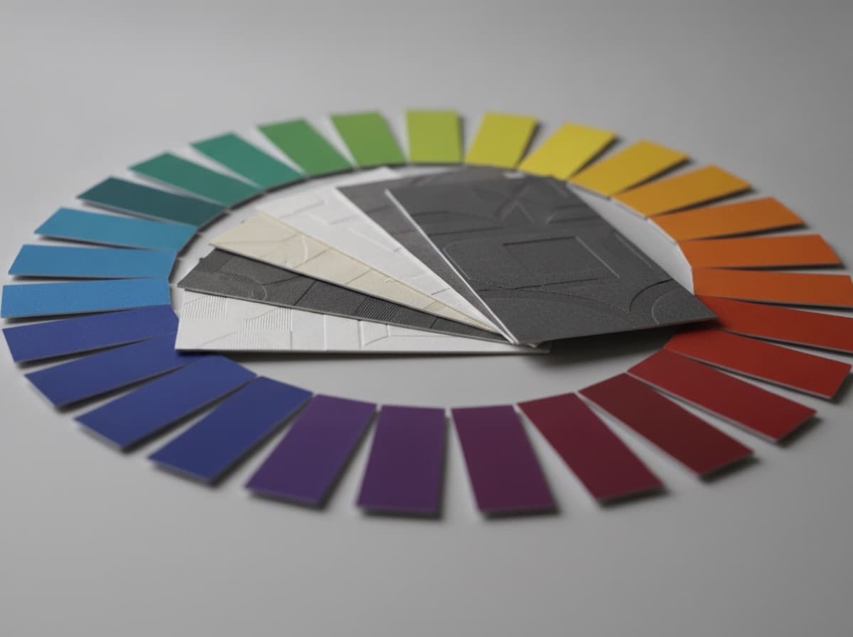
Color Psychology for Business Cards: What Your Color Choices Communicate
Color is the first element of a business card that creates emotional impact — before anyone reads a word. Understanding what specific colors communicate helps you choose a palette that supports your brand and the impression you want to make.
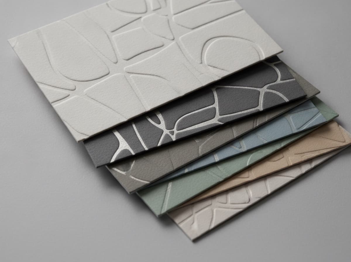
Typography for Business Cards: Choosing Fonts, Sizes, and Hierarchy
Typography is the backbone of business card design — the fonts you choose, how you size them, and how you arrange them in a hierarchy determines whether information is immediately readable or requires squinting to decode. This guide covers typography fundamentals for business card design.
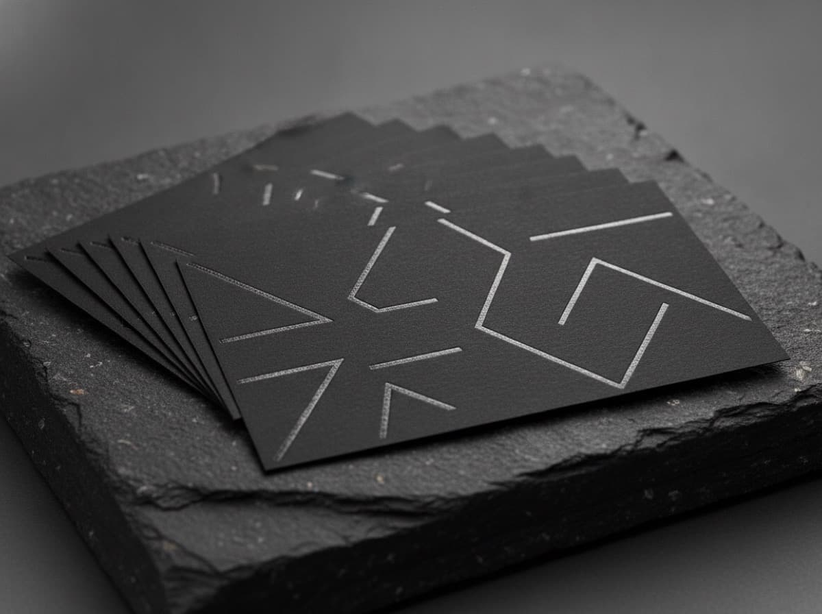
Dark Background Business Cards: Design Rules for Black and Deep Color Cards
Dark background cards make a bold first impression — but they require different design rules than light-background cards. Here's how to design a dark card that actually works in print.
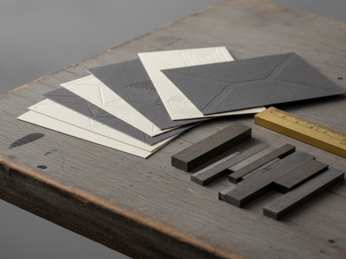
Typography Guide for Business Cards: Choosing and Using Fonts Effectively
Font choices communicate as much as the words they spell. This guide explains how to choose and combine fonts for business cards that look professional and intentional.
Business Card Color Psychology: How to Choose Colors That Win Clients
Color is the first thing your brain processes on a business card — before the name, before the logo. Here's a research-backed guide to choosing card colors that communicate the right message.
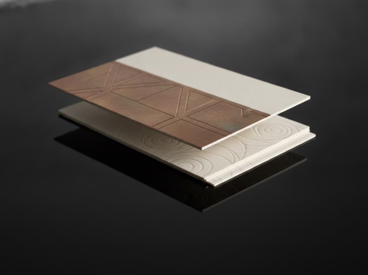
Double-Sided Business Card Design: How to Use the Back of Your Card
The back of your business card is prime real estate. Most people leave it blank or use a generic logo. Here's how to use that space to genuinely improve your conversion.
Business Card Bleed, Margins, and Safe Zones: The Complete Setup Guide
Nothing is more frustrating than receiving business cards with text cut off or white borders that should be colored. This guide explains bleed, safe zones, and how to set up your file correctly.
How to Use Your Business Cards to Build Your Instagram Following
Your business card and Instagram work better together than either does alone. Learn how to connect them — and what to post when sharing cards on social media.

25 Creative Business Card Ideas That Get Kept (Not Tossed)
Most business cards go in the trash within a week. These 25 design ideas — backed by what actually makes cards memorable — will make yours the one that stays.
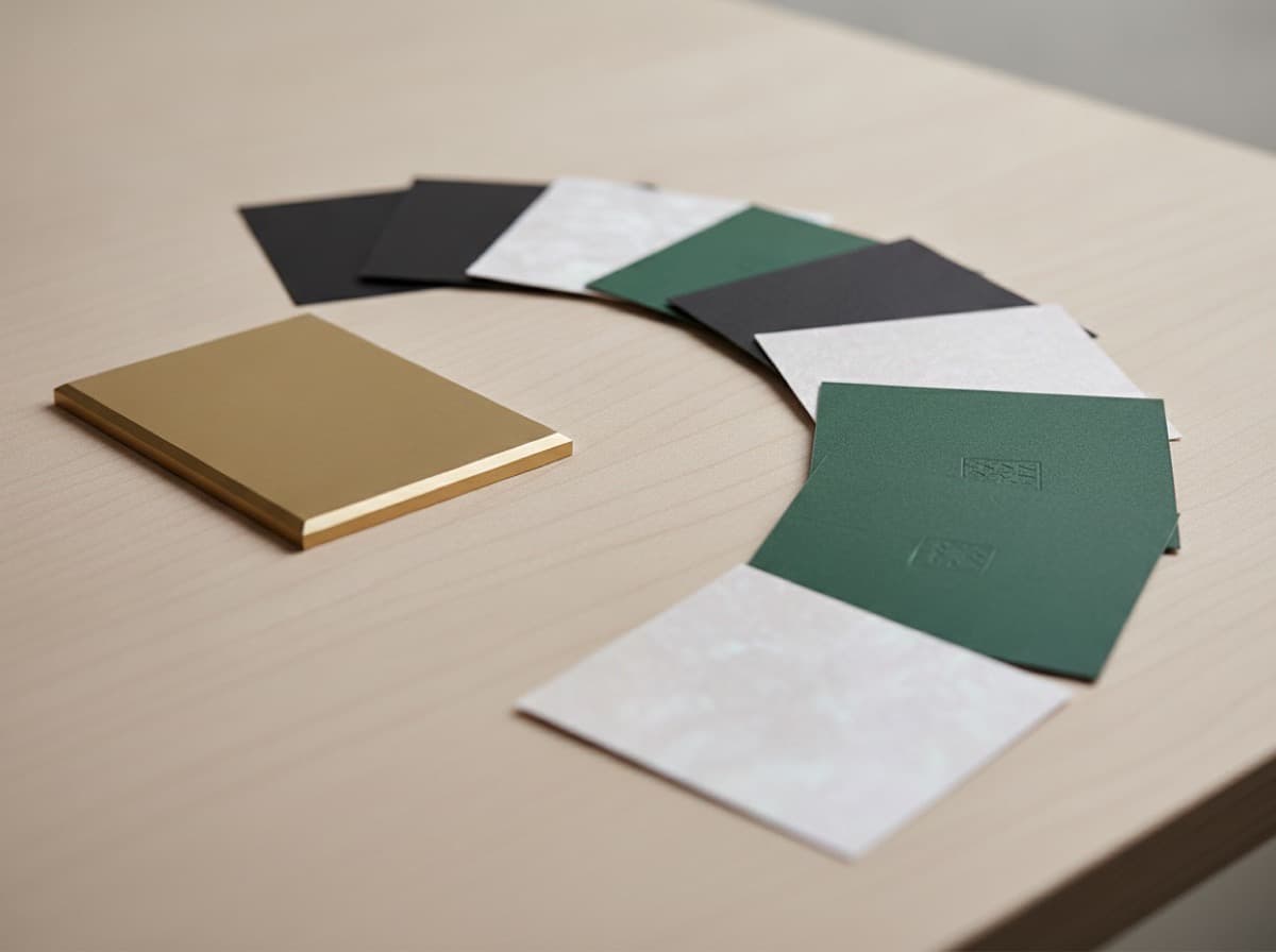
Business Card Dimensions: Standard Sizes in the US and Beyond
The standard business card size in the US is 3.5 x 2 inches (89 x 51 mm), and that single dimension quietly governs almost every design and print decision you make. Get it right and your card slides…
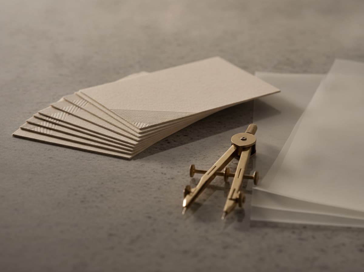
How to Design a Business Card That Stands Out
Knowing how to design a business card means understanding that you have roughly two seconds to transfer the most important information about your professional identity — name, role, and how to reach…
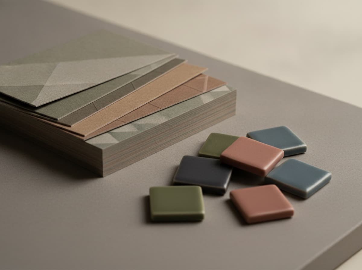
Business Card Color Psychology and Palettes
Business card colors work on two levels simultaneously: they communicate brand identity and they trigger psychological associations that influence how the recipient perceives you before they read a…
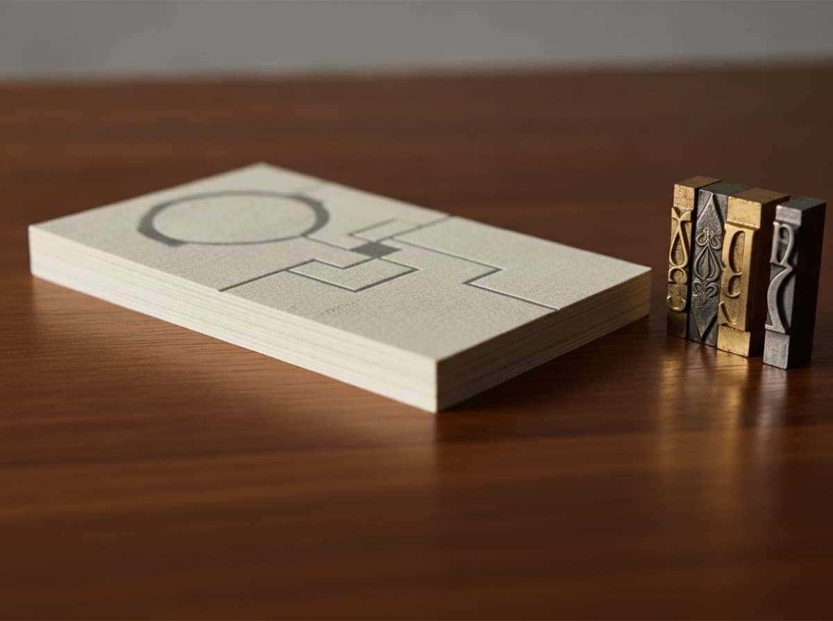
Best Fonts for Business Cards: Readability Meets Brand
The best fonts for business cards are legible at small sizes, carry the right tone for your industry, and work with a minimum of visual complexity. Because a card is read at arm's length, sometimes…
QR Codes on Business Cards: Do's and Don'ts
A QR code on a business card can do something a printed phone number or URL cannot: take someone from a physical card directly to a digital action — your contact file, your portfolio, your LinkedIn…
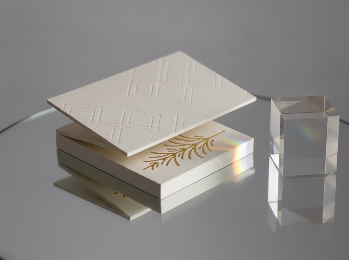
Double-Sided Business Cards: How to Use the Back
Double-sided business cards give you two faces to work with — a front that carries your identity and a back that can do almost anything else: provide context, add a QR code, carry a portfolio…
Common Business Card Mistakes to Avoid
Business card mistakes are especially costly because they're usually discovered after the cards arrive — and reprinting means paying twice. Most errors fall into a small number of categories: too…