Business Card Color Psychology: How to Choose Colors That Win Clients
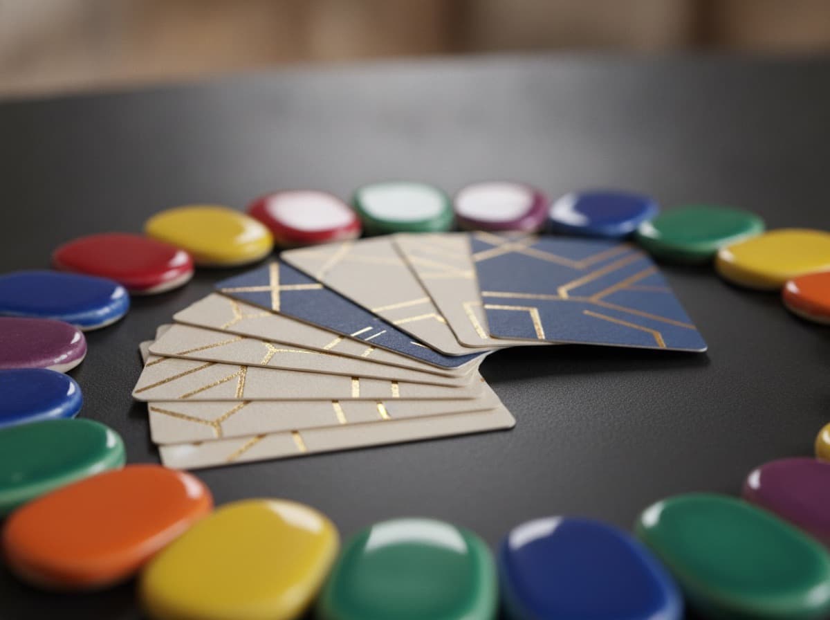
Color is processed in the limbic system — the emotional brain — before it reaches the analytical cortex. By the time someone consciously reads your name on your card, their brain has already formed an emotional response based on color.
Understanding color psychology helps you choose colors that reinforce your professional message rather than undercut it.
How Color Affects Perception
Research in color psychology (Faber Birren, Robert Plutchik, Joe Hallock's color association studies) consistently shows that colors carry cultural meaning — and that those meanings affect trust, purchasing decisions, and professional credibility.
Important caveat: Color meaning is culturally specific. The associations below are based on North American and Western European business contexts. International professionals serving different cultural markets should research color meaning in target markets.
The Professional Colors and What They Communicate
Blue — Trust, Stability, Authority
Shades: Navy, royal blue, sky blue, slate, cerulean
Psychological associations: Trustworthiness, stability, professionalism, authority, calm, intelligence
Used by: Finance (banks, insurance, investment), healthcare, technology (IBM's "Big Blue" is not an accident), law enforcement, government, corporate services
Best for: Any profession where trust is the primary purchase driver: financial advisors, attorneys, accountants, doctors, mortgage brokers, insurance agents, IT consultants
Caution: Can read as cold or emotionally distant in warmer professions (therapy, childcare). Lighter blues are warmer; dark navy is more authoritative.
Green — Growth, Health, Nature
Shades: Forest green, sage, mint, emerald, olive
Psychological associations: Health, growth, prosperity, environmental responsibility, balance, freshness, renewal
Used by: Healthcare and wellness, financial services ("money green"), environmentally focused brands, food and agriculture, landscaping, yoga/holistic wellness
Best for: Nutritionists, dietitians, wellness coaches, landscapers, eco-conscious businesses, financial advisors who want a "prosperity" feel, healthcare
Caution: Bright greens can feel too casual. Dark greens can be conservative. Sage greens are trending as a sophisticated wellness neutral.
Black — Luxury, Sophistication, Authority
Shades: Pure black, charcoal, graphite, near-black
Psychological associations: Luxury, sophistication, formality, authority, mystery, power, exclusivity
Used by: Luxury goods and services, fashion houses, premium financial services, tech (Apple's design aesthetic), photography, creative professionals
Best for: Luxury market positioning in any industry, premium pricing, sophisticated professional services (law firms, architects), creative professionals
Caution: Pure black can feel cold and intimidating. Charcoal or warm near-black is more approachable while still sophisticated. Avoid for businesses requiring warm first impressions (pediatrics, therapy, community services).
White — Purity, Cleanliness, Minimalism
Shades: Pure white, off-white, warm cream, ivory
Psychological associations: Cleanliness, purity, simplicity, minimalism, possibility, clarity, freshness
Used by: Medical and healthcare (cleanliness), beauty and cosmetics, premium minimalist brands, technology (clean interface aesthetic), spiritual and wellness practices
Best for: Cleaning services (literal cleanliness), medical/dental professionals, spa and beauty, premium minimalist brands, tech companies
Caution: White cards show dirt and handling. White cards with dark ink are highly readable but can appear generic if not designed carefully.
Red — Energy, Urgency, Passion
Shades: Crimson, scarlet, deep red, cherry, brick red
Psychological associations: Energy, passion, urgency, importance, excitement, danger, strength
Used by: Food industry (increases appetite), retail (sales and urgency), sports, emergency services, entertainment
Best for: Food businesses, gym and fitness, entertainment, urgent services (emergency plumber, locksmith), political campaigns
Caution: Red carries urgency and alarm associations that are counterproductive in trust-dependent professions (financial services, healthcare, law). Deep burgundy or wine red reads as sophisticated rather than urgent.
Orange — Enthusiasm, Creativity, Accessibility
Shades: Bright orange, burnt orange, tangerine, coral, amber
Psychological associations: Enthusiasm, creativity, accessibility, warmth, fun, innovation, value (retail orange = sale)
Used by: Creative agencies, contractors (high-vis orange has trade associations), food and beverage, children's products, real estate, retail
Best for: Creative professionals, trades and contractors, welcoming service businesses, fitness
Caution: Can signal lower price point or entry-level in luxury markets. Coral and terracotta are more sophisticated variants.
Yellow — Optimism, Energy, Caution
Shades: Golden yellow, soft yellow, mustard, amber
Psychological associations: Optimism, happiness, energy, warning/caution, intelligence, warmth
Used by: Taxis and transport, food (eggs, butter, cheese), children's products, legal (yellow pages), construction equipment
Best for: Children's services, food, cheerful/positive brands, construction
Caution: Yellow is the hardest color to read when printed (especially light yellow on white). Use as an accent on dark backgrounds or pair with dark type. Pure yellow on card backgrounds often looks cheap.
Purple — Creativity, Luxury, Wisdom
Shades: Deep purple, lavender, violet, plum, mauve
Psychological associations: Creativity, royalty, wisdom, spirituality, mystery, luxury, imagination
Used by: Beauty and cosmetics, creative agencies, wellness and spiritual practices, premium brands, children's entertainment
Best for: Creative professionals, wellness practitioners, luxury beauty, educational enrichment, spiritual or holistic practices
Caution: Can appear less serious in heavily analytical or corporate B2B contexts. Deep plum or eggplant are more sophisticated than bright purple.
Brown / Earth Tones — Stability, Naturalness, Reliability
Shades: Chocolate brown, tan, beige, kraft, terracotta, mocha
Psychological associations: Reliability, earthiness, natural, organic, stability, warmth, craftsmanship
Used by: Agricultural and farm businesses, craft food and beverages, natural and organic brands, construction, furniture and woodworking
Best for: Landscapers, organic food businesses, artisans, craftspeople, farm-to-table, coffee shops, outdoor brands
Caution: Can read as generic or low-energy in service industries without a natural or craft connection.
Color Combination Strategies
Analogous Colors
Colors adjacent on the color wheel (blue + blue-green, orange + yellow). Create harmonious, calm designs. Often used for wellness and healthcare.
Complementary Colors
Colors opposite on the color wheel (navy + gold, blue + orange). Create maximum visual contrast. Effective for making important elements pop.
Neutral + Accent
A neutral base (white, charcoal, cream, black) with one or two accent colors. The most flexible approach. Allows the accent to do all the communication work.
Monochromatic
Single color in multiple shades and tints. Sophisticated, cohesive, often upscale. Used by luxury brands frequently.
Practical Color Selection Process
- List your professional values: Trust, energy, precision, warmth, luxury, accessibility — pick 2-3.
- Map to primary color: Which color carries those associations?
- Choose secondary accent: Complementary or analogous to primary.
- Test on real paper: Order a sample print. Colors render differently on different paper stocks and finishes. Verify before committing to a full print run.
- Check legibility: Dark text on light background or light text on dark background. Test in poor lighting (wallet, bottom of purse, fluorescent office).
Checklist
- [ ] Primary color communicates your 2-3 most important professional values
- [ ] Color combination is intentional (complementary, analogous, or neutral + accent)
- [ ] Color tested on actual card stock before full print run
- [ ] Text is legible in low-light conditions
- [ ] Colors are consistent with your existing brand (website, logo, materials)
- [ ] Cultural color associations appropriate for your target market
Get 10% off your first order
Join our list for practical printing guides, new finish ideas, and a welcome coupon for your first order.
No spam. Unsubscribe anytime.
Ready to bring this design to life?
Order Premium CardsNot sure which option fits? Ask Pro Card Crafters