10 Business Card Design Mistakes That Undermine Your Professional Image
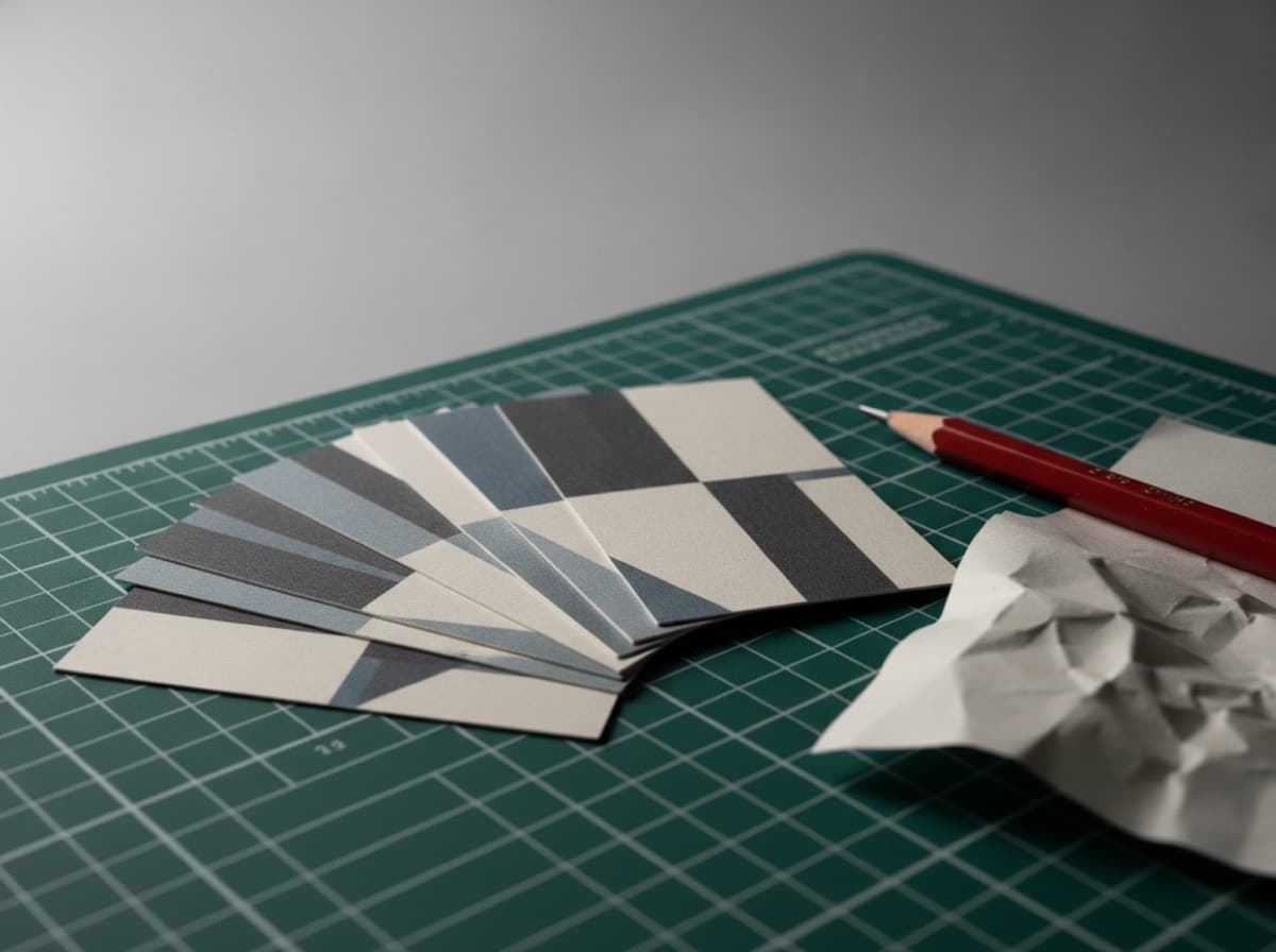
A business card is the first tangible representation of your professional brand — and a poorly designed one can undermine everything else you've done to build credibility. These are the design mistakes most commonly made on business cards, and how to fix each one before you send your file to print.
Mistake 1: Font Too Small to Read
The most common mistake: cramming so much information onto the card that the font shrinks below readability.
The problem: Text below 7pt is unreadable to most people. Text at 6pt requires a magnifying glass in dim light. If someone has to strain to read your name, your card has failed its most basic purpose.
The fix:
- Name: 14–18pt minimum
- Title: 10–12pt
- Contact details: 8–10pt
- No text below 7pt
What to cut: If you can't fit all your information at readable sizes, cut information rather than size. Ask yourself: "What's the single most important action I want the recipient to take?" Design for that action.
Mistake 2: Too Much Information
The second-most-common mistake: trying to put everything on the card — every service, every product, every certification, every social handle, every phone number, every award.
The problem: Cards that communicate everything communicate nothing. The eye doesn't know where to go, so it goes nowhere.
The fix:
- Name: One entry
- Title: One entry (your most important role)
- Phone: Maximum 2 (one mobile, one office — only if both are meaningful)
- Email: One
- Website: One (the URL where they can learn more)
- Social: Maximum 2 (your most active professional channels)
- Services: None or maximum 3 (and only if they're not obvious from the title)
The back of the card is the right place for additional information.
Mistake 3: Low Contrast — Dark Color on Dark Background
A design looks great on screen at 100% zoom. It prints dark blue on black and becomes illegible.
The problem: Screen display compensates for low contrast in ways that print does not. What reads at 85% contrast on your monitor may print at 40% contrast on the actual card.
The fix:
- White or light text on dark backgrounds
- Dark text on white or light backgrounds
- Avoid: gray text on white, dark blue on black, light gray on cream
- Test: if you can't read it as a 1-inch-tall JPEG at 72dpi, it won't print readable
Minimum contrast ratio: WCAG AA standard (4.5:1) is a good baseline for card typography.
Mistake 4: Not Including Bleed in the Design File
You've designed a card that looks perfect in Photoshop or Canva. It prints with a thin white border around the edge where the cutter didn't hit the design exactly.
The problem: Printing and cutting have slight variations (typically ±1/16"). Without bleed — additional image area beyond the cut line — background colors and edge designs get a thin white border.
The fix:
- Add 0.125" (1/8") bleed on all four sides
- Background colors must extend to the bleed edge
- Critical content (text, logos) must stay 0.125" inside the cut line (the "safe zone")
- Your final file with bleed: 3.625" × 2.125" (standard US business card 3.5" × 2")
- Most card design templates already include bleed guides — use them
Mistake 5: Using Rasterized Logos (Low Resolution)
Your card arrives with a blurry logo that looks pixelated or foggy.
The problem: Logos placed in card files must be high resolution (300 DPI minimum at print size) or vector format. Screen logos at 72 DPI scale down from 200% will look foggy.
The fix:
- Use vector format for logos: .AI, .EPS, or .SVG (infinitely scalable, never blurry)
- If raster only: ensure the logo is 300 DPI at the actual print size
- If you don't have the vector file, ask your designer or request re-export from design software
- In Canva: use "Download > PDF (Print)" which preserves vector quality
Mistake 6: Cluttered Back — No Visual Hierarchy
The back of the card gets loaded with a dense block of text with no visual breathing room.
The problem: Visual hierarchy guides the eye from the most important element to the least. Without it, everything competes equally — and the result feels crowded and amateurish.
The fix:
- Define one primary element on each side
- Use size, weight, and white space to create hierarchy
- Front: your name is the visual anchor
- Back: a key message, service list, OR certification summary — not all three
- White space is a design element, not wasted space
Mistake 7: Too Many Fonts
The card uses three typefaces in five weights at varying sizes.
The problem: Each font has its own visual personality. Mixing more than two creates visual noise and reads as inconsistent or unprofessional.
The fix:
- One font family (with different weights: bold name, regular contact details)
- Or: One serif + one sans-serif, clearly differentiated by use (name vs. details)
- Never: decorative display font + another decorative font
- Check that your chosen font is available in print-quality format (not just Google Fonts web format)
Mistake 8: Using RGB Colors Instead of CMYK
Your card design used vibrant screen blues and neon colors. The printed card comes back muted and dull.
The problem: Screens display in RGB (red, green, blue light) — which can produce colors that CMYK printing inks cannot replicate. Neon greens, electric blues, and vivid oranges from screen design often print muddy or darker.
The fix:
- Design in CMYK from the start (Illustrator and InDesign have CMYK mode)
- If converting from RGB: preview the CMYK conversion before finalizing
- Know the limits: CMYK can't reproduce all RGB colors; those colors will shift
- For exact color matching: use Pantone (PMS) colors if your print vendor offers spot color printing
- Note: ProCardCrafters digital offset printing closely matches CMYK specifications; design in CMYK for best results
Mistake 9: Overcomplicating the QR Code
A QR code that's too small, placed over a busy background, or printed at low contrast fails to scan.
The problem: QR codes need quiet zone (white border around the pattern), minimum size (at least 0.8" × 0.8"), and sufficient contrast to scan reliably.
The fix:
- QR code minimum size: 1" × 1" on a business card
- Always on a white or solid light background (not over photography or gradients)
- Maintain the quiet zone (white border around the code)
- Test with multiple scanner apps before printing
- Shorten the URL first (shorter URL = simpler QR code = more reliable scan)
- Never put UV spot coating, foil, or other special finishes directly over a QR code
Mistake 10: No Proof Before Printing a Large Run
You order 1,000 cards, and when they arrive you notice a typo in your email address or phone number.
The problem: Digital proofs look different from physical print. Typos that were invisible in the digital file become glaring in print. And 1,000 cards with a wrong phone number are 1,000 unusable cards.
The fix:
- Always order a physical proof for new designs before the full run (ProCardCrafters offers proofs before full production)
- Have someone else read the proof — fresh eyes catch what you miss
- Check specifically: phone numbers (transposed digits), email addresses, website URLs, social handles
- Verify that the proof matches your expected colors
- For recurring use, start with 250 and increase quantity after confirming the design in hand
Get 10% off your first order
Join our list for practical printing guides, new finish ideas, and a welcome coupon for your first order.
No spam. Unsubscribe anytime.
Ready to bring this design to life?
Order Premium CardsNot sure which option fits? Ask Pro Card Crafters