Double-Sided Business Cards: How to Use the Back of Your Card Effectively
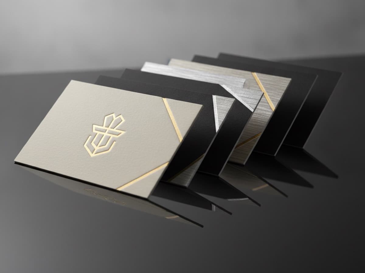
The back of a business card is some of the most underused marketing real estate in professional networking. Most cards are blank on the back, which is a missed opportunity — because people receive many cards and the back is one more surface to make yours memorable, useful, or valuable enough to keep.
This guide covers what to put on the back, what to avoid, and how to structure a double-sided card that extends your professional story.
Why Use the Back of Your Card?
You have more to say than fits on the front. The front of a standard business card — 3.5" × 2" — has room for your name, title, company, and three to four contact details. That's sufficient for a minimal card. But if you have a list of services, a portfolio link that warrants a QR code, a credential list, or a visual that will make someone remember you, the back gives you space.
The back gets noticed. When someone turns your card over to see if there's anything on the back, you have their attention for an extra moment. A well-designed back extends that attention window and makes your card more likely to be kept rather than discarded.
The cost premium is small. Most online printers charge only a small additional fee for a printed back — often $5-15 for a standard order. The cost-per-impression ratio on back printing is excellent.
What to Put on the Back
1. QR Code + Call to Action
The single most versatile use of the back of a business card. Link to:
- Your portfolio, reel, or gallery
- Your LinkedIn profile
- Your booking / scheduling page (Calendly, Acuity)
- Your online shop or menu
- A video introduction or product demo
- A specific landing page with a special offer
Best practice: Include a short label above the QR code — "See my portfolio ↓" or "Book a consultation ↓" or "View our menu ↓" — so the recipient knows what they'll find.
2. Service or Product List
If you offer multiple services and couldn't fit them all on the front, the back is the place. A clean bulleted or icon-based list:
- For accountants: "Business tax | Personal tax | Bookkeeping | Payroll | QuickBooks"
- For home service contractors: "Repair | Installation | Inspection | Emergency service"
- For designers: "Branding | Web design | Print | Illustration | Motion"
- For attorneys: "Estate planning | Business formation | Real estate | Litigation"
3. Appointment or Reminder Area
Particularly useful for healthcare providers, salons, spas, tutors, coaches, and anyone who books recurring appointments:
- "Your next appointment: Date __________ Time __________"
- A small calendar grid showing available appointment slots
- "Schedule online: [QR code]"
4. Brand Story or Differentiator
A short, focused statement that answers the question: "Why choose you?"
- "We've installed solar for [X] households in [county] since [year]"
- "Every financial plan we build follows the same principle: your goals first, our compensation last"
- "We don't just move freight — we manage supply chain risk"
Keep this to 2-3 sentences maximum. It should be a positioning statement, not a biography.
5. Credential or Award List
For professionals where credentials drive trust decisions — physicians, attorneys, CPAs, financial advisors, engineers — the back can display the full credential list that would clutter the front:
- All board certifications and license numbers
- Professional memberships
- Awards or recognitions ("Chambers USA ranked | AV Preeminent rated | Forbes Top 50")
- Publications or speaking credentials
6. Map or Location
For businesses with a specific physical location — restaurants, retail shops, clinics, law offices — a map graphic showing your location can be more useful than an address. Pair it with a QR link to Google Maps directions.
7. Social Media Profile Links / Handles
If you're active on specific platforms where clients engage with you, the back is a less cluttered place for:
- Instagram handle + QR
- LinkedIn profile QR
- YouTube channel
- TikTok (for consumer-facing businesses)
8. Strong Visual / Brand Image
For visual and creative professionals — photographers, architects, designers, artists, chefs — the back of the card can simply be a powerful image of your work. No text needed. The image speaks for the card.
What NOT to Put on the Back
A repeat of your logo. Unless the logo has specific brand recognition, a logo on the back adds no value. The front already has it.
Too much text. The back should be cleaner than the front, not more cluttered. If your card needs paragraphs of explanation, you need a different marketing tool.
Outdated information. Phone numbers, email addresses, and website URLs change. Anything on the back is printed permanently — use QR codes instead of URLs when possible, because you can update where the QR points.
Fine print. Legal disclaimers, terms, licensing conditions — these belong on your website, not your business card.
Double-Sided Design Tips
Match the design language. The front and back should look like they belong together — same fonts, same color palette, same general aesthetic.
Use contrast between the two sides. One effective approach: minimal, clean information on the front; bold visual or rich service detail on the back. The contrast creates visual interest.
Give the back a purpose, not just filler. Design the back to accomplish a specific goal: drive a scan, get an appointment, communicate a differentiator, or showcase your work. Purposeless design on the back is worse than blank.
Consider bleeding the back. A full-bleed background color or image on the back can make the card feel premium and cohesive, especially when paired with a clean front.
Print Specifications for Double-Sided Cards
- Both sides require bleed: 0.125" (1/8") bleed on all four sides for both front and back
- CMYK required: Both sides must be in CMYK color mode, not RGB
- Resolution: All images on both sides must be 300 DPI
- Orientation: Make sure front and back are oriented correctly relative to each other — both horizontal, or one vertical and one horizontal by design
- Most printers: Upload two separate files (front and back) in the order form; some request them as a combined PDF with front and back as separate pages
A well-designed double-sided card turns a one-sided credential into a two-sided marketing piece. The front introduces you; the back gives someone a reason to engage.
Get 10% off your first order
Join our list for practical printing guides, new finish ideas, and a welcome coupon for your first order.
No spam. Unsubscribe anytime.
Ready to bring this design to life?
Order Premium CardsNot sure which option fits? Ask Pro Card Crafters