Choosing Colors for Print vs Screen: Why Your Brand Colors May Look Different on a Card
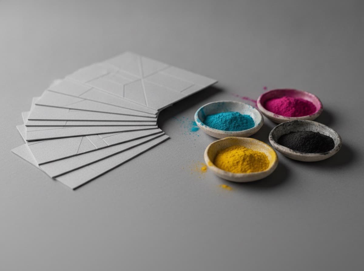
One of the most common surprises in business card printing is receiving cards where the brand colors look different from the files you submitted. The culprit is almost always the RGB-to-CMYK conversion.
Why screens and printers use different color systems
RGB (Red, Green, Blue) is additive color — screens create colors by mixing light. The full combination of red, green, and blue produces white. Your monitor, phone, and TV all work in RGB.
CMYK (Cyan, Magenta, Yellow, Black) is subtractive color — printers create colors by layering ink onto paper. The full combination of all four inks produces something close to black. Printing presses, inkjet printers, and offset presses all work in CMYK.
RGB can display colors that CMYK simply cannot reproduce — particularly vivid electric blues and bright greens. When an RGB file gets converted to CMYK for printing, those out-of-gamut colors shift to their closest printable equivalent. Sometimes that's fine. Sometimes it's jarring.
How to check your brand colors before printing
- Find the CMYK values for your brand colors. Your brand guide should list them. If it doesn't, convert your hex or RGB values in Adobe Illustrator or Photoshop and note the CMYK output.
- Check the on-screen preview in CMYK mode. In Illustrator or Photoshop, go to View → Proof Colors (or press Ctrl+Y / Cmd+Y). This simulates how your colors will look after conversion.
- Order a physical proof. The digital proof never shows exactly what the printed card looks like. A physical proof is the only reliable check.
Colors that shift most in CMYK
- Bright neon greens and limes — dull significantly
- Electric blues and cobalts — shift toward a more muted tone
- Vivid purples — can shift toward pink or navy depending on the mix
- Bright oranges — usually hold reasonably well
- Dark navies and blacks — can print slightly differently depending on the ink mix (rich black vs. standard black)
Tips for consistent color
- Design in CMYK from the start. If you're creating artwork for print, set your document color mode to CMYK in your design software.
- Specify Pantone / PMS values. If brand color accuracy is critical, request Pantone spot color printing. It's more expensive but eliminates conversion drift.
- Avoid 100% K (black) for large areas. A richer black (usually C:60 M:40 Y:40 K:100) prints better for backgrounds and text blocks.
- Always request a proof for new designs. One proof run is far cheaper than a full reprint.
Get 10% off your first order
Join our list for practical printing guides, new finish ideas, and a welcome coupon for your first order.
No spam. Unsubscribe anytime.
Ready to bring this design to life?
Order Premium CardsNot sure which option fits? Ask Pro Card Crafters