Color Psychology for Business Cards: What Your Card Colors Communicate
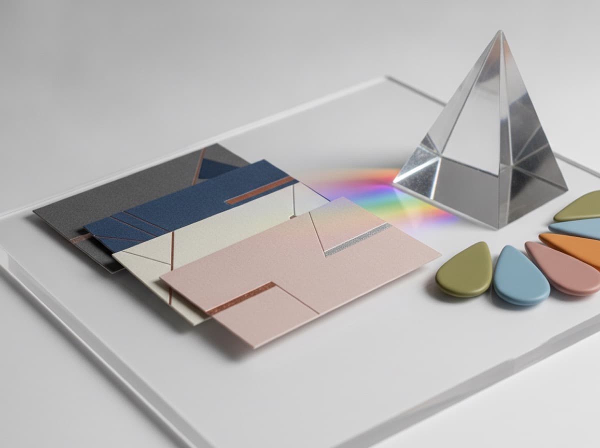
Color is the most immediate communicator on your business card. Before a recipient reads your name or processes your title, their eye registers your card's color palette and their brain fires associations — trust, authority, creativity, calm, energy, luxury, nature, technology, health — within milliseconds. Choosing card colors with intention means those milliseconds work for you, not against you.
Why Color Psychology Matters for Business Cards
Business cards are small, fast communication artifacts. They have approximately 3 seconds to register with a recipient before being pocketed or set aside. In those 3 seconds, the color palette communicates:
- Industry context — does this look like a tech company, a law firm, a creative studio, a medical practice?
- Personality — traditional or modern, bold or restrained, warm or cool?
- Trust signal — does the palette feel professional and credible?
- Energy level — calm and steady, or dynamic and high-energy?
Primary Colors and Their Card Associations
Navy Blue and Dark Blue
What it communicates: Trust, authority, stability, expertise, professionalism, dependability
Industry fit:
- Perfect for: Law firms, financial services, banking, insurance, healthcare, government, military contractors, technology companies, engineering firms, consulting
- Common in: Every traditional professional sector where trust is the primary selling proposition
Why it works: Blue is the world's most universally trusted color across cultures. Navy specifically signals depth and authority — the color of uniforms, government institutions, and corporate dress code.
Variations:
- Navy (very dark blue) — most authoritative, formal
- Royal blue — energetic, slightly more modern
- Cobalt blue — bold and confident
- Sky blue — friendly, healthcare, approachable
Black and Charcoal
What it communicates: Luxury, sophistication, power, formality, exclusivity, precision
Industry fit:
- Perfect for: Luxury goods, premium services, high-end law and finance, fashion, upscale real estate, design agencies, architecture, premium hospitality
- Careful with: Small businesses or service providers where approachability matters more than premium positioning
Why it works: Black has no competition with other colors — it draws full visual attention and signals that you are serious, premium, and confident enough to say nothing else.
Variations:
- Pure black — most dramatic, maximum contrast
- Charcoal (dark gray) — sophisticated without the severity of pure black; more approachable
- Matte black + spot gloss — card finishes that take black to a premium level
White and Cream
What it communicates: Clarity, simplicity, minimalism, cleanliness, space
Usage: White is almost always a background color rather than a primary card color, but some cards use white as the dominant visual element with minimal other color.
Industry fit: Healthcare (clinical cleanliness), design and architecture (negative space and minimalism), luxury minimalism, tech
Green
What it communicates: Growth, nature, sustainability, health, money, balance
Variations carry very different associations:
- Dark forest green — wealth, money, prestige, classic establishment
- Emerald green — luxury and gem quality, premium positioning
- Sage green / muted green — wellness, nature, holistic health, botanical
- Bright green / lime — energy, technology, sustainability startups, environmental
- Hunter green — outdoor, sporting, traditional
Industry fit:
- Dark green: finance, wealth management, high-end real estate, law
- Sage/muted green: wellness, spas, massage therapy, naturopathic medicine, nutrition
- Bright green: environmental companies, sustainability brands, natural food
Red
What it communicates: Energy, passion, urgency, boldness, confidence, action
Industry fit:
- Works well for: Restaurants, marketing and advertising agencies, retail, entertainment, real estate (especially "sold" energy), bold personal brands
- Risky for: Healthcare (anxiety), financial services (danger signal), law (aggression without authority)
Why it's powerful: Red commands attention — it is the highest-energy color and creates urgency and notice. A red card in a stack of navy and white cards stands out completely.
Variations:
- Crimson / deep red — powerful, passionate, confident
- Bright red — urgent, high-energy, attention-demanding
- Wine / burgundy — sophisticated, warm, established
Gold and Metallic
What it communicates: Luxury, achievement, prestige, success, quality
Industry fit:
- Works well for: Premium law firms, financial advisors, luxury real estate, jewelry, high-end consulting, awards and recognition
Print note: Metallic gold is achieved through metallic ink, foil stamping, or thermography — not CMYK yellow. A card printed with CMYK "gold" looks yellow and cheap. True metallic gold must be printed with a metallic fifth color or foil.
Purple
What it communicates: Creativity, royalty, mystery, spirituality, imagination, wisdom
Industry fit:
- Works well for: Creative professionals, spiritual and wellness practitioners, artists, therapists, alternative medicine, beauty professionals
- Careful with: Traditional professional sectors where purple reads as feminine or unconventional
Variations:
- Deep purple — luxury and mystery
- Lavender / soft purple — soft, calming, therapeutic, feminine wellness
- Violet — creative, artistic, unique
Orange
What it communicates: Energy, friendliness, creativity, enthusiasm, warmth, accessibility
Industry fit:
- Works well for: Design and creative agencies, construction and trade (safety orange), fitness and sports, food and beverage, youth-focused services
- Careful with: Financial services, law, and medical contexts where it reads as too casual
Teal and Turquoise
What it communicates: Balance, clarity, healing, communication, modern professionalism
Industry fit:
- Works well for: Healthcare (approachable + clinical), mental health practices, spa and wellness, technology with a human touch, holistic health, environmental services
Why it's popular: Teal combines the trust of blue with the healing associations of green — making it versatile for health, wellness, and professional services that want to feel both authoritative and warm.
Building a Professional Color Palette
Most effective business cards use 2–3 colors:
Primary color — the dominant card background or main visual element; carries the most psychological weight
Secondary color — contrast or accent color for text or design elements
White or light neutral — creates breathing room, contrast for readability
Examples of effective 2-color palettes:
- Navy + White — professional authority (most used in business)
- Charcoal + Gold — premium sophistication
- Forest Green + Cream — establishment wealth
- Teal + White — modern healthcare
- Black + White — pure elegance
- Sage Green + White — wellness and holistic health
- Navy + Gold — institutional prestige
- Charcoal + Orange — bold creative agency
- Deep Purple + White — creative + spiritual
Color and Industry Conventions
Some industries have strong color conventions — standing out can be risky or strategic:
| Industry | Convention | Stand Out | |----------|-----------|-----------| | Law | Navy, Charcoal, Black | Deep green, dark burgundy | | Finance | Navy, Green, Black | Charcoal + gold | | Healthcare | Navy, Teal, White | Sage green, warm gray | | Technology | Navy, Dark teal, Black | Bold blue, charcoal + cyan | | Creative | Anything | More is OK | | Wellness/Spa | Sage, Teal, Lavender | Warm cream, blush | | Construction | Orange, Navy | Bold red, charcoal | | Real Estate | Navy, Black, Gold | Deep green, burgundy |
Reversed-Out Text: White on Dark Backgrounds
Many professional business cards use dark backgrounds (navy, charcoal, black) with white text — the "reversed out" look. Key considerations:
- Legibility: White text on very dark backgrounds has high contrast and is readable, but requires minimum 7–8pt type in Regular weight — Light weight disappears on dark backgrounds
- Ink bleed: On offset and digital printing, ink can spread slightly into white text at small sizes, closing gaps in letters. White text should be slightly larger (add 0.5–1pt) compared to black-on-white text
- Paper: Dark background cards show every fingerprint and smudge. Matte laminate protects the surface and reduces fingerprints on dark cards
- Printing method: Reversed-out designs are generally well-supported by digital and offset printing; laser cut or Risograph printing may handle reversed text differently
Checklist
- [ ] Primary color chosen intentionally (not default)
- [ ] Color reflects industry convention OR stands out intentionally
- [ ] Maximum 3 colors (not counting white/neutral)
- [ ] Color palette tested against white background AND dark background version
- [ ] No CMYK "gold" — use metallic ink or foil for actual gold
- [ ] Reversed-out white text in Regular weight minimum
- [ ] Dark backgrounds ordered with matte laminate for fingerprint protection
- [ ] Color consistent with logo and brand system
Get 10% off your first order
Join our list for practical printing guides, new finish ideas, and a welcome coupon for your first order.
No spam. Unsubscribe anytime.
Ready to bring this design to life?
Order Premium CardsNot sure which option fits? Ask Pro Card Crafters