Color Psychology in Business Card Design: What Your Card Colors Say About Your Brand
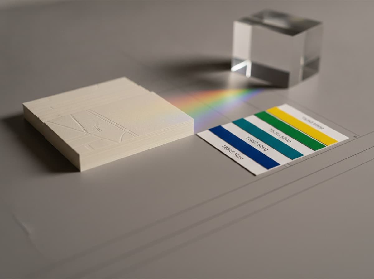
Color is one of the most immediate and unconscious ways a business card communicates. Before a recipient reads your name, before they process your title, they've already registered the color of your card and begun forming an impression. Understanding the psychology behind color choices helps you design a card that works with your brand identity rather than against it.
Why Color Matters More on Business Cards Than Other Media
Business cards are small, personal, and tactile — the recipient holds your card in their hand and processes it at close range. Colors that feel right at billboard scale or on a screen may feel overwhelming or wrong at 3.5 × 2 inches. The card color is a brand statement at human scale.
The Major Colors and Their Associations
Navy Blue and Dark Blue
Associations: Trust, stability, authority, professionalism, confidence, reliability, expertise
Industries where navy dominates:
- Financial services (banking, investment, insurance)
- Law firms
- Medical and healthcare
- Technology (B2B/enterprise)
- Government and military contractors
- Accounting
Navy is the universal professional default because it communicates trustworthiness without being cold (like black) or aggressive (like red). When in doubt about color, navy is rarely wrong in a professional context.
Shades: True navy (deep, classic) vs. royal blue (more energetic, accessible) vs. medium blue (softer, creative tech).
Black
Associations: Power, sophistication, luxury, exclusivity, precision, mystery
Industries where black dominates:
- Luxury goods and services
- Fashion and high-end retail
- Photography (fine art, editorial)
- Architecture and interior design
- Premium automotive
- Executive search and leadership consulting
Black signals premium positioning. A black card with white lettering says "we are at the top of our market" immediately. It works because so few professionals use it as a primary color — it stands out in a pile of white cards.
Caution: Black backgrounds on standard paper can look flat; black on textured or soft-touch laminate looks intentional and premium.
Red and Crimson
Associations: Energy, urgency, passion, attention, boldness, action
Industries where red works:
- Sales and marketing
- Food service and restaurants
- Real estate (energy, action)
- Sports and fitness
- Entertainment
- Consumer brands with a bold identity
Red commands attention, which makes it powerful for cards that need to be noticed. It's less common in professional services (attorney, accountant) where urgency can feel inappropriate. Red works best as an accent against a neutral background rather than as a full background — a red logo on white or a red accent stripe creates energy without overwhelming.
Green
Associations: Growth, health, sustainability, nature, prosperity, balance
Shades vary significantly:
- Emerald/dark green: Wealth, financial growth, prestige
- Sage/muted green: Natural, wellness, calm
- Bright green: Energy, innovation, eco-tech
- Olive: Natural, earthy, outdoors
Industries where green works:
- Environmental consulting and sustainability
- Finance and investment (growth and prosperity)
- Agriculture and organic food
- Health and wellness
- Landscaping and horticulture
- Natural and organic products
- Mental health and therapy
Gold and Yellow
Associations (gold): Luxury, prestige, achievement, quality, excellence
Associations (yellow): Optimism, creativity, energy, warmth, attention
Gold as an accent color (on navy, charcoal, or black) creates an impression of premium quality and achievement. Yellow on its own can read as cautionary or childlike — it's most effective when highly saturated and used strategically.
Industries where gold works:
- Financial planning and wealth management
- Awards and recognition
- Luxury hospitality and real estate
- Legal firms (especially older, established)
- Jewelry and accessories
Purple / Violet
Associations: Creativity, wisdom, luxury, spirituality, imagination, the unconventional
Industries where purple works:
- Creative agencies and design studios
- Wellness and spiritual practices
- Astrology, coaching, energy healing
- Luxury beauty
- Technology (specifically startups wanting to appear innovative)
- Fashion
Purple is relatively rare in professional business cards, which makes it distinctive. Rich, deep purple signals sophistication; bright purple reads as playful or creative.
Orange
Associations: Energy, enthusiasm, creativity, accessibility, warmth, youthfulness
Industries where orange works:
- Creative agencies
- Fitness and sports
- Food service (approachable, appetizing)
- Consumer tech and startups
- Marketing and advertising
Orange is energetic and friendly — it signals an accessible, approachable brand. It's rarer in conservative professions and works best as an accent with a neutral (charcoal, white, navy).
White (Background)
Associations: Cleanliness, simplicity, minimalism, openness, clarity
White backgrounds are the most common card background because they:
- Let other colors speak clearly
- Scan and photocopy well
- Feel clean and professional
- Accept ink without visual interference
White-on-dark (light text on dark card) is the reverse — signals premium and bold.
Charcoal and Gray
Associations: Balance, professionalism, sophistication, neutrality, modern refinement
Gray is a sophisticated neutral that pairs with almost any accent color. Charcoal backgrounds (near-black) signal premium without the full commitment of black.
Choosing Your Color Palette
Match Your Industry Conventions
Research what color palettes dominate your industry. Going against industry convention can be either brilliant differentiation or a trust signal failure. A lawyer using hot pink cards will be noticed — but not necessarily trusted.
Limit to 2-3 Colors
A focused palette communicates coherence and intention. More than 3 colors can look cluttered.
Ensure Contrast
Text must be readable at small sizes. Use a contrast checker (WebAIM Contrast Checker) — WCAG AA standard is a useful threshold even for print.
Consider the Full Context
Your card will be seen in:
- A wallet or cardholder (often against other cards)
- A brightly lit conference room
- A dimly lit event
- A photo taken to remember it
Test your palette in multiple lighting conditions before committing to a large print run.
Color Combinations That Work
| Background | Text / Accent | Signal | |-----------|--------------|--------| | White | Navy text | Classic professional | | White | Charcoal text + navy accent | Modern professional | | Navy | White text + gold accent | Authority + premium | | Black | White text + gold accent | Luxury + prestige | | Charcoal | White text + teal accent | Modern professional | | Cream | Dark charcoal text | Warmth + quality | | Dark green | White + gold | Prosperity + prestige | | White | Orange accent | Energy + approachable |
Checklist
- [ ] Color matches industry expectations (or thoughtfully diverges)
- [ ] 2-3 colors maximum
- [ ] Sufficient contrast between text and background
- [ ] Tested at actual card size before printing
- [ ] Consistent with your other brand materials (website, letterhead)
- [ ] Color available in the paper/printing process you're using (CMYK gamut)
Get 10% off your first order
Join our list for practical printing guides, new finish ideas, and a welcome coupon for your first order.
No spam. Unsubscribe anytime.
Ready to bring this design to life?
Order Premium CardsNot sure which option fits? Ask Pro Card Crafters