Dark Background Business Cards: Design Rules for Black and Deep Color Cards
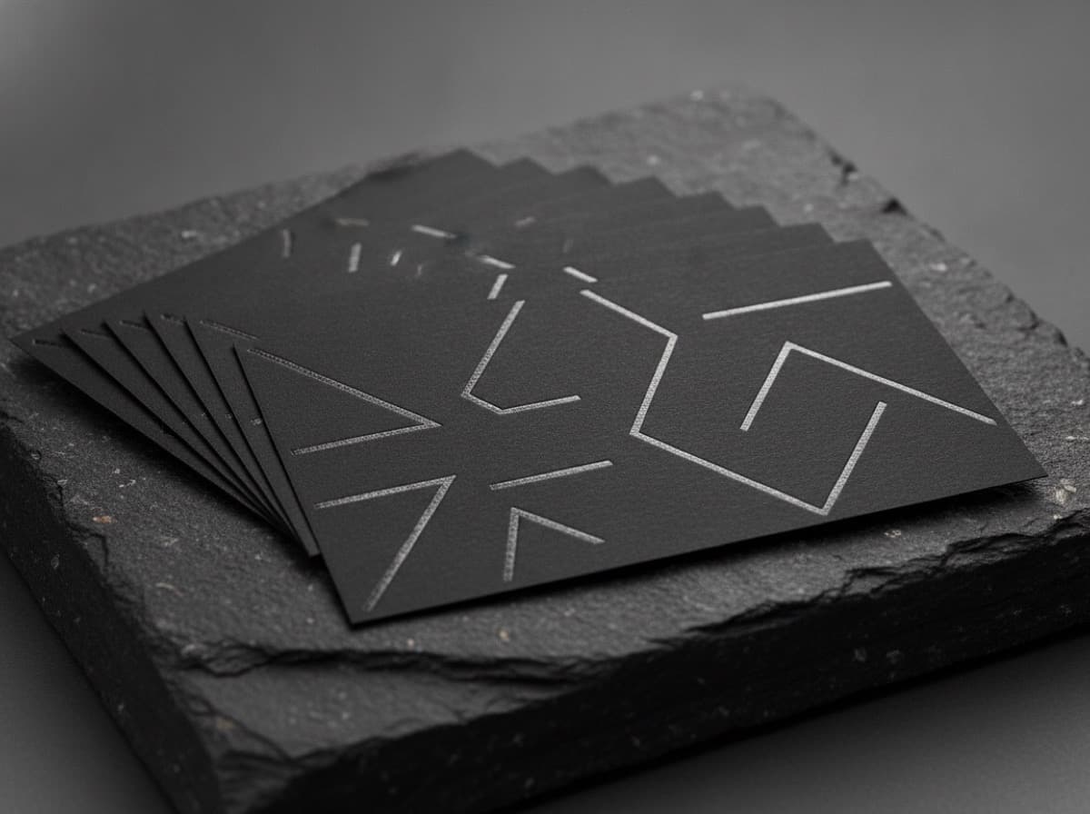
Dark and black background business cards have a distinct visual impact. When done well, they project premium, confidence, and distinctiveness. When done poorly — thin type, wrong finishes, digital colors that shift in print — they're nearly unreadable and look unprofessional.
The difference is knowing the specific rules that apply to dark-background design.
The Fundamental Shift: Light on Dark
All design principles for business cards assume light backgrounds by default. When you flip to a dark background, the rules change:
- White or very light type replaces dark type
- Contrast considerations reverse
- Ink and coating choices change significantly
- Digital-to-print color accuracy requires extra attention
Ignoring these shifts is why most dark business card designs fail.
Typography on Dark Backgrounds
Minimum Weight for Readability
Thin, delicate fonts that look elegant on white become invisible on dark backgrounds. The ink on dark stock has less contrast margin.
Rule: Use fonts no lighter than Regular weight for body copy. Bold or Medium weight recommended for contact information. Ultra-light or Thin weights are not legible on dark backgrounds in small sizes.
At risk: Popular minimal fonts in Light or Thin weights — Montserrat Light, Helvetica Neue Ultralight, Futura Light. These are beautiful on white cards and dangerously fragile on dark cards.
Font Size on Dark Cards
Increase minimum font size slightly vs. white background:
- Body copy: 8pt minimum (vs. 7pt on white)
- Contact details: 9-10pt recommended
- Name/title: 12pt+
All-Caps at Small Sizes
All-caps text at small sizes (8-9pt) is more legible on dark backgrounds than mixed-case, because caps create consistent stroke height without descenders that can disappear against dark backgrounds.
Use: Contact details in all-caps at small sizes Avoid: Long copy in all-caps at reading sizes
Color Choices on Dark Backgrounds
White Type
Pure white (0,0,0,0 in CMYK — no ink) is the cleanest and most readable on dark. It's not "white ink" — it's the absence of ink on white or light paper stock.
This only works if your paper stock is white or near-white. Dark paper stocks require a different approach (see below).
Off-White and Metallic
Instead of pure white, consider:
- Warm cream or ivory type against black: softer, warmer feel
- Silver type: metallic foil or metallic ink — luxurious against dark
- Gold type: foil is most effective; metallic gold ink is also available
Colors on Dark Backgrounds
Not all colors work equally on dark:
High contrast (works well):
- Gold/yellow
- White
- Cream/ivory
- Bright teal or electric blue
- Hot pink or coral
- Neon colors (if intentional)
Low contrast (dangerous):
- Navy or dark blue on black background (nearly invisible)
- Dark purple on dark blue
- Dark gray on black
- Any color close in value to the background
Rule: Check the luminosity difference between your type color and background. They need to contrast in value (lightness/darkness), not just hue.
Dark Paper Stock vs. Dark Ink on White Paper
Two different ways to achieve a dark card:
Dark Ink on White Paper (Most Common)
A black or very dark ink covers most of the card surface, leaving light areas for text.
Advantages:
- Standard production process
- White text is the absence of ink (no extra cost)
- Works with any finish
Disadvantages:
- Full-coverage dark ink areas can show "scuffing" or "ghosting" in CMYK
- Rich black requires proper mix (see below)
Dark Paper Stock
The paper itself is dark (black, charcoal, deep navy, forest green).
Advantages:
- Uniform, consistent dark background
- Edge color matches face color
- No ink coverage issues on dark areas
Disadvantages:
- White or light text requires white ink (a separate, expensive ink pass)
- Foil is typically required for text (no white ink option without a press configured for it)
- More expensive production
- Fewer printer options can handle it
The Rich Black Problem
When you fill a card with "100% black" (K=100, CMY=0) in CMYK, the result often looks flat and slightly gray rather than deep, rich black. This is because 100K alone doesn't have enough ink density.
Rich black formula for backgrounds: C=60, M=40, Y=40, K=100
This combination uses all four inks to achieve a deep, rich black that looks true black in print.
Important exception: Never use rich black for text. Text in rich black (four-color process) will misregister at small sizes and appear blurry. Use 100% K only for body text.
Summary:
- Large dark background areas: rich black (C60 M40 Y40 K100)
- Text on dark: 100% K (or white = C0 M0 Y0 K0)
Finishing Options for Dark Cards
Spot UV on Matte Dark Background
The most popular premium effect for dark cards: overall matte finish with spot gloss UV on selected elements (logo, name, or design detail). The contrast between matte and gloss on the same dark background is elegant and tactile.
Effect: Run your finger across the card and feel the gloss logo emerge from the matte surface.
Foil on Dark Background
Gold, silver, copper, or holographic foil on a dark card is extremely impactful. Foil by definition sits on top of the surface — its metallic quality is highlighted against dark backgrounds.
Matte Laminate on Dark
Soft-touch matte laminate on a dark card produces a velvety, suede-like feel that's been widely adopted in premium card design.
Combination: Dark matte soft-touch + spot UV logo = the most popular premium dark card recipe.
Glossy Laminate on Dark
Gloss laminate on dark creates a high-shine, lacquered effect. Bold, luxurious, slightly harder-edged than matte. Shows fingerprints more readily.
File Preparation for Dark Cards
CMYK mode required — dark backgrounds that look perfect on screen in RGB will shift significantly in CMYK. Always work in CMYK from the start.
Bleed for dark cards: Especially important. Any misalignment at trim on a dark card immediately shows a white edge. Extend your dark background at minimum 0.125" beyond all edges.
Overprint black text: Black text (100% K) on a dark background should be set to overprint (not knock out) to prevent registration issues.
Proof before printing: Order a physical proof for dark cards, especially if using rich black or multiple finishes. Digital proofs on screen don't represent the dark card accurately.
Dark Card Design Checklist
- [ ] Type is Regular or Bold weight minimum (no light/thin fonts)
- [ ] Type color has high value contrast against background (not just hue contrast)
- [ ] Rich black used for large dark areas (C60 M40 Y40 K100)
- [ ] Pure 100% K used for text (not rich black)
- [ ] Document is in CMYK color mode
- [ ] Bleed extends 0.125" on all sides
- [ ] Physical proof ordered before full run
- [ ] Foil or spot UV considered for maximum impact
- [ ] Soft-touch matte laminate + spot UV considered as signature combination
Get 10% off your first order
Join our list for practical printing guides, new finish ideas, and a welcome coupon for your first order.
No spam. Unsubscribe anytime.
Ready to bring this design to life?
Order Premium CardsNot sure which option fits? Ask Pro Card Crafters