Double-Sided Business Card Design: How to Use the Back of Your Card
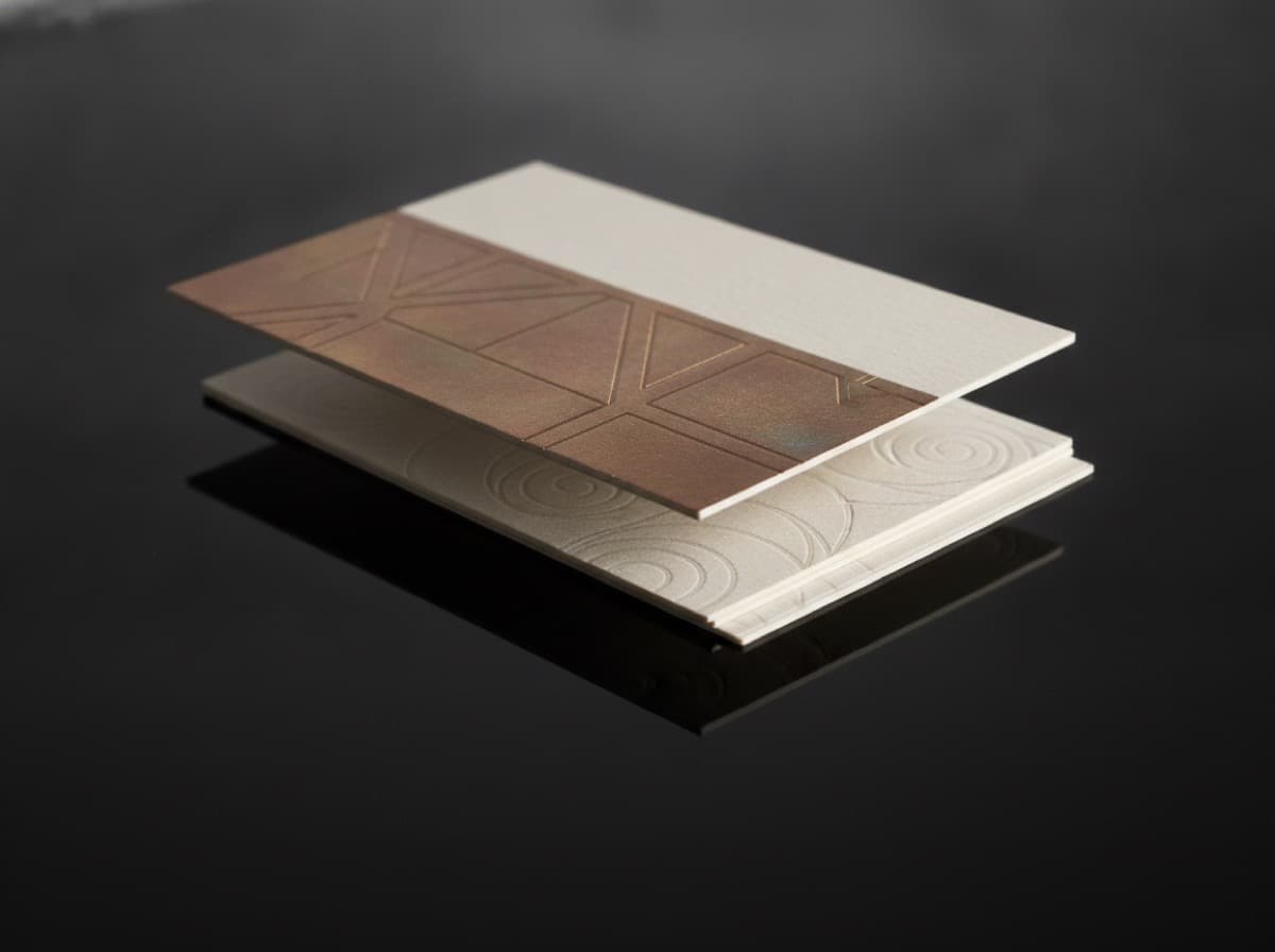
Most business cards use only the front. The back is left white, or stamped with a generic logo, or includes the same information as the front in a different layout. That's a wasted opportunity.
The back of your business card is the second impression — the thing someone sees after they've flipped your card over to read it again. Used well, it's the thing that makes someone keep your card instead of recycling it.
What the Back of a Business Card Can Do
1. Convert: Give a Reason to Act
The most valuable use of your card's back is a clear call to action:
- QR code + action label: "Scan to book a free consultation" or "Scan to see our portfolio"
- Offer: "New client special — first visit 15% off, mention this card"
- Appointment slot: "Your next appointment: ______ at ______"
A clear CTA on the back is consistently the highest-ROI use of that space.
2. Inform: Provide Useful Additional Information
Some professions benefit from information that doesn't fit on the front:
- Hours of operation (restaurants, retail, medical practices)
- Services list (what you actually do, beyond your title)
- Map or directions (if your location is hard to find)
- Social media handles (if you have multiple active platforms)
3. Show: Visual Portfolio in Miniature
For visual professionals, the back is a 3.5 × 2 inch portfolio page:
- Photographers: Full-bleed photograph — your best image
- Interior designers: A striking room shot
- Tattoo artists: A detail of your finest work
- Videographers: A cinematic still frame
- Florists: A stunning arrangement photograph
For these professions, a photo on the back converts more viewers into clients than any amount of additional text.
4. Build Trust: Social Proof
- One testimonial quote: "X helped me find my dream home" — Sarah M.
- Result stat: "Helped 150+ businesses grow their online presence"
- Media mention: "As seen in Forbes | Architectural Digest | TechCrunch"
- Number of clients served: "Trusted by 500+ clients across [region]"
5. Save: Make Yourself Useful
If someone will refer to your card repeatedly, give them a reason to keep it:
- Useful quick reference: "Signs your HVAC needs service | Call us at [number]"
- Measurement chart: (for certain trades)
- Seasonal tip: "Spring lawn care checklist" (for landscapers)
- Emergency contact: "Water emergency? Call [number] any hour"
People keep useful cards.
Design Principles for the Back
Don't Repeat the Front
If the back just repeats your name, title, and contact info in a different layout, you've wasted the space. Everything on the back should be additional information or a different function from the front.
One Job Per Side
Front: Who you are, what you do, how to reach you. Back: One primary thing: a photo, a QR code, a service list, a testimonial, or an appointment reminder.
Mixing multiple functions on the back creates visual clutter and reduces conversion from each element.
Contrast With the Front
If your front is dark, consider a lighter back. If your front is text-heavy, let the back breathe with white space and one strong visual or CTA. Contrast between front and back makes the card feel designed.
Full Bleed vs. Centered Content
For photography: full-bleed, edge-to-edge image. Powerful. For QR code + CTA: centered content, generous white space. For service list: organized, aligned, clean.
Back-of-Card Ideas by Industry
| Industry | Best Back Use | |---|---| | Real estate agent | Property photo or portfolio QR code | | Photographer | Full-bleed best photograph | | Tattoo artist | Tattoo detail photo | | Personal trainer | Client transformation QR code + "scan for free workout" | | Dentist | Appointment reminder | | Cleaning service | Referral offer | | Restaurant / food truck | Menu highlight or schedule | | Attorney | Practice areas list | | Life insurance agent | Emergency contact and policy review offer | | Yoga instructor | Class schedule or QR to booking page | | Veterinarian | Appointment reminder + "next wellness visit:" | | Mortgage broker | "Scan to get pre-approved in 24 hours" | | Contractor | Services checklist | | Home inspector | Services and certifications list |
Technical Notes for Back-Side Printing
Bleeds apply to both sides: If your back has a full-bleed background or image, it still needs 0.125" bleed on all sides.
Orientation matters: Print shops typically orient both sides in the same direction. If your front is landscape, your back is landscape. If you want the back to read in a different orientation (like when flipped left-right vs. top-bottom), specify this to your printer.
Print weight: Double-sided printing on 16pt adds slightly to the card's opacity compared to single-sided. This is a benefit — it prevents show-through from one side to the other.
The Blank Back Card: When It's Right
A completely blank (white) back isn't always wrong:
- Appointment reminder use: blank back for writing in appointment details
- Budget-conscious orders where back printing adds meaningful cost
- Minimalist design where the blank back communicates intentional restraint
If you're deliberately leaving the back blank, make sure the front alone carries enough information to make the card work on its own.
The One Rule
Whatever you put on the back should have a clear reason to exist there. "We put our logo on the back" isn't a reason. "This QR code links to our booking page and increases consultation bookings" is a reason.
Use your back intentionally or leave it blank on purpose. Don't fill it just to fill it.
Get 10% off your first order
Join our list for practical printing guides, new finish ideas, and a welcome coupon for your first order.
No spam. Unsubscribe anytime.
Ready to bring this design to life?
Order Premium CardsNot sure which option fits? Ask Pro Card Crafters