Duplex and Double-Sided Business Card Design: Using Both Sides Effectively
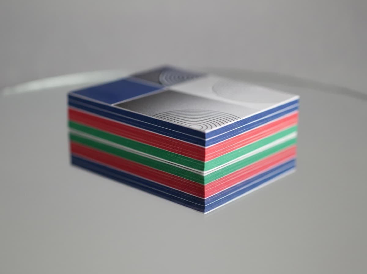
A single-sided business card wastes half of your available marketing real estate. A double-sided card doubles your canvas — but only when both sides serve a distinct, intentional purpose. The most common mistake with double-sided cards is to treat the back as an overflow container for information that didn't fit on the front. This guide shows you how to use both sides purposefully so the card becomes a complete brand experience.
The Information Architecture: What Goes Where
Think of the two sides as a sequence — the front creates a first impression, the back deepens it.
Front Side: Identity and First Impression
The front of your card is the side people see first. It should communicate the most essential information instantly:
Required on front:
- Your name — the primary visual anchor; large, readable
- Your title / role — what you do
- Your primary contact method — the one phone number or email address you most want them to use
- Your logo or brand mark — if your organization is recognizable, here; if personal brand, your initials or signature element
Optional on front:
- Secondary contact (if truly necessary)
- One social handle (LinkedIn for most professionals, Instagram for creatives)
Keep off the front:
- Long service lists
- Detailed credential strings
- QR codes (better on back)
- Too many contact methods
The front should be readable in under 3 seconds. If it requires study, it's too complex.
Back Side: Supporting and Deepening
The back is where the interested recipient turns after they've decided to look further. It's for:
Supporting information:
- Your credentials and certifications (long strings that would crowd the front)
- Your services list (condensed, 3–6 items)
- A brief positioning statement or tagline
- Your website URL (smaller, since it's supplementary)
- Social handles (all of them, since back has more space)
Conversion elements:
- QR code linking to your portfolio, website, or booking page
- A call to action ("Book a free consultation at [URL]")
- A compelling offer or differentiator
Visual storytelling:
- For photographers, designers, chefs, makeup artists: a full-bleed photo on the back of your best work
- For florists, nail technicians, and visual professionals: your portfolio is the best content for the back
Design Systems for Both Sides
Approach 1: Text Front, Visual Back
- Front: Clean typography, name, title, contact
- Back: Full-bleed photo, illustration, or branded pattern with minimal text
Who it works for: Photographers, artists, designers, food professionals, makeup artists, floral designers
Approach 2: Information Front, Credentials/Services Back
- Front: Name, title, primary contact, logo
- Back: Credential list, certifications, service list, website QR
Who it works for: Healthcare professionals, attorneys, engineers, financial advisors, consultants with long credential strings
Approach 3: Brand-Led Front, Conversion Back
- Front: Bold brand design, large logo or design element, name
- Back: Clean information, services, QR to book/contact
Who it works for: Agencies, studios, creative businesses, startups
Approach 4: Identical Information (Both Sides Same)
- Don't do this. You've paid for two sides; use them differently.
- Exception: bilingual cards (English on front, Spanish/Chinese/Korean on back) — a genuine dual-audience card
Color and Design Continuity
The front and back should feel like they belong together, but they don't need to be identical:
- Same color palette on both sides
- Same font family on both sides (you can vary weight and size)
- Complementary designs — the back can be the inverse of the front (dark on light front / light on dark back, or vice versa)
- Duplex: Contrasting back color — the most popular premium approach: front in white/light, back in deep black, navy, or brand color
Printing Specifications for Double-Sided Cards
File preparation:
- Supply two separate print-ready files: one for front (Side A), one for back (Side B)
- Both sides need full bleed: 3.625" × 2.125" (for standard 3.5" × 2" US business card)
- Important: the back of the card is a mirror image when the card is flipped left-to-right (not top-to-bottom) — check card orientation carefully; most cards are landscape and flip on the left edge
- Mark files clearly: "Front – Client Name" and "Back – Client Name"
Color management:
- Both sides should be in CMYK mode
- If using a different color treatment on each side (e.g., full color front, spot color back), specify this in your print order
Special finishes and double-sided cards:
- UV spot coating, soft-touch laminate, or foil can be applied to one or both sides
- Note: if both sides have soft-touch laminate and one side has UV spot, specifying which side gets UV is critical
- Emboss and deboss work on both sides but work best on thicker stock (32pt+) where the press doesn't show through to the other side
QR Codes on the Back
The back of the card is the ideal home for a QR code:
- Always keep the QR code on a clean white or solid light background
- Minimum size: 1" × 1"
- Include "Scan for [portfolio / booking / website]" near the code
- Test the QR code on multiple devices before printing
- Never put a QR code directly in a corner (optical scanning works better with center placement)
Common Double-Sided Card Mistakes
- Putting the same font color against the same background on both sides — the back is your opportunity for a contrasting design; use it
- Using the back as a list dump — long lists with no visual hierarchy lose the reader
- Forgetting the bleed on one side — both sides need 1/8" bleed; make sure both files are correctly sized
- QR code on a busy background — always on white or solid light
- Not labeling files Front/Back — printing houses need clear file identification
- Making both sides identical — this is the most common waste of a two-sided card
Get 10% off your first order
Join our list for practical printing guides, new finish ideas, and a welcome coupon for your first order.
No spam. Unsubscribe anytime.
Ready to bring this design to life?
Order Premium CardsNot sure which option fits? Ask Pro Card Crafters