Horizontal vs. Vertical Business Cards: Which Orientation Works for Your Brand
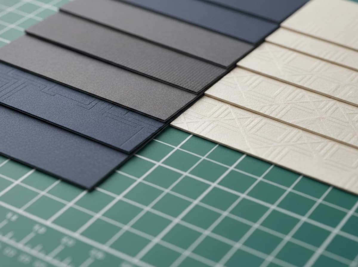
The orientation of your business card — landscape (horizontal) or portrait (vertical) — shapes how information flows across the card, how it sits in a wallet or cardholder, and the immediate visual impression it makes when someone pulls it from a stack. Most Western professionals default to landscape without thinking about it; choosing portrait is a deliberate design statement. Here's what you need to know to make the right choice.
Landscape (Horizontal) Orientation
Standard dimensions: 3.5" wide × 2" tall (88.9 × 50.8mm)
The default: Landscape is the dominant business card orientation in North America, Europe, and Australia. When someone pulls a card from their wallet or a standard cardholder, the landscape card sits naturally — left to right, the way English reads.
Information flow: The horizontal axis naturally accommodates:
- Name at left-center, contact at right-center
- Name at top-left, contact information stacked below
- Logo at left or center, name and contact flowing right
Who uses it well:
- Law firms, accounting firms, financial services (the horizontal format reads "establishment")
- Healthcare professionals (clinical authority)
- Engineering and consulting firms
- Corporate professionals of all types
- Any business where conventional professional expectation is the right signal
Why it fits standard systems:
- Horizontal cards fit in every US business card holder, Rolodex, business card wallet, and card scanner designed for the US market
- The standard sizing means they stack neatly in any standard card tray
- No adaptation needed from the recipient
Design consideration: The horizontal format has a strong "lower third" zone — the bottom of the card is where the eye lands last. Contact information in this zone reads naturally after the eye has processed name and title from the center-to-top area.
Portrait (Vertical) Orientation
Standard dimensions: 2" wide × 3.5" tall (50.8 × 88.9mm)
The choice: Portrait orientation is the same physical size as a landscape card — the card is simply printed and cut to rotate 90 degrees from the landscape baseline. Portrait cards use the same paper, same printing process, and same specifications; the design is simply laid out differently.
Information flow: The vertical axis suggests:
- Name at top, flowing downward
- Stacked information hierarchy — name, title, company, contact
- Central large design element with minimal flanking text
- Right-hand or centered contact details
Who uses vertical cards effectively:
Creative professionals: Designers, photographers, illustrators, artists, and creative directors regularly choose vertical orientation as a design statement that communicates "we think differently about space." A vertical card in a stack of horizontal cards is immediately visible.
East Asian business context: Vertical business cards are the dominant format in Japan, China, and Korea — they reflect the traditional top-to-bottom reading direction of Asian languages. For businesses serving Asian markets or working with Japanese/Korean/Chinese clients, vertical cards are often the correct choice. Bilingual cards (English one side, Japanese/Korean/Chinese the other) typically use vertical orientation.
Personal brands and solopreneurs: Coaches, speakers, consultants, and other personal brands find that the vertical format de-emphasizes the company and emphasizes the person — the name runs top-to-bottom, commanding the visual field.
Wellness and health practitioners: Massage therapists, acupuncturists, yoga teachers, and holistic health providers often choose vertical cards because the format feels less corporate and more personal.
Fashion and lifestyle brands: Boutique shops, stylists, and fashion professionals appreciate the editorial quality of a vertical card — it mimics the proportions of a magazine or editorial spread.
Design consideration: The vertical format naturally creates a "column" of information rather than a "row." Centered alignment works strongly in portrait; left-aligned text in a vertical card can leave significant right-side dead space.
Which Fits Standard Card Holders?
Landscape cards: Fit in virtually all standard business card holders, wallets, and card storage systems.
Portrait cards: Often do NOT fit sideways in standard cardholders (designed for the 3.5" width, not the 3.5" height). Portrait cards typically sit upright in wallets (the 2" width fits vertically in most wallets) and are typically stored face-down or grouped together. This is worth considering for clients who organize cards in traditional cardholders.
How to Choose
Choose landscape (horizontal) if:
- Your industry has conventional professional expectations (law, finance, medicine, engineering, corporate)
- Your clients are likely to store cards in traditional business card holders
- You want the card to fit seamlessly into standard Western business card systems
- Your design has a strong horizontal element (logo with horizontal lockup, landscape photo)
Choose portrait (vertical) if:
- You are in a creative, design, or visually expressive profession
- Your brand is built around a person rather than a company
- Your design has more vertical than horizontal information (stacked credentials, tall logo)
- Your clients are primarily in Japan, China, or Korea where vertical cards are standard
- You want the card to stand out visually in a stack of landscape cards
- You've seen a vertical card design that perfectly expresses your brand
The Hybrid Approach
Some professionals use two card designs: a standard landscape card for conventional business contexts and a more distinctive card (square, vertical, or specialty format) for creative contexts or personal networking. This is especially effective for someone who operates in both a corporate environment (where landscape is expected) and a creative or personal brand context (where distinctiveness helps).
Design Tips by Orientation
For landscape:
- Use the left-right reading direction: name and brand elements left-center, contact right-center
- The safe zone is 3.25" × 1.75" — wider than tall; design for horizontal balance
- The "golden zone" for the most important element is center-left
For portrait:
- Use centered alignment — it reinforces the top-to-bottom reading direction
- The safe zone is 1.75" × 3.25" — taller than wide; design for vertical flow
- Your name at top, followed by title, company, then contact details
- A large, bold visual element in the center can anchor the design well
Get 10% off your first order
Join our list for practical printing guides, new finish ideas, and a welcome coupon for your first order.
No spam. Unsubscribe anytime.
Ready to bring this design to life?
Order Premium CardsNot sure which option fits? Ask Pro Card Crafters