Logo Placement on Business Cards: Where to Put Your Logo for Maximum Impact
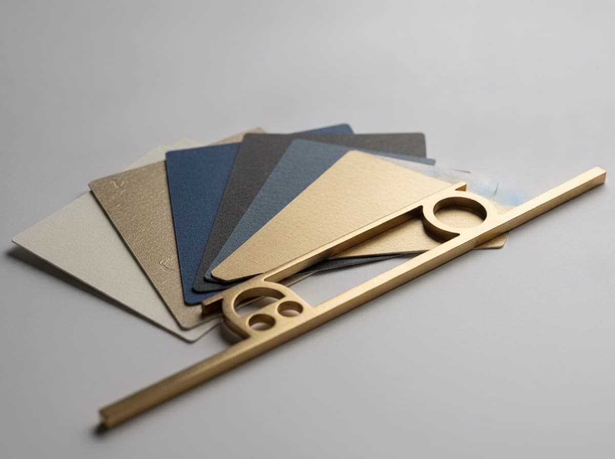
Your logo is the most recognizable visual asset your business has — and where you place it on a business card determines whether it anchors the design, supports your name, or competes with the information that matters most. Logo placement is one of the most consequential design decisions in business card layout, yet it's often made by instinct rather than strategy.
This guide breaks down the logic of logo placement, the most effective positions for different card types, and the common mistakes to avoid.
Why Logo Placement Matters
A business card is a small, information-dense space. Every element competes for visual attention. Placement determines reading order — the sequence in which a reader's eye naturally moves through the card — and reading order determines what they notice first, second, and last.
Your logo tells someone: "This is who this card is from." Your name (for personal brands) or company name (for corporate brands) tells someone: "This is who to call." These two elements need to work together, not fight each other.
The Four Primary Logo Positions
1. Top-Left Corner (Most Traditional)
The top-left corner is where Western readers instinctively begin reading — it's the natural entry point for a card's visual hierarchy. Placing your logo here means it's the first thing seen.
Best for:
- Corporate and company cards where brand recognition precedes the individual
- Well-known or visually distinctive logos
- Cards where the company brand is more important than the person's name
Considerations: The top-left logo works when the logo is simple and readable at a small size. Complex logos with fine details fail in this position — they become a visual blur rather than a recognizable brand mark.
2. Top-Center (Balanced, Premium)
A centered logo at the top creates symmetry and visual balance across the card. This is the premium, architectural layout — everything flows from the centered mark downward.
Best for:
- Luxury and premium brands
- Professional services (law, finance, architecture) where formality signals status
- Cards with predominantly centered text layouts
- Square logo marks and icons
Considerations: A centered layout requires every other element to also feel intentionally centered. Mixed alignment (centered logo + left-aligned text) looks like an accidental layout, not a design decision.
3. Right Side (Modern, Balanced with Name)
Placing the logo on the right — either top-right or middle-right — creates a natural visual balance with the name and contact information on the left. The eye moves left to right across the card, making the logo a conclusion rather than an introduction.
Best for:
- Personal brands where the individual's name leads
- Creative professionals who want a modern, non-traditional layout
- Cards with a vertical design element on one side
4. Bottom of Card (Anchored, Supporting Role)
A logo at the bottom right or bottom center functions as a visual anchor — it grounds the card and identifies the brand without competing with the name and contact information in the reading hierarchy.
Best for:
- Personal cards where your name is the primary brand
- Professionals who want the logo to support (not lead) the card
- Cards with a strong personal brand and a secondary corporate affiliation
Logo Sizing on Business Cards
Size is as important as position. An oversized logo crowds out contact information; an undersized logo looks timid or gets lost.
Practical guidelines:
- Icon/mark only (no text): Minimum 0.5" height; typical range 0.5"–1.0"
- Horizontal wordmark (text-only logo): Maximum width of card's printable area (3.25" within safe zone); typical 1.5"–2.5" wide
- Stacked logo (mark + text below): Typically 0.75"–1.25" wide
- Full-bleed or dominant logo card: The logo IS the card front — works for very strong visual brands; name and contact on the back
Rule of thumb: A logo on a business card should never be so large that it visually outweighs your name and contact information (unless the logo IS the card). And it should never be so small that it becomes illegible or loses detail.
Logo-First vs. Name-First Card Design
When to Lead with the Logo
- Your company brand is more recognizable than you personally (Google, Apple, a nationally known firm)
- You work for a company and represent the company first, yourself second
- You're handing cards to people who already know your company but not you specifically
When to Lead with Your Name
- You are the brand — consultant, freelancer, solo professional, creative
- Your personal reputation drives business, not company name recognition
- You frequently change companies or positions (your name is consistent, your company may not be)
The Split (Logo and Name Together)
Most effective for personal branding: your name in large text as the visual anchor, logo as a secondary brand element. The logo confirms brand identity; the name drives human connection.
Common Logo Placement Mistakes
Placing the logo too close to the card edge: Logos within 0.125" of the card edge risk being cut off during trimming. Keep logos within the safe zone (0.125" from the final card edge).
Scaling a complex logo too small: A detailed logo that looks great at 3" wide may become illegible at 0.5". Test your logo at card scale before finalizing your design. If necessary, use a simplified version or icon variant of your logo for small sizes.
Using the logo in wrong color mode: Your logo should be in CMYK for print. An RGB logo embedded in a CMYK document can produce unexpected color shifts. Convert all logo files to CMYK.
Overriding the logo's required clear space: Most professional logos have defined "clear space" rules — a minimum amount of empty space around the logo mark. Crowding the logo with other elements distorts the brand.
Using a low-resolution logo: A logo from a website (72 DPI PNG or JPG) will look pixelated in print. Use vector files (AI, EPS, SVG) or high-resolution PNG at 300 DPI at the final print size.
Testing Your Layout
Before committing to a print order:
- Export a PDF and print it at home at 100% scale on paper — then cut it to 3.5"×2" and hold it. Does the logo look right at true size?
- Show it to someone who doesn't know your brand — ask where their eye goes first. Is it where you intended?
- View it at arm's length — business cards are often held at arm's length when read. Does the logo remain readable from 18 inches?
Logo placement is a design decision, not a default. The most effective business cards place every element intentionally — and the logo's position signals whether you're a company representative, a personal brand, or a creative professional. Design from that signal outward.
Get 10% off your first order
Join our list for practical printing guides, new finish ideas, and a welcome coupon for your first order.
No spam. Unsubscribe anytime.
Ready to bring this design to life?
Order Premium CardsNot sure which option fits? Ask Pro Card Crafters