Minimalist Business Card Design: The Power of Whitespace and Less
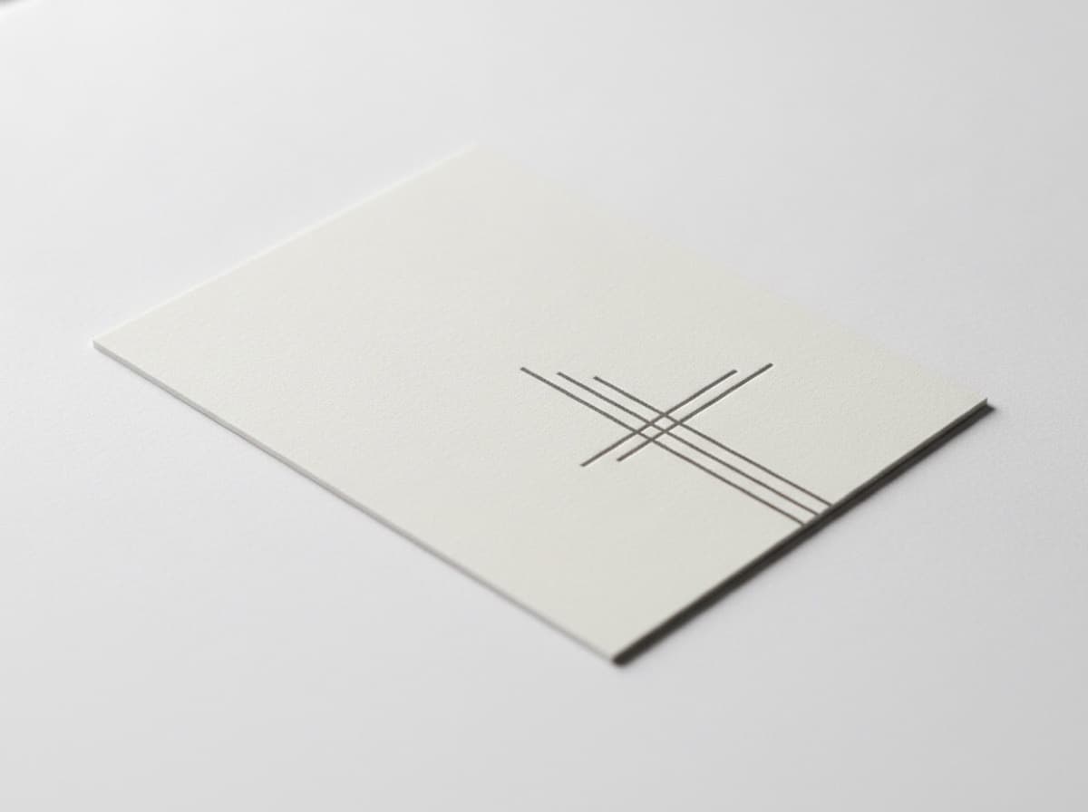
Minimalist business cards communicate confidence through restraint. While most cards try to pack in every credential, service, and contact method, the minimalist card signals something different: security in position, premium market placement, and trust in the design itself to do the work that most designers try to accomplish through volume of content.
True minimalism isn't just leaving things off a card — it's a deliberate design philosophy where every element earns its place, whitespace is used as an active design element, and the result feels intentional rather than empty.
The Minimalist Card Philosophy
Minimalist cards operate on a set of core principles:
1. Every element earns its place. Before including any element — even your phone number — ask: does this specific person who receives this card need this information? Can they get it another way (website, email)? If not, include it. If it's redundant, remove it.
2. Whitespace is an element, not empty space. In minimalist design, the blank areas of the card are as carefully considered as the printed elements. Generous margins, breathing room between lines, empty quadrants — these aren't wasted space. They're what makes the elements that remain feel important and readable.
3. Hierarchy through size and weight, not through quantity. Without lots of content to create visual hierarchy through volume, minimalist cards rely entirely on typographic hierarchy — larger for more important, smaller for less important, bolder for primary, lighter for secondary.
4. One typeface family. Minimalism almost always means one typeface family (with size and weight variations) rather than a combination of display and body fonts.
5. A constrained color palette. Typically one or two colors — most often black on white or white on black, with occasional accent colors used extremely sparingly.
What to Include on a Minimalist Card
The canonical minimalist business card:
- Your name
- Your title (single line — the most specific and relevant title)
- One or two contact methods — typically email + one of (phone / website / LinkedIn)
That's it. Everything else is optional — and for true minimalism, probably omitted.
The luxury tier minimalist card: Some ultra-premium personal brand cards include only:
- Name
- One contact method (email or phone only)
This works when the recipient already knows who you are and what you do — the card is merely a transfer of contact information. It requires the card recipient to have enough context already. If your card will be received by strangers who don't know you, pure minimalism of this kind risks being unclear.
Typography for Minimalist Cards
Typography carries almost the entire design weight in a minimalist card.
Typeface choices for minimalist cards:
- Helvetica Neue — the canonical minimalist typeface; neutral, precise, professional
- Aktiv Grotesk — modern Helvetica alternative; crisp and clean
- Inter — excellent open-source neo-grotesque sans-serif
- Neue Haas Grotesk — Helvetica's refined successor; premium positioning
- Futura — geometric, elegant, slightly more distinctive than Helvetica
- Gill Sans — British, warm but clean
- Garamond / EB Garamond — elegant serif for minimalism with a literary or luxury quality
What to avoid:
- Script or handwritten fonts (these add decorative energy that fights minimalism)
- Display fonts with heavy stroke variation
- Fonts with excessive character (quirky, playful, rustic)
- Too many weights from the same family (one light + one regular is enough)
Type size guidance:
- Name: 18–24pt
- Title: 10–12pt
- Contact information: 9–10pt
- Logo (if any): sized proportionally, not competing with the name
Spacing:
- Leading (line spacing): generous — 140–160% of point size
- Letter spacing: slightly increased on smaller text (+0.02–0.05em on body text) for readability
- Margin: generous — minimum 0.25" on all sides, preferably 0.375"
Color in Minimalism
Black on white: The canonical minimalist palette. True black (#000000 or close to it) on white (#ffffff) with nothing else is the clearest expression of minimalist design. Every element gets maximum contrast.
White on black: Inverted — equally minimal, reads as more premium / dramatic. Full-bleed black background with white type only.
Off-white on white (embossed / blind deboss): The ultimate luxury minimalist card — letterpress or emboss/deboss with no ink. This works only with premium print production (letterpress, foil, engraving) and typically requires thick card stock (32pt or thicker).
Single color accent:
- Navy blue on white: classic, restrained authority
- Warm gray on white: soft, slightly warmer than pure black
- A single logo or name in a specific brand color with all supporting text in black or dark gray
What to avoid:
- More than two colors (including black and white, three colors total is the outer limit)
- Gradient or multi-color logo treatment (saves for more expressive brands)
- Background colors other than white, black, or very light neutral
What NOT to Include on a Minimalist Card
This is the hard part. Minimalism requires decisions to omit:
Usually omit:
- Address (people don't mail things to business cards; your address is on your website or email signature)
- Fax number (remove unless you are in a profession that still uses fax legally — some healthcare and legal contexts still do)
- Multiple phone numbers (pick one — your primary number)
- Multiple email addresses (pick one)
- Multiple social media handles (pick the one where you're most active, if at all)
- Tagline (only if it's both essential and very short — "Commercial Real Estate" below a name is functional; "Building Tomorrow Together" is marketing noise)
- List of services (belongs on the back of the card, if anywhere)
- Long credentials trail (credential abbreviations after your name — choose your single most important one if any)
- QR code (consider carefully: a QR code adds visual complexity; sometimes right for minimalism, sometimes not — depends on implementation)
Logo Treatment in Minimalist Cards
Option 1: No logo, just your name. The most minimal. Works when your name is your brand (personal brand, consultant, freelancer).
Option 2: Logo only, no company name. Works when your logo is highly recognizable and replaces the text name. Risk: if your logo isn't immediately identifiable, this creates confusion.
Option 3: Small, restrained logo + company name. The most common for businesses — a small, simple logo mark positioned to the left of the company name, or above the name block. Key: the logo must be simple enough to work at small size without visual clutter.
Logo marks that work for minimalism:
- Abstract geometric marks
- Simple letterform marks (initials)
- Line-art icons with few nodes
- Wordmarks in a clean sans-serif
Logo marks that fight minimalism:
- Highly detailed illustrations
- Badges and crests with multiple rings/borders
- Multi-color gradient logos
- Logos with decorative script lettering
Achieving True Minimalism vs. Just Underfilling
The difference between a minimalist card and a poorly designed card with too little content:
| True Minimalism | Just Underfilled | |---|---| | Generous intentional margins | Random empty space with no design intention | | Carefully chosen single typeface | Default typeface from a template | | Deliberate typographic hierarchy | All text the same size | | Considered element placement | Content dropped to center of card by default | | Whitespace as active design element | White space as afterthought | | Card stock and finish are premium | Default card stock |
Minimalist Card Examples by Profession
Architect:
[White card, 0.375" margins]
MARCUS CHEN                [14pt, light weight, tracked +0.08em]
Architect  AIA             [9pt, regular weight]

marcus@chen.design         [9pt, regular]
chen.design                [9pt, regular]
Management Consultant:
[Black card, white type]
ELEANOR VOSS               [18pt, white, light weight]
                           [6pt space]
Management Consulting      [9pt, white, regular]
eleanor@vossco.com         [9pt, white, regular]
Brand Designer:
[Off-white card, dark charcoal type]
[Logo mark: small, 0.35" height, top-left aligned]

Sofia Martinez             [16pt, medium weight, top-left]
Brand Designer             [9pt, light weight]

sofia@martinez-studio.com  [8pt, regular]
martinez-studio.com        [8pt, regular]
Checklist
- [ ] Content reduced to: name + title + 1–2 contact methods (maximum)
- [ ] Single typeface family (no font mixing)
- [ ] Max 2 type sizes with clear hierarchy
- [ ] Margin: minimum 0.25" (preferably 0.375"+)
- [ ] Whitespace used intentionally, not by default
- [ ] Color palette: 1–2 colors (black/white + one accent at most)
- [ ] Logo mark simple enough to work small
- [ ] Address removed (if not essential)
- [ ] Multiple phone numbers / emails consolidated to one each
- [ ] Services list removed (belongs on back or website)
- [ ] Tagline evaluated — if not essential, removed
- [ ] Premium paper stock chosen (minimalism requires quality tactile feedback)
- [ ] Finish: matte, soft-touch, or uncoated (minimalism often avoids high gloss)
Get 10% off your first order
Join our list for practical printing guides, new finish ideas, and a welcome coupon for your first order.
No spam. Unsubscribe anytime.
Ready to bring this design to life?
Order Premium CardsNot sure which option fits? Ask Pro Card Crafters