Two-Sided Business Card Design Guide: How to Use Both Sides of Your Card Effectively
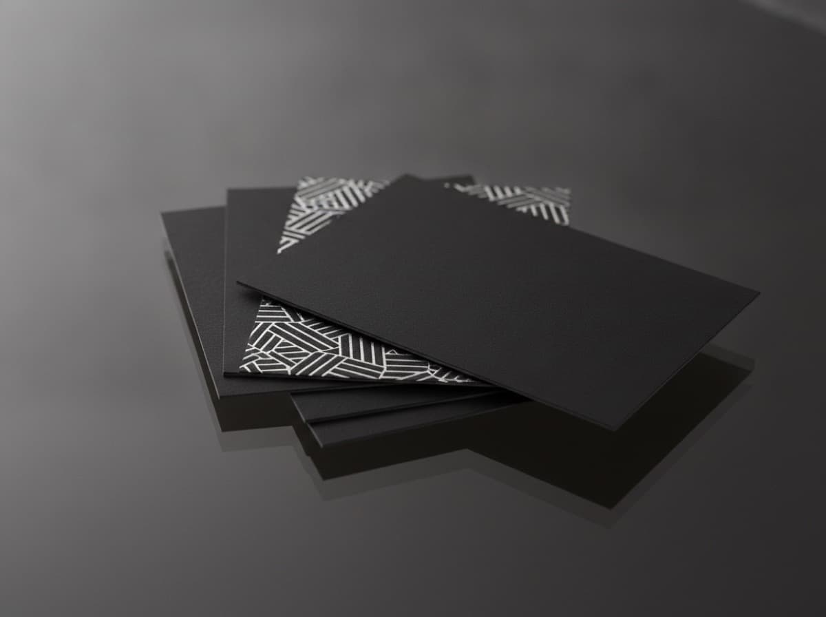
Two-sided (or duplex) business card printing — printing on both the front and back of the card — is standard practice for professional business cards, and most professional card orders are printed on both sides as a default. Yet the back of a business card is frequently underdesigned or completely wasted: left blank, printed with a basic logo repeat, or used for a low-value element that adds no information or brand impact.
The back of a business card is essentially free additional advertising space. You've already paid for the paper, you've already paid for the print run — using the back thoughtfully can double the communicative power of your card without doubling the cost.
Front vs. Back: The Principle
The front of the card is your primary identification.
The front is what the recipient sees first, what they file the card by, and what they reference when they remember who you are. The front should contain:
- Your name (clearly readable, prominent)
- Your professional title
- Company name and/or logo
- Primary contact information (phone, email, website)
The back of the card is your secondary value layer.
The back has no primary identification responsibility — the recipient already knows who you are from the front. The back can carry:
- Extended portfolio content (photo, QR, samples)
- Supporting information that reinforces the front
- Brand visual statement
- Services or specialties listing
- Social links and secondary contacts
- Memorable information that creates a talking point
Back of Card Design Approaches
1. Full Portfolio Image (Best for Creative and Service Professionals)
Who it's for: Photographers, designers, illustrators, architects, interior designers, stylists, artists, chefs (food photography), florists, makeup artists
How it works: A full-bleed high-quality photograph or portfolio image printed on the back, edge-to-edge; the front has standard professional information; the back IS the portfolio sample
Why it's effective: Turns the card exchange into an immediate portfolio preview; the recipient experiences your work before visiting your website; eliminates the "I'll check out your portfolio later" friction
Production note: For images, ensure 300 DPI at print size; choose an image that translates well to small scale (tight composition, strong focal point, high contrast); avoid complex images with fine detail that reads poorly at 3.5" × 2"
Paper pairing: Soft-touch matte laminate on the back allows the image to show without glare; uncoated gives a fine-art aesthetic for photographers and artists
2. Services or Specialties List
Who it's for: Service professionals with multiple offerings; lawyers (practice areas), doctors (specialties), contractors (services), consultants (practice areas), personal trainers (training specialties), financial advisors (services)
How it works: A bulleted or formatted list of your services, specialties, or areas of practice on the back; clean, readable, appropriately formatted
Why it's effective: When someone receives your card, they may not immediately know if you offer the specific service they need; the back immediately answers "can this person help me with X?" without requiring a website visit
Design approach:
- Keep the list to 6–10 items maximum (longer becomes a wall of text)
- Use consistent typographic formatting (bullets, numbers, or clean line breaks)
- Consider a header: "Services" / "Practice Areas" / "Specialties" / "What I do"
- Leave breathing room — a list with adequate white space is more readable than a densely packed list
3. QR Code(s) with Destination Labels
Who it's for: Tech professionals, startup founders, creative portfolios, booking-focused service professionals
How it works: One or more QR codes on the back, each with a clear label indicating the destination
Why it's effective: Converts the physical card into a digital gateway; the recipient can instantly access your portfolio, schedule a call, or save your contact information
QR placement on the back:
- Single QR: centered or lower-centered; generous white space around it; the QR is the design element
- Multiple QRs: Grid with labels (LinkedIn | Portfolio | Book a call); keep it clean; max 3 QRs or it becomes confusing
Design principle for QR on back: Make the QR the hero if it's the primary back element; don't treat it as an afterthought tucked in a corner
4. Testimonial or Key Statement
Who it's for: Professionals where social proof is important; coaches, consultants, service businesses, creative professionals
How it works: A brief, powerful testimonial quote from a client, or a key positioning statement or brand promise; presented typographically on the back
Why it's effective: Social proof is powerful at any touchpoint; a compelling testimonial on the back creates a memorable moment ("this is what people say about working with me")
Design approach:
- One testimonial only — not multiple quotes (one strong quote beats three weak ones)
- Quote marks visual treatment
- Attribution: "— [First name], [Title/Industry]" (specific but privacy-respecting)
- Strong, scannable — a quote that can be absorbed in 5 seconds
5. Bold Color Block or Pattern (Brand Statement)
Who it's for: Any professional with a strong brand color or pattern as a signature element; creative agencies, design studios, marketing professionals, consumer brands
How it works: The back is a full-bleed solid color, gradient, or pattern that represents your brand identity; the front has standard information; the back is a color statement
Why it's effective: When a stack of white cards sits on a desk, the card with a deep navy, terracotta, or rich forest green back stands out; the color back creates visual differentiation and strong brand association
Color back approaches:
- Solid brand color: the simplest and most impactful
- Color + minimal logo or wordmark: brand color with subtle identity reinforcement
- Pattern: brand pattern, textile print, geometric, or illustration on color ground
- Gradient: contemporary; works for tech and design brands
Paper pairing for color back: Soft-touch matte laminate on color backs creates a premium, warm surface; gloss laminate on vivid colors creates high-energy visual impact
6. Illustrated Map or Service Area
Who it's for: Local service businesses; contractors, real estate agents, home inspectors, landscapers, wedding photographers (with venues), electricians
How it works: A simple map showing the service area, or an illustrated map reference of your location or the areas you serve
Why it's effective: Immediately communicates geographic relevance; a recipient can instantly see "yes, this professional serves my area"
Design approach:
- Custom illustrated map (not a Google Maps screenshot — look very unprofessional)
- Minimal, brand-consistent visual style
- Cities, regions, or county names clearly labeled
- Simple icons for your home base
7. Brand Story or Mission Statement
Who it's for: Nonprofits, purpose-driven brands, mission-oriented professionals, wellness practitioners, spiritual directors
How it works: Your organizational mission, a brief brand story, or a why-focused statement on the back
Why it's effective: For mission-driven organizations, a card isn't just a contact exchange — it's a values introduction; the back reinforces what you stand for and why that matters to the recipient
8. Appointment/Discount Card
Who it's for: Service professionals with repeat appointments; doctors, dentists, chiropractors, hair stylists, massage therapists, therapists, personal trainers, pet groomers
How it works: The back is formatted as an appointment reminder card ("Your next appointment: ___________") or a loyalty punch card ("After 5 visits, your 6th is free")
Why it's effective: Dual-purpose card; doubles as an appointment card; increases card retention because the recipient keeps it for a purpose (the appointment reminder or loyalty program)
Design approach:
- Front: standard professional information
- Back: appointment reminder lines with blanks for date/time/provider, OR punch card circles/squares; OR a loyalty program tracker
Paper and Printing Considerations for Two-Sided Cards
Bleed on Both Sides
If either side has a background that extends to the edge, both sides need a 0.125" bleed beyond the trim line. Standard bleed rules apply to both sides independently.
Lamination on Two-Sided Cards
When laminating two-sided cards:
- Both sides same laminate: Most common; provides a consistent feel
- Different laminate on each side: For example, matte soft-touch on the front (premium information side) and gloss on the back (vivid image pop)
- Mixing laminate types on opposite sides can cause slight curling due to differential film tension; experienced printers account for this; ask your printer about this if using different laminates
Duplex (Thick) Cards and Two-Sided Design
Duplex or "double thick" cards (two card sheets laminated together with a colored or white core) work beautifully with two-sided design:
- Outer facing sides can have different designs (front and back)
- The colored core creates a colored edge (edge paint effect without edge painting)
- Standard duplex thickness: 32pt (approximately 0.8mm)
What NOT to Put on the Back
Avoid:
- Generic stock art that doesn't represent your brand
- Repeating all the same information from the front (the back is additional real estate, not duplicate space)
- Tiny, unreadable fine print
- A QR code with no label (always label your QR)
- Your mailing address (almost no one needs a physical mailing address on a networking card)
- Disclaimers or legal language (consult an attorney if you feel this is needed — but generally, it's not appropriate for a business card)
Summary Checklist
Front:
- [ ] Name (prominent, readable)
- [ ] Professional title
- [ ] Company name and/or logo
- [ ] Phone, email, website (primary contact)
- [ ] Specialty or tagline (optional but effective)
Back design approach:
- [ ] Portfolio image (creative professionals)
- [ ] Services list (multi-service professionals)
- [ ] QR code(s) with labels (tech/digital forward)
- [ ] Testimonial quote (trust-based services)
- [ ] Bold color block or brand pattern (strong brand identity)
- [ ] Appointment/loyalty card (repeat-service businesses)
- [ ] Mission/brand story (purpose-driven organizations)
Technical:
- [ ] Bleed 0.125" on both sides (if either side has edge-to-edge background)
- [ ] Lamination specified (matte, soft-touch, gloss, or mixed sides)
- [ ] 300 DPI for any photographs on back
- [ ] Both sides proofed before print approval
Get 10% off your first order
Join our list for practical printing guides, new finish ideas, and a welcome coupon for your first order.
No spam. Unsubscribe anytime.
Ready to bring this design to life?
Order Premium CardsNot sure which option fits? Ask Pro Card Crafters