Two-Sided Business Cards: How to Design the Front and Back of Your Card
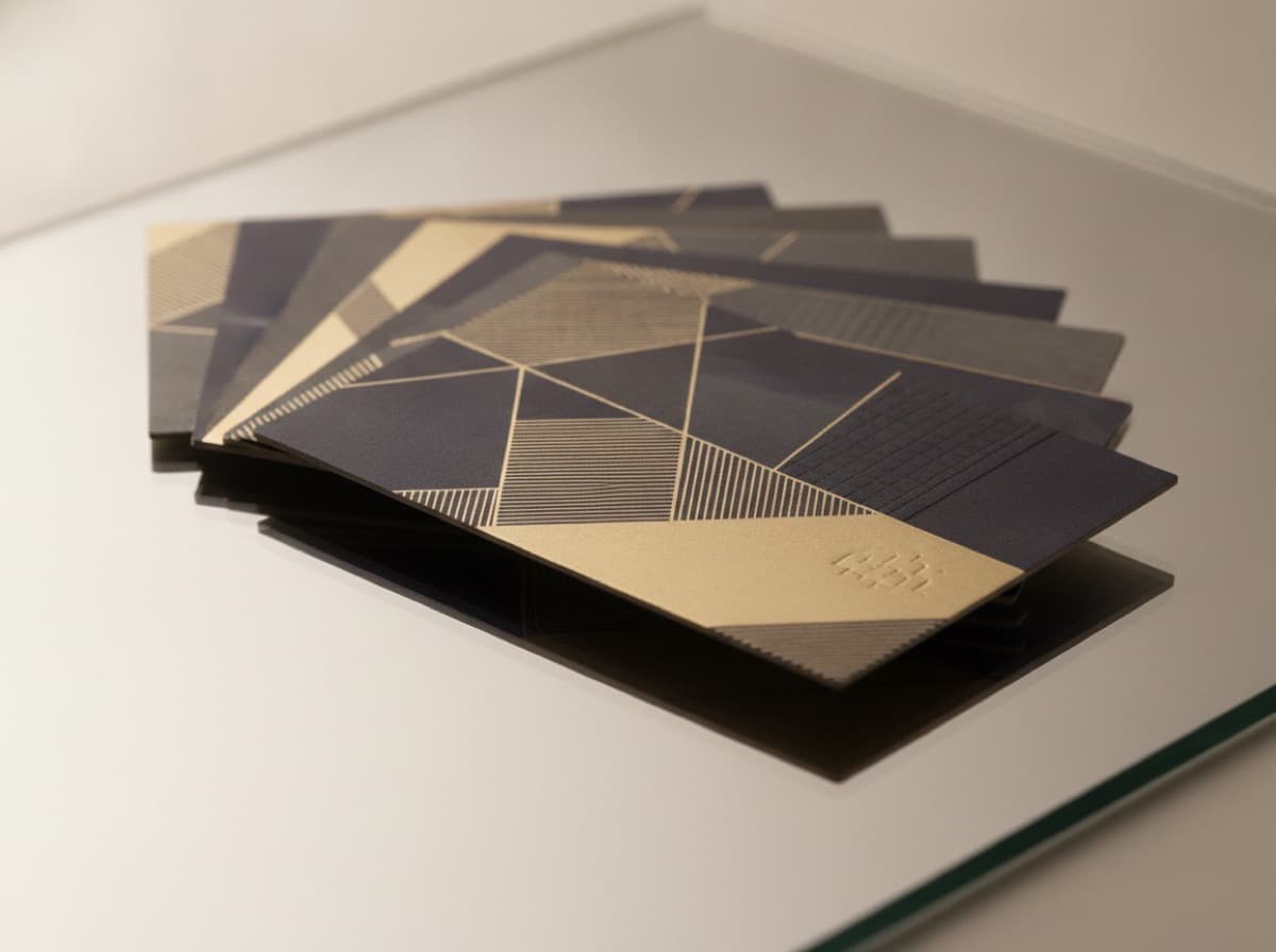
Printing both sides of your business card is one of the highest-value design decisions you can make — doubling your communication space without increasing the card's size or footprint. Most professionals default to a blank or solid-color back, wasting half their card's real estate. A well-designed two-sided card uses the front for identity and the back for depth — credentials, services, portfolio, or a booking QR code that converts card recipients into clients.
The Principle: Front for Identity, Back for Depth
The front of your card should accomplish one thing: immediately communicate who you are and how to reach you. A recipient who glances at the front for three seconds should know your name, your role, your company, and your primary contact method.
The back of your card is where you can develop the relationship — adding the credentials, services, specialties, social proof, or call-to-action that would be too much for the front but matters to someone who wants to know more.
Think of the front as the headline and the back as the supporting story.
What to Put on the Front
Essential Elements (Always Front)
- Your name — the most prominent element; the largest type on the card
- Your title / role — "Architect, AIA" / "Attorney at Law" / "Licensed Realtor"
- Company name — employer or business name
- Logo — your personal brand or company logo
- Primary contact — typically your email address and/or phone number; whichever is your preferred first contact
- Website — if you have one and it's a meaningful asset (not a placeholder)
Secondary Elements (Front — Include if Space and Priority Allow)
- Tagline or one-line value proposition
- City / location (for local service businesses)
- Primary social handle (one, if highly relevant)
What NOT to Put on the Front
- A laundry list of services — this belongs on the back
- Multiple logos — pick one
- Long paragraphs of text — everything must be readable at a glance
What to Put on the Back
The back of your card should serve ONE primary purpose. Choose the back strategy that best fits your profession and business development goals:
Strategy 1: Services / Specialty Menu
List your services or specialties clearly — a scannable bulleted or spaced list that helps recipients understand exactly what you do.
Best for: Consultants, attorneys, agencies, contractors, anyone with multiple distinct services that clients need to understand to evaluate fit.
Example back (general contractor):
Custom home building  |  Additions & remodels
Kitchen & bath  |  ADU construction
Commercial build-out  |  Design-build
Licensed & insured  |  [County] contractor
Licensed General Contractor #[Number]
Strategy 2: Credentials and Certifications
For heavily credentialed professionals, the back is where you list your full credential set, specialty certifications, board memberships, and professional associations.
Best for: Physicians, attorneys, CPAs, engineers, financial advisors — any professional where credentials communicate authority and trust.
Example back (attorney):
J.D., Harvard Law School
California Bar | USDC — Central District
Board Certified — Family Law (CFLS)
ABA | LACBA | State Bar of California
Collaborative Law Certified (IACP)
Free initial consultation
Strategy 3: Portfolio Image
A single stunning visual from your portfolio — especially powerful for visual professions.
Best for: Photographers, interior designers, architects, graphic designers, wedding planners, home stagers, landscapers, florists.
Example: A full-bleed photograph of your best project (the bedroom you staged, the garden you designed, the portrait you shot) with only your website URL and a QR code overlaid.
Design tip: Use a full-bleed image that extends to the bleed boundary. Add the URL or QR in the corner with sufficient contrast (white text on a natural image area, or a semi-transparent panel).
Strategy 4: QR Code and Digital Destination
The back is primarily a QR code with a short label and your digital destination URL.
Best for: Booking-driven businesses, portfolio-heavy creatives, anyone whose digital presence (Instagram, booking page, portfolio) is the primary sales tool.
Example back:
[Large QR code — 1.25" × 1.25"]

Scan to see my work
or book a session

instagram.com/yourhandle
portfolio.yourname.com
Strategy 5: Social Proof / About
A brief, compelling one-paragraph description of your business or a testimonial quote.
Best for: Personal brands, coaches, speakers, consultants where the "who you are" differentiates you.
Example back (executive coach):
I help C-suite executives and founders
communicate with authority, presence,
and clarity — so their ideas get the
traction they deserve.

"[Name] transformed how I present
to my board." — CEO, [Company]

Book a discovery call: [QR]
Strategy 6: The "Nice to Meet You" Page
The back is designed to direct people to a digital landing page specifically created for card recipients.
Example back:
It was great meeting you.

Here's everything you need:
→ Portfolio and case studies
→ Client testimonials
→ Book a 30-minute discovery call

yourname.com/hello
[QR code]
Common Two-Sided Card Mistakes
1. Repeating front content on the back: The back should add information, not repeat your name and phone number.
2. Too much content on the back: The back is more space, not unlimited space. Maintain margins, use hierarchy, don't list 40 services in 6-point type.
3. Mismatched aesthetics: Front and back should feel like one connected design system — same color palette, same typefaces, related visual language.
4. Forgetting the bleed on the back: If the back has a full-bleed color or image, extend to the full bleed boundary (3.75" × 2.25" with bleed) just like the front.
5. Two different logos on front and back: One logo per card. If you need brand reinforcement on the back, use it as a subtle watermark rather than a second full logo.
6. Portrait front + landscape back: If your front is landscape, your back should also be landscape. Never mix orientations.
7. Opposite orientation of text: Both sides should have text reading in the same direction — so the card doesn't need to be flipped 180° to read the back.
Printing Two-Sided Cards
Most professional printers offer two-sided (duplex) printing:
- 4/4 printing — full color both sides (the standard and recommended option)
- 4/1 printing — full color front, black-and-white back (cost savings for simple back designs)
- 4/0 printing — full color front only, blank back
File submission: Most printers want front and back as separate PDF files (labeled "front" and "back") or as a single PDF with two pages (page 1 = front, page 2 = back). Confirm your printer's requirements before submitting.
Registration: For designs with bleeds on both sides, note that registration (alignment between front and back) is not perfect in digital printing. Don't design front and back to depend on precise front-to-back alignment — elements near the edge may not align perfectly.
Checklist
- [ ] Front: name, title, company, logo, primary contact (phone or email), website
- [ ] Back: choose ONE primary strategy (services, credentials, portfolio, QR, social proof)
- [ ] Both sides: same typeface family and color palette
- [ ] Both sides: content inside safe zone (0.125" from trim edge)
- [ ] Both sides: background extends to bleed boundary (0.125" beyond trim)
- [ ] Text reads in the same direction on both sides
- [ ] No front content repeated on back
- [ ] QR code (if included): minimum 1.0" × 1.0" with quiet zone
- [ ] Submitted as 4/4 full color (unless intentionally 4/0 or 4/1)
- [ ] Print proof requested and reviewed before full run
Get 10% off your first order
Join our list for practical printing guides, new finish ideas, and a welcome coupon for your first order.
No spam. Unsubscribe anytime.
Ready to bring this design to life?
Order Premium CardsNot sure which option fits? Ask Pro Card Crafters