Typography and Fonts for Business Cards: A Complete Design Guide
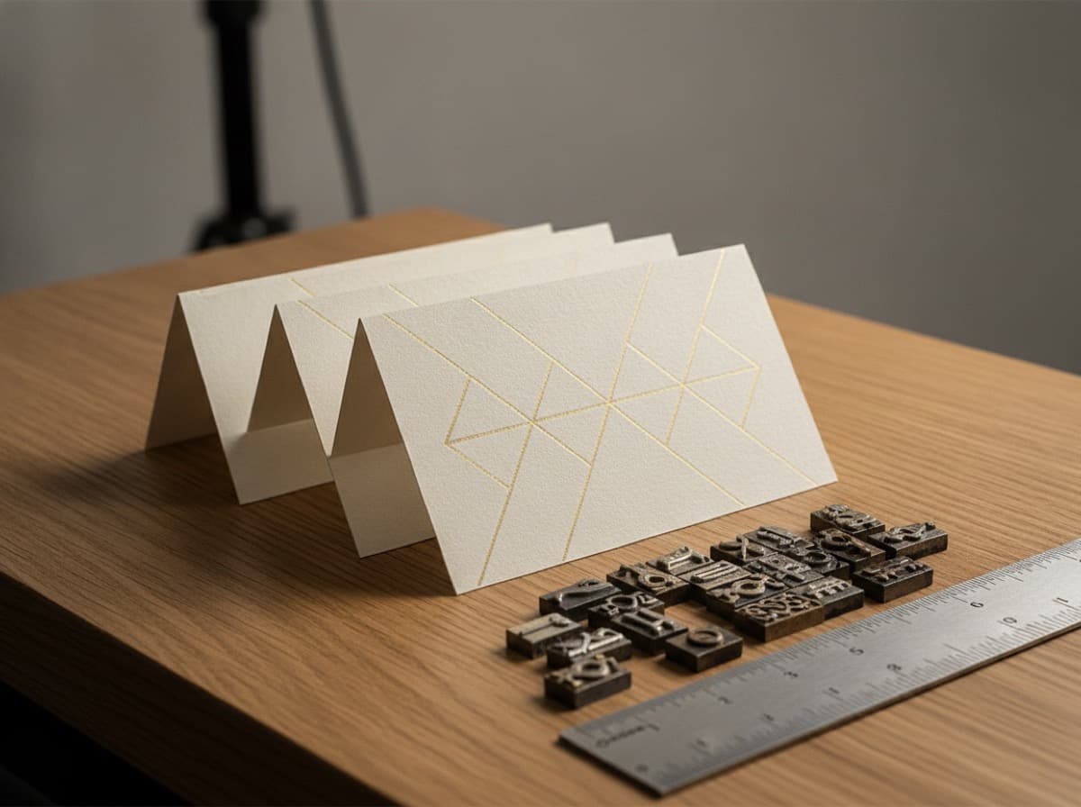
Typography is often the underestimated half of business card design. People notice the layout and color first — but it's the typeface that establishes personality, communicates brand voice, and either makes the card feel confident and intentional or generic and forgettable. More practically: at the small sizes required by business cards (6pt–10pt for body information, 12pt–18pt for names), some typefaces are highly legible and some become unreadable blurs of ink.
The Two Categories: Display vs. Text
Every font you encounter serves one of two primary roles:
Display fonts — designed for large sizes (logos, headlines, signage). They have personality, distinctive letterforms, and often detailed or decorative features that look great at 30pt but become illegible noise at 7pt.
Text fonts — designed for small sizes (books, body text, labels). They prioritize legibility at small scale: open apertures, distinct letterforms (especially for easily confused letters like l/I, O/0), optimized spacing at small sizes.
For business cards: Use a text font for all contact information. Use a display or heading font only for your name (large on the card, where it works). Never use a display font for your phone number or address.
Serif vs. Sans-Serif for Business Cards
Serif typefaces have small strokes (serifs) at the ends of letterforms. They communicate tradition, authority, heritage, and formality.
Best for: Law firms, financial services, medical professionals, heritage brands, academic and editorial contexts, luxury goods, anyone whose brand should feel established and authoritative.
Business card serif examples:
- Garamond — classic Renaissance humanist serif; elegant, editorial
- Times New Roman — newspaper serif; familiar but can feel default
- Caslon — "When in doubt, use Caslon" — classic American serif
- Palatino — warm humanist serif; highly legible at small sizes
- Georgia — designed for screen; also prints well
- Minion Pro (Adobe) — one of the most legible book serifs
- Freight Text — elegant, contemporary editorial serif
- Lyon Text — precise, modern editorial
Sans-serif typefaces have no serifs — clean, modern, geometric or humanist. They communicate modernity, clarity, technology, and directness.
Best for: Tech companies, startups, design studios, creative professionals, healthcare (modern clinical), finance (contemporary), any brand positioning as modern or forward-thinking.
Business card sans examples:
- Helvetica Neue — the most neutral, Swiss modernist sans
- Futura — geometric, Bauhaus, modernist authority
- Gill Sans — humanist British sans; warm but still professional
- Univers — systematic, neutral, highly legible
- Myriad Pro (Adobe) — clean, humanist, very legible at small sizes
- Inter — designed for UI; exceptional small-size legibility
- Brandon Grotesque — geometric with warmth; popular in branding
- Proxima Nova — workhorse modern sans; versatile
- Aktiv Grotesk — Helvetica-adjacent without Helvetica's licensing issues
- Neue Haas Grotesk — the authorized digital revival of the original Helvetica
Font Weight
Business cards typically use two weights at most — one for emphasis (name, important info) and one for secondary info:
- Regular or Book weight — for body information (phone, email, address, title)
- Semibold or Bold weight — for your name (the hierarchy anchor)
Avoid: Very thin weights (Light, Thin, Hairline) at small sizes — strokes become invisible at 6–8pt when printed. Light weight ≠ elegant at small print sizes. It reads as thin and weak, and the strokes can break down in printing.
Use: Regular, Book, or Medium as your minimum weight for anything under 9pt.
Minimum Sizes for Legibility
Business cards are printed at small physical dimensions — 3.5" × 2" — and the text is viewed at arm's length. These are practical minimums for different text roles:
| Text Type | Minimum Size | Recommended | |-----------|-------------|-------------| | Name (primary) | 12pt | 14–18pt | | Title / Company | 9pt | 10–11pt | | Contact info (phone, email) | 7pt | 8–9pt | | URL | 7pt | 8pt | | Address | 6pt | 7–8pt | | Fine print / license # | 5.5pt | 6–7pt |
Note: These sizes apply to standard-weight fonts (Regular/Book). If you use Light weight, add 1–2pt. If you print white text on dark background (reversed out), add 1–2pt — reversed-out type requires more size to hold its weight at small scale.
Font Pairing
Most professional business cards use one to two typefaces — a headline font for the name and a body font for contact details:
Classic pairings:
- Garamond (name) + Garamond (contact) — one-font approach; refined restraint
- Futura Bold (name) + Futura Regular (contact) — geometric consistency
- Playfair Display (name) + Lato (contact) — display serif + humanist sans
- Montserrat Bold (name) + Montserrat Regular (contact) — geometric one-font
- Caslon (name) + Gill Sans (contact) — classic serif meets British humanist sans
Rules for pairing:
- Don't combine two serifs or two sans-serifs that are similar weights and size — they compete rather than contrast
- Pair by contrast: serif + sans, or same family different weights
- Limit to TWO typefaces — three is almost always too many for a 3.5" × 2" card
- Ensure both fonts have the character sets you need (accents, special characters if your name or words require them)
White Space and Letter Spacing
Tracking (letter spacing): Adding slight positive tracking (0.5–2pt) to all-caps or small-caps text improves legibility. Negative tracking (too tight) at small sizes causes letters to run together.
Line spacing (leading): For stacked contact information lines, slightly more leading than the default (120–140% of point size) reduces crowding and makes scanning faster.
White space: The most important typographic decision on a business card is how much breathing room you give your text. Overcrowded cards feel cheap. Confident cards have generous margins and don't try to fill every corner.
Common Typography Mistakes
1. Too many fonts — Three or four typefaces on a 3.5" × 2" card creates chaos. One or two is the rule.
2. Font too light for small print — Thin and ExtraLight weights below 9pt disappear or break up in printing. Use Regular or Medium minimum.
3. Font too decorative for contact info — Script and calligraphy fonts for phone numbers and email addresses are almost always illegible at print sizes. Reserve decorative fonts for your name at large sizes only.
4. All caps with tight tracking — ALLCAPS without sufficient letter spacing creates letter-jumble. If using all-caps, track out by +50–100 units.
5. Too small for the information — Trying to fit too much information by reducing type size below 6pt is always wrong. Cut the information before you cut the font size below 6pt.
6. Reversed-out light weight — White text on dark background in a Light or Thin weight becomes invisible. Use Regular minimum for reversed-out white text.
7. Script fonts for credentials — Credentials and certifications (MD, ABIM, CPA) must be legible to be credible. Never put credentials in a script typeface.
8. Generic fonts — Times New Roman and Arial are installed on every computer and read as "default" — as if you made no choice at all. Choose intentionally, even if the choice is a close relative.
Practical Resources
Free fonts for professional cards:
- Inter — free, excellent small-size sans
- Source Serif Pro / Source Sans Pro (Adobe) — free, complementary pair
- Lato — humanist sans, free, widely used
- Libre Baskerville — free, Baskerville-inspired
- EB Garamond — free, Garamond-inspired
Premium font sources:
- Adobe Fonts (included with Creative Cloud)
- Google Fonts (free, web-first but many print well)
- Fonts In Use — real-world font usage examples for inspiration
- MyFonts.com — large commercial font catalog
Checklist Before Printing
- [ ] Name at 12pt+ (14–18pt recommended)
- [ ] All contact info at 7pt+ (8–9pt recommended)
- [ ] No font below 6pt for any text
- [ ] Maximum two typefaces
- [ ] Regular or Medium weight minimum (no Thin/Light at small sizes)
- [ ] Reversed-out text in Regular weight minimum
- [ ] Decorative/script fonts only at large name size, not contact info
- [ ] Sufficient letter spacing (tracking) on all-caps text
- [ ] White space preserved — not everything needs to fill
- [ ] Test print a proof before final order
Get 10% off your first order
Join our list for practical printing guides, new finish ideas, and a welcome coupon for your first order.
No spam. Unsubscribe anytime.
Ready to bring this design to life?
Order Premium CardsNot sure which option fits? Ask Pro Card Crafters