Typography Guide for Business Cards: Choosing and Using Fonts Effectively
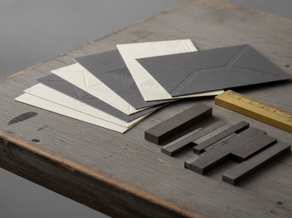
Typography is the most overlooked element of business card design — and the most revealing. Before a client reads your name, their visual cortex has processed your font choices and formed an unconscious opinion about your professionalism and taste.
This guide explains how to choose, size, and combine fonts for business cards that communicate exactly what you intend.
The Font Hierarchy on a Business Card
A business card typically has three levels of information, each requiring different typographic treatment:
Level 1: Your Name The most important element. Largest, most prominent. Should be immediately readable from arm's length.
Level 2: Title and Contact Info Secondary information. Readable but not competing with your name.
Level 3: Supplementary Details Website, social handles, specialty details. Smaller but still legible.
This three-level hierarchy should be visible and clear. A card where all text is the same size has no hierarchy — the eye doesn't know where to start.
Font Categories and What They Communicate
Serif Fonts
Serifs are the small strokes at the ends of letterforms. Serif fonts feel:
- Traditional, authoritative, established
- Academic and institutional
- Literary and editorial
- Classic and timeless
Professional uses: Law firms, traditional finance, academia, medicine, publishing, heritage brands
Examples: Times New Roman (overused), Garamond (elegant), Baskerville (classic authority), Georgia (readable), Playfair Display (editorial), EB Garamond (refined)
Sans-Serif Fonts
No strokes at letterform ends. Sans-serif fonts feel:
- Modern, clean, accessible
- Technology-appropriate
- Contemporary, forward-looking
- Functional and efficient
Professional uses: Technology, startups, design, modern professional services, healthcare (modern approach), food and lifestyle brands
Examples: Helvetica (design authority), Futura (geometric modernism), Gill Sans (British authority), Inter (digital-first), Montserrat (friendly modern), Source Sans (open-source, readable)
Script and Handwritten Fonts
Mimic handwriting or calligraphy. Script fonts feel:
- Personal and intimate
- Creative and expressive
- Feminine or romantic (most scripts)
- Artisanal and craft-oriented
Professional uses: Wedding vendors, beauty and spa, food and bakery, artistic/craft businesses, certain wellness professions
Common mistake: Script fonts used at small sizes become illegible. If you use a script font, use it large (your name, a tagline) and test readability in print.
Display Fonts
Designed for headlines and large type, not body text. Highly varied in style.
Professional uses: Branding elements, taglines, name treatments where impact is more important than neutrality
Warning: Display fonts used at small sizes or for body copy are a frequent amateur mistake. Reserve for large-type elements only.
Minimum Size Requirements
Business cards are small. Type that looks readable on your screen may become illegible in print.
Minimum font sizes for business cards:
- Primary name: 12-18pt
- Title/company: 9-11pt
- Contact details (email, phone, address): 8-10pt
- Secondary information, taglines: 7-9pt
Never go below 7pt. Even at 7pt, legibility depends on font choice and contrast.
Special cases:
- Very light-weight fonts need to be larger to maintain legibility
- Reversed text (white on dark) should be 1-2pt larger than standard
- Condensed fonts can be sized slightly smaller and still read
Font Pairing Principles
Using two different fonts (a pair) adds visual interest and hierarchy. Using more than two usually creates chaos.
The classic pairing pattern:
- Serif for name/headline + Sans-serif for details
- Or Sans-serif for name + Serif for tagline/specialty
Rules for successful pairing:
- Contrast, don't conflict: Choose fonts that are clearly different (a geometric sans with a calligraphic serif) rather than similar (two modern sans-serifs that look almost identical)
- Same source: Fonts from the same type family or foundry usually pair well (Google Fonts lists font pairings)
- Share proportions: Fonts with similar x-height and proportions pair harmoniously
- One serif, one sans: The most reliable combination
Font pairs that work on business cards:
- Playfair Display + Source Sans Pro
- Montserrat + Merriweather
- Raleway + Lato
- Libre Baskerville + Libre Franklin
- EB Garamond + Nunito
Spacing and Tracking
Spacing between letters (tracking/letter-spacing) affects how professional type looks:
Too tight: Letterforms compete. Especially problematic with all-caps headings. Too loose: Letters seem to float, unrelated. Common amateur mistake with open tracking. Just right: Letters relate comfortably. Determined visually, not by arbitrary numbers.
When to add tracking:
- All-caps text typically needs some tracking (+100 to +200 tracking units)
- Very large type often needs reduced tracking (tighter)
- Very small type may benefit from slightly open tracking for legibility
Common Typography Mistakes
Using Two Similar Sans-Serif Fonts
The fonts aren't different enough to create hierarchy — they just look like an inconsistent mess. Pick one sans-serif and use weight variation (light, regular, bold) for hierarchy instead.
Using a Script Font for Your Name at Small Size
Test legibility. If someone can't read your name easily in 5 seconds in moderate lighting, redesign.
Default Tracking on All-Caps Text
All-caps with default tracking (no tracking adjustment) looks cramped. Always add 50-150 tracking units to all-caps type.
Too Many Fonts
One or two typeface families. No more. Every additional typeface reduces cohesion.
Font From a Limited Source
Using default system fonts (Calibri, Arial, Times New Roman) signals lack of design attention. There are thousands of professional-quality free fonts on Google Fonts alone.
Recommended Free Fonts for Business Cards
Available free on Google Fonts:
| Font | Category | Tone | |---|---|---| | Playfair Display | Serif | Elegant, editorial | | EB Garamond | Serif | Classic, refined | | Libre Baskerville | Serif | Traditional authority | | Montserrat | Sans-Serif | Modern, friendly | | Inter | Sans-Serif | Digital-native, clean | | Raleway | Sans-Serif | Elegant sans | | Josefin Sans | Sans-Serif | Geometric, stylish | | Cormorant Garamond | Serif | Luxury, fashion | | Nunito | Sans-Serif | Rounded, warm | | Lato | Sans-Serif | Humanist, versatile |
Quick Decision Framework
| Industry | Recommended Font Style | |---|---| | Law, Finance, Medicine | Traditional serif (Garamond, Baskerville) | | Technology, Startup | Modern sans-serif (Inter, Montserrat) | | Creative, Design | Distinctive display + clean sans pairing | | Wedding, Luxury Events | Elegant serif or calligraphy (Cormorant, Playfair) | | Health, Wellness | Humanist sans (Lato, Nunito, Raleway) | | Trades, Contractors | Bold, strong sans (Montserrat Bold, Raleway Bold) | | Beauty, Nail, Spa | Elegant or script for name, clean sans for details | | Food, Restaurant | Varies by concept — match the cuisine aesthetic |
Get 10% off your first order
Join our list for practical printing guides, new finish ideas, and a welcome coupon for your first order.
No spam. Unsubscribe anytime.
Ready to bring this design to life?
Order Premium CardsNot sure which option fits? Ask Pro Card Crafters