White Space in Business Card Design: Why Less Really Is More
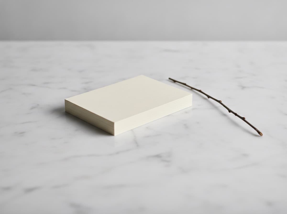
When people design their first business card, they often try to include everything: name, title, email, phone, website, two social handles, a tagline, and the logo twice. The result is a card no one reads.
The most effective business cards — the ones people hold onto — almost always have one thing in common: breathing room.
What white space does
White space (also called negative space) isn't wasted space. It's functional space that:
- Guides the eye toward what matters
- Signals confidence — brands that don't need to fill every inch
- Improves readability — text surrounded by space is easier to scan than text packed in tightly
- Feels premium — crowded = cheap, spacious = considered
The 60/40 rule as a starting point
A rough guideline: aim for no more than 40% of the card surface to be occupied by ink or content. The remaining 60% is white space. This isn't a law — it's a check against overcrowding.
If you're laying out a card and the 60/40 check feels impossible with all the information you want to include, that's a signal to cut, not to shrink.
What to cut
- Redundant titles — if your name says "Dr.," your title doesn't need to say "Physician"
- Multiple phone numbers — give one; let people text or call it
- Every social platform — include the one channel you respond to
- Your full mailing address — only if you don't need walk-in clients to find you
- The company tagline — is it essential? Does it help the person holding the card?
How to create white space intentionally
- Use larger margins than you think you need — at least 5mm from the trim line, more if the design allows
- Increase leading (line spacing) in contact blocks
- Group related elements and leave clear separation between groups
- Let the logo breathe — don't butt it against the text block
The back of the card
The back is often either completely blank or completely overcrowded. Both are missed opportunities.
A single, strong element on the back — your logo, a tagline, a pattern, a QR code with one destination — uses white space effectively and gives the card a clear front/back identity.
The goal isn't an empty card. It's a card where every element has room to be seen.
Get 10% off your first order
Join our list for practical printing guides, new finish ideas, and a welcome coupon for your first order.
No spam. Unsubscribe anytime.
Ready to bring this design to life?
Order Premium CardsNot sure which option fits? Ask Pro Card Crafters