White Space in Business Card Design: Why Less Is More on a 3.5" × 2" Card
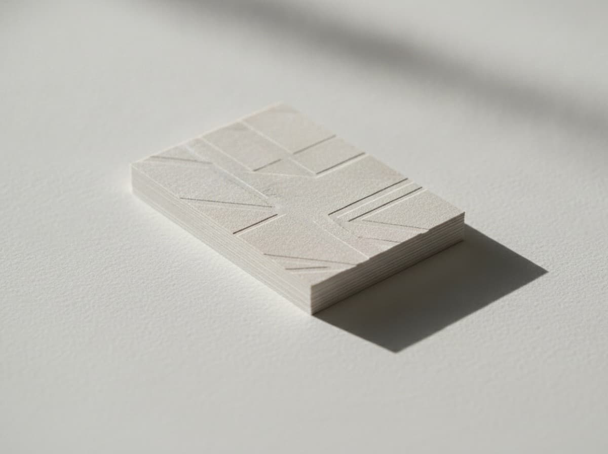
White space — the empty area around, between, and within design elements — is not wasted space on a business card. It's strategic breathing room that guides the reader's eye, creates hierarchy, and communicates a quality and confidence that cluttered designs can't achieve. Understanding white space is the difference between a card that looks homemade and one that looks designed.
What Is White Space?
White space (also called negative space) is the portion of a design that is left unmarked — empty margins, space between text lines (leading), space between letters (tracking/kerning), and the areas around design elements that aren't filled with content.
White space is not the background. It's not necessarily white, and it doesn't require a white card. Even a black card with dark text has negative space — it's the areas of black around the text and between elements.
White space creates visual weight balance. Design elements gain visual weight and emphasis from the space around them. A name in a large, airy font with plenty of surrounding space feels more important and authoritative than the same name crowded by a dense list of services and credentials.
Why White Space Matters on Business Cards
Business cards are small — 3.5" × 2". That limited space is both a challenge and a forcing function for good design. Many people respond to limited space by trying to fill it: cramming in more information, reducing font sizes to fit more text, using every inch of the card.
The result is a card that does less, not more. Information overload causes the reader's eye to skip or skim — and when everything is equally prominent, nothing is. You've paid for a design and printing, and the card communicates less than a card with half the content would.
The professional response to limited space is to make choices. What are the two or three things that matter most on this card? What can go on the back? What can be communicated via QR code rather than text? What information is NOT necessary on a business card?
The Three Types of White Space on Business Cards
Macro White Space (Overall Margins)
The space between the content area and the card edges. Standard safe zone guidance is 0.125" from the edge — the content-free zone required by print trimming tolerance. But many excellent cards have interior margins of 0.25" or more.
Generous margins feel premium. Look at business cards from luxury brands, law firms, and design studios — the margins are often substantial. The content "floats" in space rather than pressing against the edges.
Tight margins feel budget. Content that crowds the card edge signals that either the designer didn't know about safe zones, or every possible inch had to be used because there wasn't enough discipline to cut content.
Micro White Space (Between Elements)
The space between specific design elements — between your name and title, between the title and contact information, between different items in a contact list.
Micro white space creates grouping and hierarchy:
- Related items close together (company name + title)
- Unrelated items with more space between them (name block vs. contact block)
- The reader reads the closeness as meaning: "these things belong together"
If every element is equally spaced, the reader can't tell what belongs with what.
Active White Space (Intentional Empty Areas)
Sometimes a designer intentionally creates a large empty area on the card as a design element — a quadrant of pure color, a blank zone that creates visual tension. This is active (or dynamic) white space.
Active white space signals confidence: "I chose to leave this area empty because the card doesn't need anything here." Luxury brands do this constantly. It's harder to execute well than filling the space, which is why it signals expertise.
How to Create More White Space on Your Card
Step 1: Audit Your Content
Ask for each element on your card:
- Does this go on every card, or does it belong on a specialty version?
- Is this something people actually call me for, or is it just padding?
- Can this go on the back?
- Can this be expressed as a QR link rather than text?
Remove everything that doesn't directly serve the card's single most important goal.
Step 2: Increase Your Margins
Start by increasing your content area margins to 0.25"–0.35" from each edge. See if the content still fits. If it does, you probably had too much breathing room lost to the edges.
Step 3: Increase Leading (Line Spacing)
Leading — the space between lines of text — is a simple way to add elegance and breathing room within a text block. Tight leading (100-110% of type size) feels dense. Generous leading (130-150%) feels refined.
Step 4: Use Weight and Size Instead of Density
Instead of adding more text to communicate more, use typographic weight (bold vs. regular) and size differences to create hierarchy within fewer elements. A name in 20pt bold communicates more authority than the same name in 12pt surrounded by credentials.
Step 5: Let One Element Breathe
Identify the most important element on your card — usually your name — and give it more surrounding space than anything else. Compress or move other elements to give that one thing room. The reader will find it immediately.
What White Space Communicates About Your Brand
- Luxury and premium: High-end brands use generous white space to signal exclusivity. The space says: "We don't need to fill every inch — our brand is confident."
- Precision and expertise: Technical professionals (surgeons, architects, engineers) who use well-structured white space communicate that they can identify the essential and discard the irrelevant.
- Modernity: Minimal, well-spaced designs feel contemporary. Dense, filled-in designs can feel dated.
- Confidence: There's inherent confidence in using less. It says you trust the reader to come to you if they want more.
White Space and Print Cost
A common concern: "If I'm paying per card, shouldn't I fill every inch?" No. The communication value of a well-designed card with appropriate white space dramatically outperforms a cluttered card on the same paper. The return on investment isn't in the number of words per card — it's in how the card makes the recipient feel about you.
The goal of a business card is to be kept, not discarded — to create an impression that makes someone want to reach out. White space serves that goal better than maximum text density.
Get 10% off your first order
Join our list for practical printing guides, new finish ideas, and a welcome coupon for your first order.
No spam. Unsubscribe anytime.
Ready to bring this design to life?
Order Premium CardsNot sure which option fits? Ask Pro Card Crafters