Business Card Color Guide: CMYK, Pantone, RGB and How to Get Accurate Color in Print
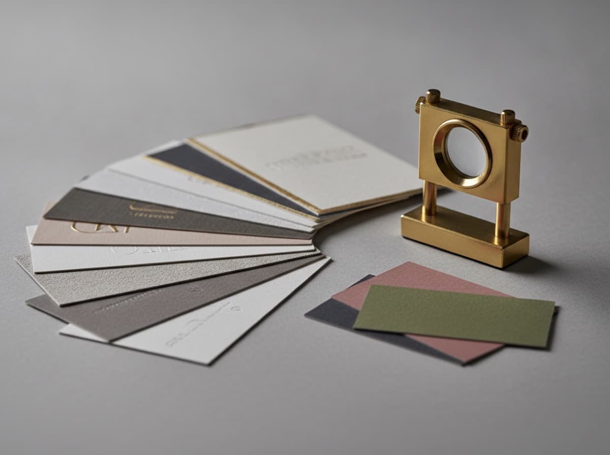
Color accuracy is the most common technical disappointment in business card printing. The color you see on your screen is produced by light (additive color); the color printed on your card is produced by ink on paper (subtractive color). These are fundamentally different systems, and colors that look vibrant and accurate on screen can appear different — sometimes dramatically so — when printed. Understanding the color systems, designing with print accuracy in mind, and proofing before printing are the three steps to consistently achieving the color results you intend.
The Three Color Systems in Business Card Design
RGB: Screen Color (Not for Print)
RGB (Red, Green, Blue) is the color system used by screens — monitors, phones, tablets, and projectors. RGB colors are created by combining intensities of red, green, and blue light. RGB has a very wide color gamut — it can display vivid neons, electric blues, and saturated colors that don't exist in the physical printing world.
Where you encounter RGB:
- All screen design software defaults
- Web and social media graphics
- Phone photography
- Stock photo files
The problem with RGB for print: Commercial printing uses ink on paper — not light. The RGB color gamut (the range of colors it can display) is significantly larger than the CMYK print gamut. Colors that exist only in RGB have no CMYK equivalent — they will shift when converted.
The most common RGB-to-print surprises:
- Neon/fluorescent colors: these simply don't exist in CMYK; they print as muted
- Extremely bright, saturated oranges: may print darker or warmer
- Electric blues: may print differently than displayed
- Colors that look different between monitors: what looks correct on your laptop might look different on the print shop's calibrated monitor
CMYK: Print Color (The Standard)
CMYK (Cyan, Magenta, Yellow, Black) is the color system used by commercial offset and digital printers. Ink colors are expressed as percentages: C (cyan), M (magenta), Y (yellow), K (black), each ranging from 0–100%.
CMYK examples:
- Navy blue: approximately C:100 M:80 Y:0 K:30 (or C:90 M:70 Y:10 K:40 depending on the specific shade)
- Warm red: C:0 M:90 Y:80 K:0
- Forest green: C:85 M:20 Y:80 K:20
- Rich black (full black): C:60 M:40 Y:40 K:100 (more saturated than K:100 alone)
- Warm gold/yellow: C:0 M:20 Y:90 K:0
Always design in CMYK for print:
- In Adobe Illustrator: File → Document Color Mode → CMYK
- In Adobe Photoshop: Image → Mode → CMYK Color
- In InDesign: Document Setup → Intent → Print (defaults to CMYK)
- Check any placed images: they must be CMYK, not RGB
Pantone / Spot Colors: Exact Color Matching
Pantone Matching System (PMS) is a standardized color system where each Pantone color has a unique formula made from premixed inks — not mixed on press from CMYK. This produces exact, consistent color regardless of which press prints the job.
Pantone designations:
- Pantone Solid Coated (C): Pantone solid coated — e.g., "PMS 485 C" (a vivid red); for coated paper stocks (glossy or matte laminated)
- Pantone Solid Uncoated (U): Same Pantone formula, but printed on uncoated paper; looks notably different than Coated because uncoated paper absorbs more ink; always specify U for uncoated stocks
- Pantone CMYK: Pantone has a separate CMYK Pantone system for digital printing
When to use Pantone:
- When color consistency across multiple print runs is critical (brand standards, identity design)
- When a specific color cannot be accurately reproduced in CMYK (some bright oranges, specific brand blues and greens)
- On 2-color or 1-color designs where exact color is critical
Pantone on business cards:
- Only available at printers offering spot color printing (not all digital printers offer Pantone spot color)
- Typically higher cost than standard 4-color CMYK
- Each Pantone adds to cost; a 1-color Pantone card (black + 1 PMS color) = 2-color printing
Converting Colors: Common Mistakes and Solutions
RGB to CMYK Conversion
When you design in RGB and convert to CMYK (or when Photoshop converts for you), colors shift — sometimes subtly, sometimes dramatically. The shift is caused by the CMYK gamut being smaller than RGB.
How to convert accurately:
- In Photoshop: Image → Mode → CMYK Color; use a standard CMYK profile (US Web Coated SWOP v2 or Coated GRACoL 2006 depending on your printer's specification)
- After conversion: visually check the image; certain colors will shift; adjust sliders in CMYK mode if needed
- Do NOT convert to CMYK and back to RGB for editing — multiple conversions cause color degradation
Colors most affected by RGB-to-CMYK conversion:
- Vivid cyan/turquoise: RGB cyan is more saturated than CMYK can produce
- Vivid orange: RGB brilliant orange shifts in CMYK
- Neons: simply fall outside CMYK gamut; print as muted versions
- Bright blue (electric blue): depends on specific shade; some shift dramatically
Solution for brand colors: If you have an established brand color, define it in both RGB (for screen use) and CMYK (for print) and use each in its appropriate context — don't convert between them; maintain the two values independently.
Designing a Business Card Color Palette for Print
Selecting print-safe colors:
- Design in CMYK mode from the start (not RGB → convert)
- Use the CMYK color picker in Illustrator or Photoshop; avoid out-of-gamut indicators
- Reference a Pantone color fan if your printer supports Pantone and you need exact color
- Print a test sample before ordering the full quantity
Rich black vs. pure black:
- Pure black (K:100): On large solid areas (dark cards), K:100 alone can look thin or slightly gray
- Rich black (C:60 M:40 Y:40 K:100 or similar): Adds CMY to black ink for a denser, more saturated black; ideal for full-bleed dark card backgrounds
- Caution on small text: Rich black on very small text can cause slight misregistration-induced color fringing; use K:100 for small text, reserve rich black for large backgrounds
White:
- White in commercial printing = no ink (the paper itself is "white")
- Paper white differs from monitor white; uncoated papers are warmer cream-white; coated papers are brighter white
- For maximum whiteness: coated (C2S) paper stock
Proofing: The Critical Step Before Full Print Run
Soft proof (on-screen proof):
- View your file on a calibrated monitor with appropriate color profile applied
- In Photoshop: View → Proof Colors (uses the document's embedded ICC profile)
- This gives a screen preview of how CMYK will print; better than raw screen view, but not a substitute for a physical proof
Digital print proof (hard proof):
- A physical output of your file from the same printing system you'll use for production
- For online printers: order a single card or small quantity as a proof before ordering the full run
- Check the proof under consistent lighting (ideally a D50 lightbox if available)
Physical press proof (highest accuracy):
- A full-fidelity physical proof from the same press and stock as production
- Most accurate but expensive; typically used for offset press jobs, not for standard digital business card printing
Color Recommendations by Card Type
Dark card (navy, black, charcoal background):
- Use rich black for dark backgrounds (C:60 M:40 Y:40 K:100)
- White text and graphics will be bright against the dark ground
- Proof the physical sample; dark-card color shifts can be surprising
Colorful full-bleed backgrounds:
- Convert all RGB to CMYK before designing (or design in CMYK throughout)
- Proof before the full run; vibrant colors are most likely to shift
- If the color is brand-critical, specify Pantone instead of CMYK
Logo color matching:
- If your logo has defined Pantone values (most brand standards do), use those values to generate the CMYK equivalent
- Pantone Bridge book shows CMYK equivalent of each Pantone color; use this to set your CMYK values for digital printing
Summary Checklist
- [ ] Design in CMYK color mode throughout (File → Document Color Mode → CMYK in Illustrator)
- [ ] All placed images in CMYK (not RGB); check in the Links panel
- [ ] Define brand colors in CMYK explicitly — don't convert from RGB
- [ ] Use rich black for large dark backgrounds (C:60 M:40 Y:40 K:100)
- [ ] Use K:100 only for small text and thin lines
- [ ] If specifying Pantone: use Coated (C) for coated stocks, Uncoated (U) for uncoated
- [ ] Avoid out-of-gamut colors (Illustrator flags these with a warning triangle)
- [ ] Order a physical proof before full print run
- [ ] Proof the physical card under consistent lighting
- [ ] Use a calibrated monitor and ICC profile for soft proofing
- [ ] Compare paper color (warm uncoated vs. bright coated) to your design expectations
Get 10% off your first order
Join our list for practical printing guides, new finish ideas, and a welcome coupon for your first order.
No spam. Unsubscribe anytime.
Ready to put these tips into print?
Order Business CardsNot sure which option fits? Ask Pro Card Crafters