CMYK vs. RGB for Business Cards: Why Color Mode Matters for Print Quality
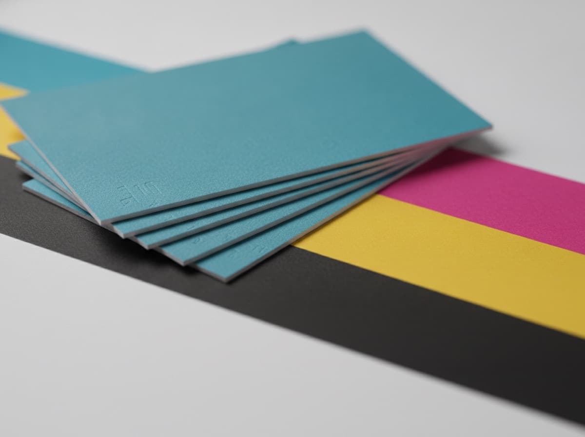
The most common cause of unexpected color in printed business cards is a simple one: designing in RGB color mode and printing in CMYK without understanding what changes. Colors that look vibrant on screen — a royal blue, a bright orange, a rich teal — can appear muted, shifted, or flat after printing.
This guide explains why CMYK matters and how to set up your files to get the color you expect.
How Screen and Print Color Work Differently
Screen color (RGB): Monitors display color by emitting red, green, and blue light. Mixing all three at maximum produces white (additive color). Your computer screen can display an enormous range of colors, including vibrant electric blues, neon greens, and highly saturated colors that exist only in light.
Print color (CMYK): Commercial printers apply four inks: Cyan, Magenta, Yellow, and Black (called Key). Mixing inks absorbs rather than emits light (subtractive color). Mixing all four inks at maximum produces black (approximately). The CMYK color gamut — the range of colors achievable — is significantly smaller than the RGB gamut.
The practical consequence: Some colors you can see and design on screen cannot be reproduced in print. When an RGB design is converted to CMYK for printing, colors outside the CMYK gamut are shifted to the nearest printable equivalent. The result is sometimes acceptable; sometimes it's dramatically different from what you saw on screen.
Colors That Shift Most in RGB → CMYK Conversion
Electric Blue and Royal Blue
Blue is the most notorious problem color in print. A bright RGB royal blue (R: 68, G: 114, B: 196 / hex #4472C4) prints significantly more muted and purple-shifted than it appears on screen. Many designers are disappointed by how "dull" their blue logo looks on printed cards.
What happens: The vibrant screen blue is outside the CMYK gamut. The conversion shifts it toward the cyan-blue range achievable with ink.
Fix: Design your blue directly in CMYK values. A clean process blue: C: 100, M: 60, Y: 0, K: 10. Test with a physical proof.
Neon and Fluorescent Colors
Electric greens, neon oranges, hot pinks — these colors exist because light can be mixed to produce them. Print inks can't reproduce them. Converting them to CMYK produces noticeably less vibrant equivalents.
Fix: If vibrant impact is critical, use a Pantone spot color (not CMYK four-color process). Pantone inks are premixed to specific formulas and can produce colors outside the CMYK gamut.
Bright Orange
Oranges and warm reds designed in RGB often shift to a browner or more muted tone in CMYK. The CMYK equivalent of a bright RGB orange is a good approximation but rarely identical.
Fix: Test your orange in CMYK mode before finalizing. C: 0, M: 50, Y: 100, K: 0 is a clean, printable orange.
Rich Greens
Vibrant greens designed in RGB (especially lime greens and electric teals) can shift to more muted tones. CMYK-safe greens use cyan heavily rather than the green channel available only in RGB.
Deep Blacks
Screen black (R: 0, G: 0, B: 0) converts to a single-ink CMYK black (C: 0, M: 0, Y: 0, K: 100). On printed cards, especially on large filled areas, this single-ink black can look slightly gray or cold compared to a "rich black" formulation.
Rich black for large background fills:
- Standard: C: 60, M: 40, Y: 40, K: 100
- Alternative: C: 0, M: 0, Y: 0, K: 100 (for text — too thin for large areas)
- Important: Never use rich black on small text (under 18pt) — the ink layers can misalign and create blurry type.
Setting Up Your Document in CMYK From the Start
The correct approach: design in CMYK from the beginning, not convert at the end.
Adobe Illustrator
File > New > Color Mode: CMYK Color
If you have an existing RGB document: File > Document Color Mode > CMYK Color (This converts the document but may not update individual objects' colors to CMYK equivalents — you may need to update individual elements.)
Adobe InDesign
File > New > Intent: Print (selects CMYK automatically) Or: Edit > Color Settings > Working Spaces > CMYK: "U.S. Web Coated (SWOP) v2" (common US print standard)
Adobe Photoshop
Image > Mode > CMYK Color (Convert before designing, or convert at save time and examine carefully for shifts)
Canva
Canva works in RGB internally. For business card printing, Canva's print service handles CMYK conversion. For professional print shops, note that Canva files downloaded as "PDF Print" are converted by Canva to CMYK — but you can't control exact CMYK values in Canva.
Checking Colors in CMYK
Using Illustrator or InDesign
Open the Color panel (Window > Color). Toggle between RGB and CMYK display to see your values. Every color should show CMYK values, not RGB values.
Out-of-Gamut Warning in Photoshop
View > Gamut Warning (Shift + Ctrl/Cmd + Y) — shows colors in your document that are out of the CMYK printable range, highlighted in gray. Adjust these colors before printing.
View > Proof Colors (Ctrl/Cmd + Y) — shows a soft proof of how your design will look when converted to CMYK. This is the most useful preview before printing.
Common Mistakes to Avoid
1. Converting at export, not while designing Designing in RGB and converting to CMYK when exporting to PDF is the worst time to discover color problems. The conversion happens without your input, and you can't review the result.
2. Using RGB blacks for large areas RGB black (R: 0, G: 0, B: 0) converts to single-ink K: 100. For large filled backgrounds, use a rich black formula for deeper, more even coverage.
3. Trusting only screen preview Screen colors look different from printed colors even when your file is in CMYK. Order a printed proof before running a full quantity.
4. Using profile-specific CMYK without knowing the press Different presses use different CMYK profiles. "U.S. Web Coated (SWOP) v2" is a safe generic US standard. If your printer specifies a different profile, use theirs.
5. Assuming Pantone colors print correctly in CMYK If you designed with Pantone spot colors, those colors are specified for single-ink printing. When they convert to CMYK four-color process, they may not match the Pantone standard. Order a proof if color accuracy matters.
The Best Way to Get Accurate Color
- Design in CMYK from the start — use CMYK document mode
- Specify all colors as CMYK values — not Pantone, not RGB, not hex
- Use a physical proof before your full run — most quality printers offer proofs; the cost is worth it
- Compare the proof to your screen on a calibrated monitor — uncalibrated monitors are notoriously inaccurate
- Adjust CMYK values until the proof matches your intent, then run the full quantity
CMYK Values for Common Business Card Colors
| Color | CMYK | Notes | |---|---|---| | Process blue | C: 100, M: 50, Y: 0, K: 0 | Clean, vibrant blue | | Navy blue | C: 100, M: 80, Y: 30, K: 20 | Deep, conservative navy | | Forest green | C: 80, M: 30, Y: 80, K: 10 | Rich, saturated green | | Warm red | C: 0, M: 90, Y: 80, K: 0 | Classic red | | Orange | C: 0, M: 50, Y: 100, K: 0 | Bright orange | | Gold/yellow | C: 0, M: 15, Y: 100, K: 0 | Warm gold tone | | Rich black | C: 60, M: 40, Y: 40, K: 100 | For large filled areas | | Text black | C: 0, M: 0, Y: 0, K: 100 | For all body text | | Cream/off-white | C: 0, M: 2, Y: 10, K: 2 | Warm off-white |
Checklist
- [ ] Document is in CMYK mode (not RGB)
- [ ] All colors specified as CMYK values
- [ ] No out-of-gamut colors (checked in Photoshop or confirmed by printer)
- [ ] Rich black used for large background fills (not K: 100 only)
- [ ] Text black is K: 100 only (single ink for crispness)
- [ ] PDF exported in CMYK (Output Preview in Acrobat confirms)
- [ ] Physical proof ordered before full run
- [ ] Proof approved before full quantity printed
Get 10% off your first order
Join our list for practical printing guides, new finish ideas, and a welcome coupon for your first order.
No spam. Unsubscribe anytime.
Ready to put these tips into print?
Order Business CardsNot sure which option fits? Ask Pro Card Crafters