Embossed, Debossed, and Letterpress Business Cards: A Premium Finishing Guide
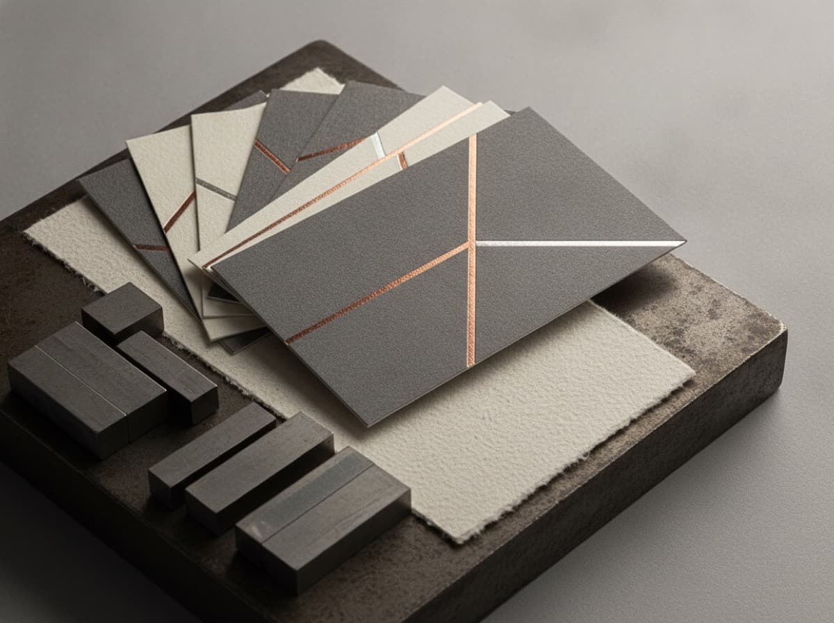
Embossing, debossing, and letterpress printing are the premium production techniques that transform a business card from a flat printed surface into a three-dimensional tactile experience. These techniques use physical pressure — not just ink — to create impressions in the card stock that recipients feel when they touch the card. The tactile dimension is what elevates a card from "memorable" to "remarkable."
Understanding the Three Techniques
Blind Embossing
What it is: A raised impression pressed into the card from below, creating a three-dimensional lift on the card surface. "Blind" means no ink is applied — the design is created purely through the raised texture of the paper itself.
How it works: A metal die presses against the back of the card stock while a counter-die supports the front. The pressure displaces the paper fibers, creating a raised relief on the face of the card.
Visual effect: The raised design catches light differently than the flat surface — when light hits the embossed area at an angle, it creates a subtle shadow that makes the design visible. In direct overhead light, the design can almost disappear; in raking light, it becomes beautifully dimensional.
Best for:
- Logos that read well as a silhouette
- Monograms and letterforms
- Simple geometric motifs
- Borders and frame elements
- Wedding, luxury, and high-end personal brand cards
Paper requirement: Requires thick paper stock (16pt minimum, 32pt preferred) that has enough fiber mass to hold the impression without tearing. Cotton paper and uncoated papers emboss beautifully. Laminated papers can crack or delaminate when embossed.
Registered Embossing (Ink + Emboss)
What it is: Embossing that is aligned (registered) with a printed ink element — the raised dimension occurs precisely on top of the printed logo, name, or design.
Visual effect: The combination of ink color and three-dimensional relief creates the most visually impactful effect — color plus texture plus dimension.
Design consideration: Registration accuracy varies between print runs; elements with thin strokes or very precise alignment requirements are riskier than broader shapes. For logos with significant detail, the emboss die should simplify the shape to what translates well in relief.
Common combination: Gold foil stamp + registered emboss on the foil element — the metallic foil + raised texture = extremely premium result.
Debossing
What it is: The opposite of embossing — pressure creates a recessed impression (pushed into the card surface from the front), creating a depression rather than a raised area.
Visual effect: The recessed area catches shadows rather than reflecting light. In many lighting conditions, deboss reads as more refined and subtle than emboss. Deboss is particularly elegant on thick, uncoated papers.
Common use:
- Logo deboss on thick cotton or uncoated stock
- Letterpress-style impression
- Brand name or initials
- Back-of-card texture pattern
"Ink deboss" / "color filled deboss": Ink (or foil) is applied into the recessed impression — filling the depression with color. This creates strong contrast between the recessed, ink-filled area and the natural paper surface color.
Letterpress Printing
What it is: A historic printing technique in which raised metal or polymer type and design elements are inked and pressed into soft paper stock, creating a visible impression (indentation) of the printed type. Originally used for all commercial printing before offset printing became dominant; now used almost exclusively for luxury stationery and business cards.
How it's different from deboss: Deboss uses a die to create an impression without ink. Letterpress uses a printing plate with ink applied to raised surfaces — the ink transfers while simultaneously pressing into the paper.
Visual effect: Letterpress creates both an inked impression and a physical indentation simultaneously. The character edges are sharp, the impression depth creates a three-dimensional quality, and the look is unmistakably artisanal. Under raking light, you can see the impression depth clearly.
Best for: Personal brands, attorneys, architects, creative professionals, consultants, and anyone positioning as high-end where the tactile experience differentiates from digital communications.
Paper requirement: Letterpress absolutely requires soft, thick, uncoated paper — 110# or 140# uncoated stock, or 300–600 gsm cotton paper (Crane's, Lettra, Savoy). Coated papers don't compress and hold the impression. Most letterpress business cards are made on cotton rag paper for the softest, deepest impression.
Design Principles for Emboss / Deboss / Letterpress
1. Simpler is Better
All three techniques translate design elements through physical impression — fine lines, thin strokes, and tight spacing between elements can lose definition or fill in when the die presses into paper. Design for these techniques at a higher level of abstraction than you would for offset printing.
Guidelines:
- Minimum stroke width: 0.5pt (ideally 1pt+ for reliable reproduction)
- Minimum text size: 8pt for letterpress, 10pt+ for emboss/deboss
- Avoid very tight letter spacing in small text
- Logos with fine interior detail should be simplified to the most essential shapes
2. The Card Stock IS the Design Element
For blind emboss and letterpress, the paper itself is part of the design:
- Crane's Lettra 300 gsm / 600 gsm — the most popular letterpress paper; 100% cotton, incredibly soft, holds impression beautifully, comes in Pearl White and Fluorescent White
- Savoy cotton paper — similar to Lettra; premium letterpress substrate
- Thick uncoated stocks — 32pt or heavier uncoated
- Natural/off-white papers — warm undertone adds to the artisanal aesthetic
Avoid:
- Any laminated paper (laminate cracks when embossed)
- Coated gloss or matte stocks (don't compress for letterpress; will crack for emboss)
- Thin stocks (14pt and under — insufficient body for deep impression)
3. Single-Sided or Strategic Two-Sided
Most premium emboss/letterpress cards are single-sided or use the back for simple digital delivery (QR, website). The front is the showcase.
4. Color Restraint
The most classic premium card designs using these techniques use:
- One color (black or a single PMS color on white paper)
- Two colors maximum
- Foil + letterpress (gold or silver foil for one element, letterpress for text)
- Blind emboss only (no ink at all — purely tactile)
5. The Die Has a Cost
Unlike digital printing where changing a color costs nothing, emboss, deboss, and letterpress require custom dies (metal or polymer). Dies cost $50–200+ per design depending on complexity. This is a setup cost amortized across the print run — the more you print, the lower the per-card die cost.
Common Premium Combinations
1. Blind emboss + cotton paper: The most refined and subtle — a raised logo visible only in directional light, on thick cotton paper. Reserved for brands confident enough to let the tactile quality do all the talking.
2. Letterpress black on Lettra white: The classic letterpress card — crisp black impression in thick cotton paper. Extremely readable, beautiful shadow detail, unmistakably artisanal.
3. Gold foil + letterpress text: Foil-stamped logo or monogram in gold or rose gold, with letterpress text body. The most common "luxury tier" business card combination.
4. Soft-touch matte laminate + deboss: Digital printing on soft-touch (velvet) laminate, with a debossed logo. The soft-touch material holds deboss beautifully and the matte velvet surface enhances the tactile contrast.
Cost Considerations
Premium tactile finishing adds significant cost per card relative to standard printing:
- Blind emboss: +$0.15–$0.50 per card
- Registered emboss + foil: +$0.40–$1.00 per card
- Letterpress (1 color): $0.50–$3.00 per card (highly quantity-dependent; lower per-card at 500+ quantity)
- Letterpress (2 colors): $1.00–$5.00 per card
These techniques are investment pieces — appropriate when the card recipient represents high-value relationships (premium clients, high-net-worth individuals, luxury market positioning) where the tactile impression reinforces the value proposition.
Checklist
- [ ] Design simplified for physical impression (no hairlines, generous spacing)
- [ ] Paper stock selected for technique: cotton / thick uncoated for letterpress; 32pt+ uncoated for emboss/deboss
- [ ] NOT laminated stock (laminate cracks; incompatible with emboss and letterpress)
- [ ] Text minimum 8–10pt for legibility in impression
- [ ] Die cost factored into budget ($50–200 per design)
- [ ] Quantity adequate to amortize die cost ($500+ print run recommended)
- [ ] Ink + emboss (registered) or blind emboss chosen intentionally
- [ ] Letterpress paper (Lettra, Savoy cotton) if using letterpress
- [ ] Proof / press proof requested before full run (especially for letterpress)
- [ ] Finishing combination chosen (foil + letterpress, deboss + soft-touch, blind emboss only)
Get 10% off your first order
Join our list for practical printing guides, new finish ideas, and a welcome coupon for your first order.
No spam. Unsubscribe anytime.
Ready to put these tips into print?
Order Business CardsNot sure which option fits? Ask Pro Card Crafters