Letterpress Business Cards: How the Technique Works and When to Choose It
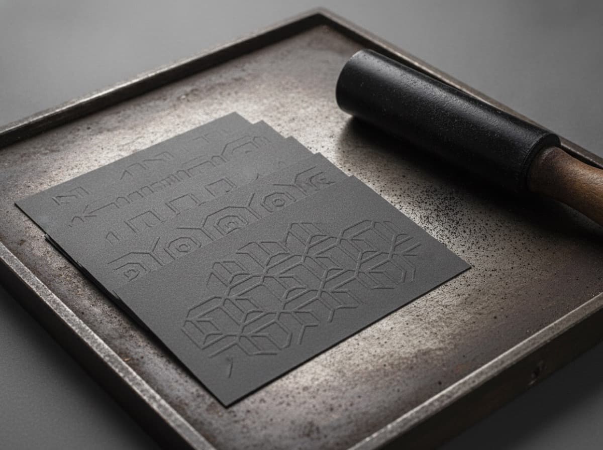
Letterpress printing is more than 500 years old — Gutenberg's printing press was a letterpress. In a world of digital printing and offset lithography, letterpress has undergone a full renaissance among designers, stationers, and professionals who want the most tactile, distinctive card possible.
How Letterpress Printing Works
Traditional letterpress printing uses a raised printing surface (type, photopolymer plates, or metal blocks) pressed against paper under significant pressure. This pressure creates a physical impression — a debossed indentation — in the paper.
The process:
- Your design is transferred to a photopolymer plate or metal type
- The plate is inked with oil-based ink
- Paper is fed through the press and pressed against the inked plate
- The combination of ink transfer and physical impression creates the characteristic letterpress look
What makes letterpress distinctive:
- The physical impression into the paper — you can feel it with your fingertip
- Rich, deep ink saturation from oil-based inks
- Slight ink halo around letterforms from the plate meeting the paper
- The weight and density of the cotton paper substrate
The Paper — The Non-Negotiable Element
Letterpress requires thick, soft cotton paper to achieve the characteristic deep impression. Printing letterpress on thin coated paper produces shallow impression and loses the tactile quality that defines the technique.
Cotton Stock for Letterpress
- 100% cotton rag stock: 600gsm or 700gsm (equivalent to multiple standard business card weights)
- Standard letterpress weights: 110lb–220lb (300–600gsm in metric) for double-thick or triple-thick cards
- Crane's Lettra, Mohawk Superfine, Cougar: Common letterpress paper brands recognized by quality printers
Double-Thick and Triple-Thick Cards
Letterpress cards are typically made from multiple sheets bonded together:
- Double-thick (2-ply): Two sheets bonded — the most common letterpress card thickness
- Triple-thick (3-ply): Three sheets — ultra-premium, impressive weight
- Edge coloring on thick cards: Colored edges on a thick letterpress card are a popular premium option
What Letterpress Looks Like vs. Digital
| Characteristic | Letterpress | Digital/Offset | |---|---|---| | Impression | Deep physical deboss | Flat ink on surface | | Ink texture | Rich, matte, slightly raised | Even flat coverage | | Color range | Limited (1-4 colors per pass) | Full CMYK range | | Paper | Must be thick cotton | Any stock | | Feel | Heavy, textured, distinctive | Variable | | Cost | Premium ($3–$8+ per card) | Standard ($0.05–$0.50) | | Turnaround | 2–4 weeks | 3–7 days |
Design Constraints and Opportunities
What Works Well in Letterpress
Bold, simple typography: Letterpress excels with clean type. Serifs and geometric sans-serifs both print beautifully. Very thin hairline fonts may not achieve consistent impression.
Line work and illustration: Clean vector line work prints crisply and impressively. Intricate hand-drawn illustrations can be stunning.
Spot colors: Pantone spot colors achieve rich, saturated ink saturation. Most letterpress runs use 1-3 spot colors maximum.
Blind emboss/deboss: A design element that's pressed without ink — pure impression, no color. The design becomes visible through light and shadow on the paper. Extremely elegant.
What Doesn't Work Well in Letterpress
Photographs: Letterpress cannot reproduce photographic images faithfully. The halftone dots from a photo look distorted under the plate pressure.
Fine gradients: Smooth color gradients are a digital/offset capability. Letterpress is flat-color only.
Very fine details below ~0.5pt: Extremely fine strokes can lose definition in the impression. Design with slightly bolder strokes than you would for offset.
Full-bleed backgrounds: Large solid ink areas in letterpress can show inconsistency. Digital printing handles full-bleed better.
Full-color CMYK: Letterpress is not a CMYK process. It's a flat spot-color process.
Color in Letterpress
Letterpress uses Pantone (PMS) spot colors for accurate color matching. Each ink color requires a separate pass through the press and a separate plate.
- 1 color: Most economical letterpress. Often black or one strong brand color.
- 2 colors: Classic letterpress — name in one color, contact details in another
- 3 colors: More complex but achievable; each additional color adds cost
- Edge color: Painted or inked card edges (third color that doesn't print on the face)
Ink Density in Letterpress
Because letterpress uses oil-based inks, colors appear more saturated and luminous than the same Pantone color in offset printing. Dark inks print very richly. This is part of the letterpress appeal.
When to Choose Letterpress
Situations Where Letterpress Earns Its Premium
Creative professionals: Designers, photographers, architects, brand strategists — industries where the card itself is evidence of aesthetic taste. A letterpress card says "this is someone who cares about materials and craft."
Law, finance, and luxury services: Partners at established firms, wealth managers, private bankers, luxury real estate — where the physical weight of the card signals the weight of the relationship.
Wedding and event industry: Photographers, florists, planners, stationery designers — letterpress is the material language of premium events.
Brand consultants and agency principals: When you're selling creative thinking, your business card can't look like it came from a big-box printer.
When you distribute cards rarely: If you hand out 20 cards per year to highly qualified prospects, the per-card economics of $5-8 are completely different than distributing 500 cards at a trade show.
When to Choose Digital Instead
- High-volume distribution (conferences, trade shows, direct mail)
- Tight turnaround (letterpress takes 2-4 weeks)
- Budget-constrained projects
- Cards requiring full-color photography
- Frequent design changes (reprinting letterpress requires new plates)
Letterpress Card Design File Requirements
File format: Vector AI, EPS, or PDF with outlined fonts. Letterpress plates are made from vector artwork.
Color: Pantone (PMS) solid coated swatches. No CMYK colors — convert to Pantone for accurate plates.
Resolution: Vector files are resolution-independent. Placed raster elements should be 600 DPI or higher.
Plate setup: Each color is a separate art layer or file. Your printer will separate colors for plate-making.
Stroke weight: Minimum 0.5pt stroke for lines that will impression-print legibly.
Finding Letterpress Printers
Letterpress is not available from most commercial digital printers. Look for:
- Specialty letterpress studios (often run by designer-printers)
- Fine stationery printers
- Wedding stationery companies that also do business cards
- Regional craft printing studios
Online letterpress printers ship nationally; local studios may offer in-person proofing.
Checklist
- [ ] Budget accommodates $3-8+ per card
- [ ] Timeline allows 2-4 week production
- [ ] Design uses 1-3 spot colors maximum
- [ ] No photographic elements
- [ ] Vector art file with Pantone colors
- [ ] Cotton/rag stock chosen (not standard coated stock)
- [ ] Blind deboss option considered for logo or monogram
- [ ] Edge color considered for triple-thick cards
Get 10% off your first order
Join our list for practical printing guides, new finish ideas, and a welcome coupon for your first order.
No spam. Unsubscribe anytime.
Ready to put these tips into print?
Order Business CardsNot sure which option fits? Ask Pro Card Crafters