Pantone and Spot Color Printing for Business Cards: When to Use PMS Colors
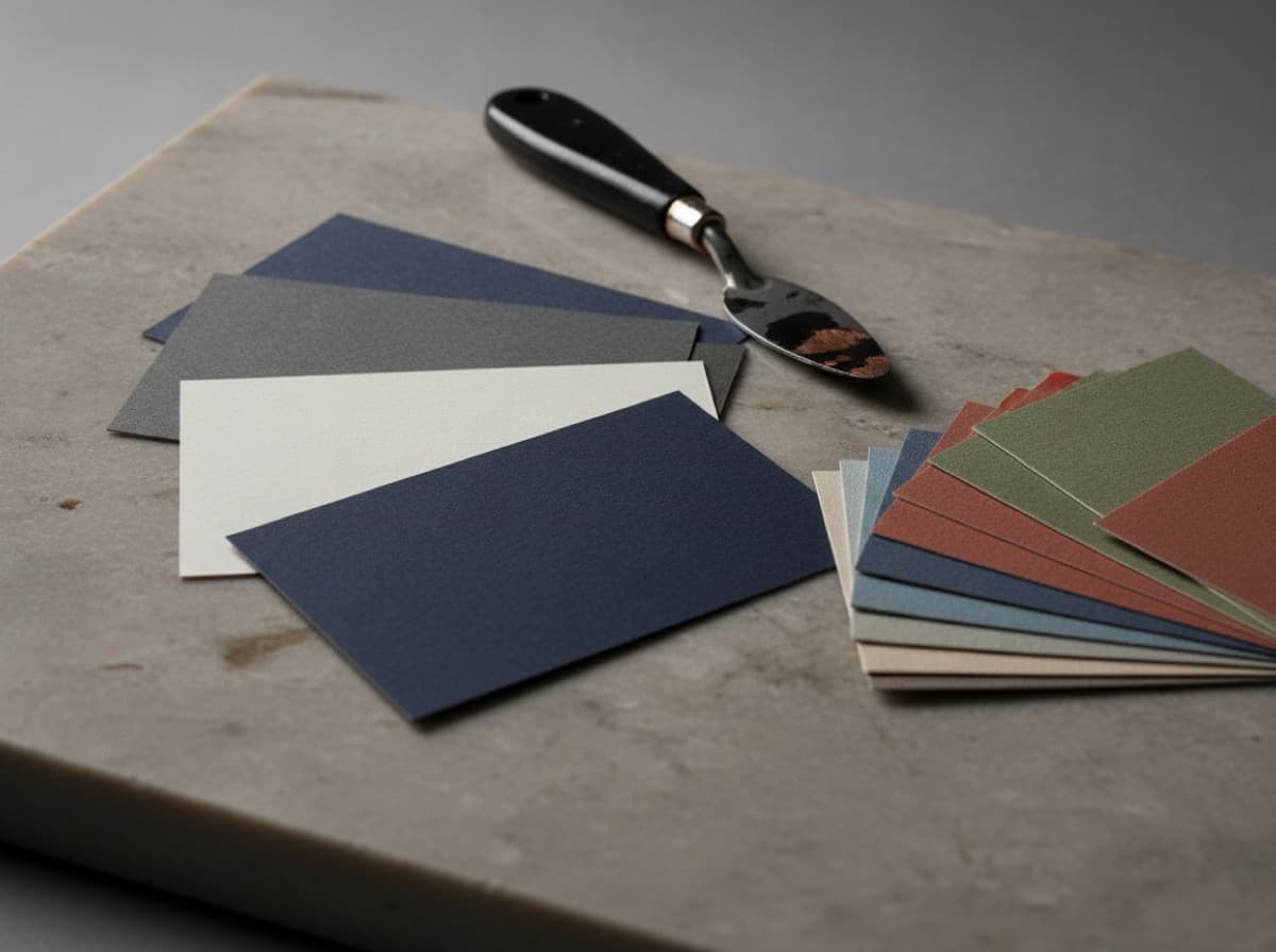
Pantone colors — formally called Pantone Matching System (PMS) colors — are the standard language of color accuracy in professional printing. When a brand color must be exact across every printed piece, Pantone spot colors are the solution.
Here's when spot colors matter for business cards, when they don't, and how to use them correctly.
What a Spot Color Is
In standard four-color (CMYK) printing, every color is created by mixing four inks: Cyan, Magenta, Yellow, and Black. CMYK can reproduce millions of colors, but it achieves them through tiny dots of four inks — and the result can vary between press runs, paper types, and print vendors.
A spot color is a pre-mixed, proprietary ink that is printed as a single, pure color — no mixing. The Pantone Matching System assigns each color a unique number (e.g., Pantone 286 C for a specific navy blue), and printers worldwide buy that exact ink. The result is the same color everywhere, every time.
CMYK navy blue: A mix of C=100, M=80, Y=0, K=10 — looks different depending on the press, the ink batch, and the paper.
Pantone 286 C navy blue: A single pre-mixed ink — visually identical on every press that uses the correct Pantone ink.
When Spot Colors Matter for Business Cards
Brand Color Accuracy
If your brand has an official Pantone color (many companies do — Tiffany Blue is Pantone 1837, UPS Brown is Pantone 469, Coca-Cola Red is Pantone 484), you want that exact color on your card, not a CMYK approximation.
If your logo or brand identity was designed with specific Pantone colors, print your business cards with those Pantone inks for visual consistency with your other branded materials.
When CMYK Can't Match
Some Pantone colors are simply outside the CMYK gamut — they're physically unmixable from the four CMYK inks. These include:
- Extremely bright, saturated oranges and reds
- Very vivid greens
- Pure metallics (Pantone 877 Silver, Pantone 871 Gold)
- Fluorescent colors (Pantone Pink C, Pantone Orange 021)
If you need a metallic gold or silver, Pantone offers metallic ink formulas that create true metallic effects. CMYK cannot produce true metallic — it can only approximate.
Consistency Across All Materials
If your business cards, letterheads, brochures, signage, and clothing all use PMS 286 C, they all match. If they each use their printer's CMYK interpretation of "navy blue," they'll all be slightly different.
When Spot Colors Are Not Necessary
Full-Color Photography
Spot colors can only print flat colors and simple graphics. If your card includes a photograph, gradient, or complex illustration with many colors, you need CMYK (four-color process). Spot colors can't reproduce photographic content.
When You're Fine with CMYK Color
Modern digital printing (the type most online print shops use) produces very good CMYK color. If you don't have an official Pantone brand color and aren't comparing your card against other printed materials, CMYK printing is excellent and sufficient.
Small Budget Projects
Spot color printing typically costs more than CMYK — each Pantone color requires its own ink mixing and press setup. For 1-2 spot colors, premium commercial printers charge a plate/setup fee per color. On small quantities, this can significantly increase per-card cost.
How Pantone Printing Works for Business Cards
Offset vs. Digital Printing
True spot color printing is available in offset lithography (the traditional commercial printing process). Offset printing uses physical plates and inks, so adding a Pantone spot color means adding that ink to the press.
Most online print shops and quick-turnaround vendors use digital printing (inkjet or laser-based). Digital printing cannot use Pantone inks directly — it approximates Pantone colors using its CMYK process. This is called "Pantone simulation" or "convert PMS to CMYK."
If you need true Pantone spot colors: You need offset printing, which is less common and higher-priced than digital. Letterpress printers commonly offer spot color printing.
If you're using digital printing: Specify the Pantone color in your file, and the printer will convert it to the closest CMYK approximation. The result is close but not exact.
Typical Spot Color Configurations for Business Cards
- 1 spot color + black: Most economical spot color option — black plus one brand color
- 2 spot colors: Classic two-color printing — brand color + black (or two brand colors)
- 1 spot color + CMYK: Uncommon — usually just choose one or the other
Metallic Spot Colors
Pantone metallic inks (silver, gold, copper, rose gold) are popular for premium business cards. These achieve genuine metallic effects — distinct from foil stamping but also visually impressive.
Pantone Gold options:
- Pantone 871 C — muted warm gold
- Pantone 872 C — bright gold
- Pantone 877 C — silver
- Pantone 8002 C — rose gold tones
Metallic Pantone inks require offset printing and look completely different from any CMYK yellow-and-orange gold approximation.
Specifying Pantone Colors in Your File
Design Software Settings
Adobe Illustrator:
- Swatch Library > Color Books > Pantone + Solid Coated (for coated paper) or Solid Uncoated (for uncoated paper)
- Apply the Pantone swatch to your design element
Adobe InDesign:
- Swatches panel > New Color Swatch > Color Type: Spot > Color Mode: Pantone+
Important: Add "(C)" or "(U)" after your Pantone number to specify coated or uncoated variant — the same number looks different on coated vs. uncoated paper.
Coated vs. Uncoated
- Pantone 286 C (Coated) — for glossy or coated card stock
- Pantone 286 U (Uncoated) — for matte or uncoated card stock
The "same" Pantone color on coated vs. uncoated paper looks different. If your card uses uncoated stock, specify the uncoated variant.
Quick Decision Chart
| Your Situation | Recommendation | |---|---| | Brand has an official Pantone color | Use that Pantone in offset printing | | Need true metallic gold or silver | Pantone metallic offset (or foil stamping) | | Full-color photo on card | CMYK digital printing | | Budget-conscious, no brand color standard | CMYK digital printing | | Very specific bright orange or green | Test CMYK approximation; offset if unsatisfactory |
Checklist
- [ ] Confirmed whether your brand has an official Pantone number
- [ ] Verified whether printer offers offset (true spot) or digital (CMYK simulation)
- [ ] Specified coated vs. uncoated Pantone variant matching your card stock
- [ ] Converted any Pantone colors to CMYK if using digital printing
- [ ] Considered Pantone metallic for gold/silver elements
- [ ] Ordered a physical proof to verify color accuracy before full run
Get 10% off your first order
Join our list for practical printing guides, new finish ideas, and a welcome coupon for your first order.
No spam. Unsubscribe anytime.
Ready to put these tips into print?
Order Business CardsNot sure which option fits? Ask Pro Card Crafters