Spot UV Business Cards: A Guide to Selective Gloss Coating on Matte Cards
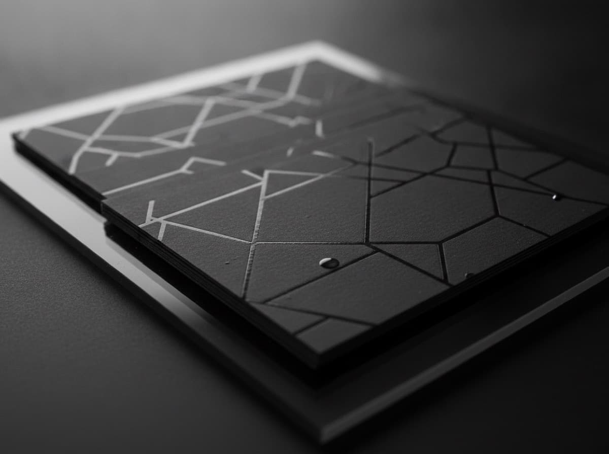
Spot UV (spot ultraviolet) coating is one of the most popular premium business card finishing techniques — applying a high-gloss UV-cured varnish to specific areas of a card that has otherwise been laminated with a matte or soft-touch (velvet) finish. The result is a visual and tactile contrast between the ultra-matte background and the glossy highlighted elements that catches light, draws the eye, and signals premium quality the moment someone picks up the card.
How Spot UV Coating Works
- The card is printed using standard offset or digital printing
- A matte or soft-touch laminate is applied to the entire card surface — this creates the base matte or velvet texture
- A UV-cured gloss varnish is selectively applied to specific design elements using a plate or screen that matches the shape of the elements you want glossy
- UV light cures the varnish instantly — hardening it to a high-gloss surface
The result: the laminated surface is uniform matte (or velvet), while the spot UV areas are dramatically shiny — the contrast makes the glossy elements appear to pop off the surface.
Spot UV vs. Other Finishes
| Finish | Effect | |--------|--------| | Full gloss laminate | Entire card glossy | | Full matte laminate | Entire card matte | | Soft-touch laminate | Entire card velvet/suede texture | | Spot UV on matte | Matte base + selective gloss highlights | | Spot UV on soft-touch | Velvet base + selective gloss (maximum contrast) | | Foil stamp | Metallic color + shine on specific elements | | Spot UV + foil | Metallic metallic elements + spot gloss on others |
Spot UV on soft-touch laminate is the premium-within-premium option — the velvet texture of soft-touch provides the maximum possible contrast against the gloss UV areas, creating a more dramatic, tactile effect than spot UV on standard matte laminate.
What to Highlight with Spot UV
Spot UV is most effective on elements that benefit from selective attention and that have enough area to register visually:
Most Effective Spot UV Applications
1. Logo: The single most common use — your logo in spot UV on a matte background reads as elevated and confident. The gloss makes the logo almost appear raised (though it isn't physically raised the way embossing would be).
2. Monogram or initials: A large initial letter in spot UV, particularly on a dark matte card, is extremely impactful.
3. A graphic element or pattern: An abstract shape, geometric pattern, or design element that runs across part of the card — especially as a full-bleed texture on the back, with spot UV revealing the texture only at certain angles.
4. Company name (wordmark): If your logo is text-based, the company name in spot UV has the same impact as a logo.
5. A card back pattern/texture: The back of the card can be covered with a subtle geometric or texture pattern, where the entire pattern is spot UV on solid matte — visible only in directional light. This creates the most premium card back effect.
Less Effective Spot UV Applications
- Very thin lines or fine detail — spot UV registration isn't perfect; very thin strokes or fine detail may look slightly misaligned or smeared
- Large solid areas of pure white — spot UV on white matte looks similar to gloss laminate; the contrast is lowest on light-colored areas
- Small text — body text, phone numbers, email addresses in spot UV can look shiny but provides no functional benefit and adds complexity for little impact; save spot UV for graphic elements
- Entire card — applying spot UV to 90%+ of the card eliminates the contrast effect; if you want the whole card glossy, use full gloss laminate instead (cheaper and better result)
Design Principles for Spot UV Cards
1. High Contrast Background Maximizes Impact
Spot UV effect is strongest on dark backgrounds:
- Black matte base + spot UV → maximum impact (the gloss appears to glow against the dark matte)
- Dark navy, charcoal, deep forest green + spot UV → excellent contrast
- White or light-colored matte base + spot UV → weakest contrast; still works but less dramatic
2. The Spot UV Element Should Be Meaningful
Spot UV draws the eye. Whatever you put in spot UV becomes the visual focal point of your card. This should be your most important brand element (logo, monogram, name) — not a decorative element that fights for attention with your actual name.
3. Scale to Legible Size
Spot UV is most impactful at 0.5" and larger. Elements under 0.25" height tend to lose registration accuracy and can look sloppy. Design spot UV elements at generous scale.
4. Avoid Text in Spot UV (Generally)
Your name, phone number, and email in spot UV is interesting but doesn't actually help communication. The gloss can make text harder to read in certain lighting conditions. Reserve spot UV for graphical/brand elements, not communication elements.
5. The Back as a Spot UV Showcase
The back of the card is often the best canvas for ambitious spot UV design:
- Full-back geometric or texture pattern in spot UV on solid dark matte
- Large-scale logo or monogram in spot UV on dark back
- The "flip the card over" moment becomes a reveal — the back looks matte, then under light, the pattern appears
File Preparation for Spot UV
Spot UV requires a separate technical layer in your design file:
How to Prepare Spot UV Files
Step 1: Create your standard design file Your standard card design with all print elements — exactly as you'd submit without spot UV.
Step 2: Create a spot UV "knockout" layer
- Create a separate layer in your design file (Illustrator, InDesign, Photoshop)
- On this layer, place the shapes that will receive spot UV coating — filled with a spot color named exactly as your printer specifies (common names: "Spot UV," "UV Varnish," "Die Cut," or a specific PANTONE code like "PANTONE 801")
- The shapes must be vector paths (not raster) for clean edges
- Set the spot color to Overprint (so the spot UV layer overlays your print, not knocks it out)
Step 3: Check with your printer's specific requirements Different printers have slightly different file requirements for spot UV:
- Some want a separate single-layer PDF
- Some want a layered PDF with the spot UV layer isolated
- Some want an AI or INDD file with the spot UV as a named spot color swatch
Most common submission format: Print-ready PDF with the spot UV elements in a separate layer as a spot color swatch named to the printer's specification.
Common mistakes:
- Spot UV element in the wrong layer (accidentally prints as a solid color ink)
- Spot UV element not set to Overprint (knocks out the underlying design)
- Raster (bitmap) shapes instead of vector paths (jagged edges)
- Element too fine or thin (minimum 0.5pt stroke for spot UV elements)
Checklist
- [ ] Base finish selected: matte laminate or soft-touch laminate (soft-touch = more contrast)
- [ ] Spot UV element(s) identified: logo, monogram, brand element (not body text)
- [ ] Dark background used for maximum contrast (black, navy, charcoal)
- [ ] Spot UV shapes are vector paths (not raster)
- [ ] Spot UV layer set to Overprint
- [ ] Spot color named per printer's spec ("Spot UV," "UV Varnish," etc.)
- [ ] Spot UV element scale: 0.5"+ height for clear effect
- [ ] Thin strokes avoided (<0.5pt may not register cleanly)
- [ ] Printer's file submission format confirmed (separate PDF, layered file, etc.)
- [ ] Proof / digital mock-up reviewed before production
- [ ] Both sides considered: front spot UV + back pattern spot UV is a popular combination
Get 10% off your first order
Join our list for practical printing guides, new finish ideas, and a welcome coupon for your first order.
No spam. Unsubscribe anytime.
Ready to put these tips into print?
Order Business CardsNot sure which option fits? Ask Pro Card Crafters