Best Fonts for Business Cards: Readability Meets Brand
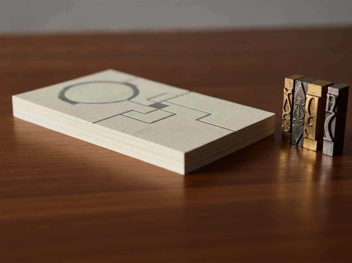
The best fonts for business cards are legible at small sizes, carry the right tone for your industry, and work with a minimum of visual complexity. Because a card is read at arm's length, sometimes in poor lighting, typography choices that look fine on a screen can fail badly in print — hairline serifs disappear, condensed fonts crowd together, and display scripts become unreadable below 10pt. This guide covers the categories of typeface that work on business cards, specific font recommendations in each category, sizing rules to follow, and how to pair two fonts without producing visual noise.
Why type choice matters more on a card than anywhere else
A business card has less room to hide typography problems than almost any other medium. A font that looks sophisticated on a poster at 48pt may have barely legible thin strokes at 8pt — which is where your contact details will live. The first test of any business card font is: does it read clearly at 8pt on a physical proof?
The second test is: does the typeface's personality match the professional context? Legal and financial services read better in serious, refined type; creative studios can afford more expressive choices. Choosing against type convention for your industry doesn't make you look unconventional — it makes you look like you don't know the convention.
Serif fonts for business cards
Serifs are the small strokes at the ends of letterforms. They signal tradition, authority, and refinement. Well-chosen serifs are among the most effective typefaces for professional cards:
Caslon (Adobe Caslon, Williams Caslon) — a classic humanist serif with warm, slightly irregular strokes. Widely considered the standard for professional typography in law, publishing, and academia. Legible at small sizes; high-quality at all weights.
Garamond (EB Garamond, Cormorant Garamond) — a refined Old Style serif with low stroke contrast. Elegant and refined rather than bold. Works beautifully for creative professionals, designers, and consultants whose brand favors quiet confidence.
Freight Text (Freight Text Pro) — a contemporary slab-influenced serif that holds well at small sizes. More robust than Garamond, with enough character to distinguish it from standard office typography.
Playfair Display — a high-contrast, editorial serif with strong personality. Better for name/headline use than body text, as the hairline strokes can be fragile at small sizes.
Sans-serif fonts for business cards
Sans-serifs (fonts without the decorative end strokes) read as modern, clean, and precise. They're the default in technology, design, and contemporary professional contexts:
Helvetica Neue / Neue Haas Grotesk — the definitive professional sans-serif. Available in a full weight range; the medium or regular weight is almost universally legible at card sizes. Neutral enough to be professional in virtually any industry context.
Futura — a geometric sans with a modernist, early-20th-century pedigree. The circular letterforms and geometric construction give it a distinctive rhythm. Popular in design, architecture, and minimalist branding.
Aktiv Grotesk / Acumin Pro — contemporary grotesque sans-serifs designed for screen and print legibility. Clean and versatile with a slightly warmer quality than Helvetica.
Montserrat — a widely available web-adjacent font with geometric structure. Not as refined as the options above but a reliable, professional choice for small budgets.
Inter — designed for screen legibility but holds well in print. Free, well-spaced, and a solid workhorse option.
Script and display fonts: use with caution
Script and decorative fonts have narrow use cases on business cards:
- One-line use for a name or brand — a script for the name only (used at 14pt or larger) can be a strong branding statement when paired with a clean sans for all other content.
- Logos only — a display font embedded in a logo graphic is handled by the logo file rather than as live text; this avoids the small-size legibility issue entirely.
- Never for contact details — scripts become unreadable below 10pt and unreliable at small sizes in general. Contact details must be in a legible sans or serif.
Sizing rules for business card type
| Element | Recommended size | |---|---| | Name | 12–18pt | | Title / role | 9–11pt | | Contact details | 8–10pt | | Fine print / legal | 7pt minimum |
Go below 7pt only with a physical proof in hand to confirm legibility. Digital previews don't simulate actual print output accurately enough at small sizes.
Our design guide covers how to use these sizes to establish a visual hierarchy.
How to pair two fonts
Most business cards need no more than two typefaces — one for the name and headline elements, one for contact and supporting information. Rules for pairing:
- Combine a serif and a sans — they contrast in structure without fighting each other. Garamond name + Helvetica details is a classic, almost invisible combination.
- Or stay in one family, vary the weight — Heavy for the name, Light for contact details within a single typeface family (Neue Haas Grotesk Heavy + Neue Haas Grotesk Light) is clean and coherent.
- Avoid two serifs or two different sans-serifs — similar fonts at the same size create tension that reads as inconsistency rather than contrast.
- Don't add a third font — if you're tempted to add a script for the name, a sans for the title, and a different sans for the contact details, stop. The result will look messy rather than layered.
Bottom line
Choose one strong, legible font for contact details (Helvetica, Caslon, Garamond, or Futura all work reliably), one font or weight for the name and headline, and confirm legibility at 8pt on a physical proof before committing to a run. Type is the primary content vehicle on a card — get it right before you decide on finish or layout.
Frequently Asked Questions
What is the best font for a business card?
There is no single best font, but the most reliable professional choices are Helvetica Neue (clean, modern, universal), Adobe Caslon or Garamond (traditional, refined, authoritative), and Futura (geometric, modern, distinctive). All are legible at small sizes and appropriate across most professional contexts.
What font size should I use on a business card?
Name: 12–18pt. Title and role: 9–11pt. Contact details: 8–10pt. Never go below 7pt for text recipients need to read. Confirm legibility on a physical proof — digital previews can be misleading for small print sizes.
Can I use a script or handwriting font on a business card?
Yes, but only for the name or a headline element at a minimum of 12–14pt. Scripts become illegible below 10pt and should never be used for contact details. Pair a script name with a clean sans-serif for all other information.
Should I use a serif or sans-serif font for a business card?
Both work. Serifs (Garamond, Caslon, Freight Text) signal tradition, authority, and refinement — suited to law, finance, consulting. Sans-serifs (Helvetica, Futura, Aktiv) signal modernity and precision — suited to technology, design, and contemporary professional services. The choice should align with how you want your brand to be perceived.
How many fonts should a business card have?
Two, maximum. One for the name/headline, one for contact details. Or use a single font family with weight contrast (Heavy for name, Light for details). A third font introduces visual noise that reads as inconsistency rather than sophistication.
Does font choice affect how printable a business card is?
Yes. Thin-stroke fonts (high-contrast serifs, light-weight sans) can drop out or become fragile on certain paper stocks, especially uncoated ones. Bold or medium-weight fonts are more reliable across coated and uncoated stocks. For cards with spot UV or foil, avoid very thin strokes in the treated area.
Get 10% off your first order
Join our list for practical printing guides, new finish ideas, and a welcome coupon for your first order.
No spam. Unsubscribe anytime.
Ready to bring this design to life?
Order Premium CardsNot sure which option fits? Ask Pro Card Crafters