How to Design a Business Card That Stands Out
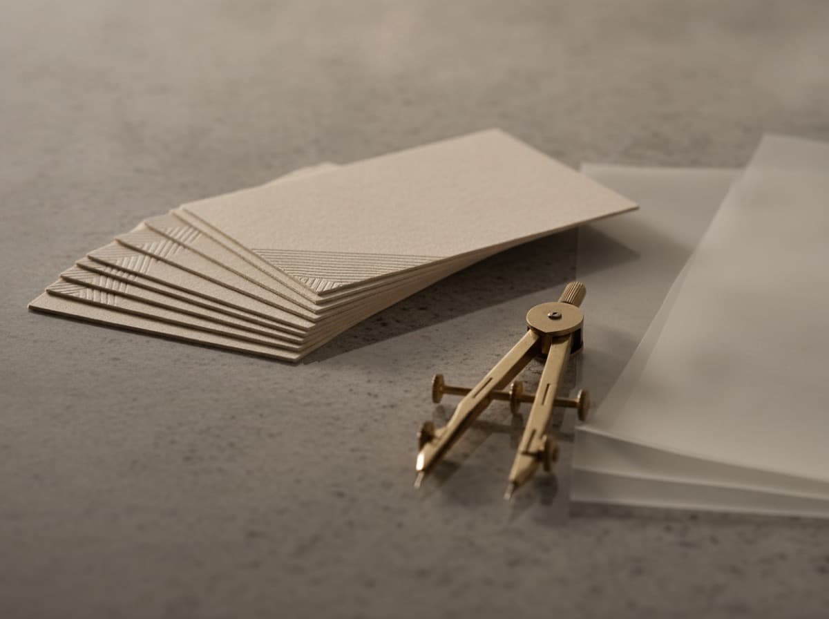
Knowing how to design a business card means understanding that you have roughly two seconds to transfer the most important information about your professional identity — name, role, and how to reach you — onto a 3.5 × 2 inch surface, in a way that the recipient will remember. The best cards are not the busiest; they're the ones that make a clear hierarchy instantly readable and add one deliberate detail — a finish, a color, a layout choice — that earns a second look. This guide walks through the entire process, from information architecture to file setup, so your first card (or your next one) avoids the most common mistakes.
Start with information, not design
Before you open any design software, write down every piece of information you're considering for the card. Then cut it ruthlessly.
Mandatory:
- Full name (first and last, unless you go by one name professionally)
- Job title or role
- One primary contact method — either email or phone, whichever is the real first step for your audience
Usually useful:
- Company name and/or logo
- Website
- The second contact method (email or phone)
Use sparingly:
- Social handles (one is enough, only if it's where you actually do business)
- Physical address (mostly for retail, legal, or medical contexts)
- Tagline or one-line value proposition
Everything else is noise. A card with nine pieces of information in a 8pt font tells someone you couldn't edit yourself — which is not the first impression to make. For more on what to include and where, our networking card design guide covers hierarchy and the psychology of what recipients notice first.
Choose a layout direction
Business cards come in two orientations: landscape (horizontal) and portrait (vertical). Most cards are landscape because most people hand them out in landscape orientation and most cardholders are designed for it. But portrait cards stand out in a pile of landscape ones, and for certain aesthetics — photography, fashion, architecture — the vertical proportion can feel more aligned to the brand.
Make this decision before you start placing elements, because it affects every other layout choice. Our comparison of vertical vs horizontal cards covers when each orientation works.
Establish a clear visual hierarchy
Visual hierarchy is the order in which the eye moves through the card. For most business cards, it should go: name → what you do → how to reach you. Design should reinforce that order, not fight it.
Practical rules:
- Name gets the most visual weight — largest type, heaviest weight, or most prominent position. This is a networking artifact: people remember names, and your name is the card's primary purpose.
- Title and company support the name — slightly smaller or lighter, but clearly paired with it.
- Contact information recedes — functional, legible, but not competing with the identity information.
- Logo earns its own space — if you have a strong logo, give it room. If you don't have a strong logo, don't force one; a well-typeset name is better than a weak symbol.
Typography: size and legibility matter more than style
For a card, legibility under real-world conditions (a conference, a restaurant, low light) is the primary criterion. A few rules prevent the most common typography mistakes:
- Minimum 7pt for body contact information — 8pt is safer. Anything smaller requires good eyesight and good lighting and will be unreadable to a significant portion of your recipients.
- Limit to two typefaces — one for name/headline, one for contact details. More creates visual clutter without adding information.
- Use weight contrast, not font-family proliferation — Bold + Regular within one font family reads cleaner than three different fonts.
For an in-depth look at which typefaces work best and why, see our business card font guide.
Color: make one choice count
The most effective card color strategies are simple:
- Neutral background (white, cream, black, or dark color) + one accent color — for most professional contexts, this produces a readable, brand-consistent card without visual noise.
- Single solid-color card — a deep navy, forest green, or burgundy card with white or metallic type stands out in a stack of white cards and reads as confident.
- Full-bleed color with a patterned or photographic element — high-risk, high-reward. Requires strong design execution.
Color also communicates industry positioning. White and light grey signal precision and clean professionalism; black signals premium and luxury; earth tones signal sustainability and craft; bold primaries signal creativity and energy. Our color psychology guide walks through common industry palettes.
Finish: your most powerful design decision
The stock and finish you choose affect the card's impact more than almost any design element. A beautifully designed card on 14pt gloss stock and the same design on 32pt cotton with a foil logo are not the same card — the second signals a fundamentally different level of intention.
Key decisions:
- Matte vs gloss — covered in our matte vs glossy comparison
- Adding spot UV or foil — see the premium finishes overview
- Going uncoated — right for eco-friendly stocks and letterpress
Set up your file correctly
The most common production problem is a design that looks right on screen but prints with cut-off edges or color shift. Three settings prevent most issues:
- Bleed — extend background colors and edge-to-edge elements at least 3mm (0.125 inches) beyond the trim line. Content that touches the edge will otherwise have a white border after cutting.
- Safe zone — keep all important content (text, logos) at least 3mm inside the trim line. Cutting tolerances mean edge-adjacent content can be clipped.
- Color mode — set your file to CMYK, not RGB. RGB colors can shift significantly in print; see our CMYK vs RGB guide for specifics.
Bottom line
Design a business card by starting with less information than you think you need, establishing a name-first hierarchy, choosing legible typography at minimum 8pt, making one clear color choice, selecting a finish that matches your positioning, and setting up the file with bleed and CMYK before you submit. Every element should earn its place on a 3.5 × 2 inch surface — and the ones that don't should go.
Frequently Asked Questions
What information should go on a business card?
At minimum: your name, job title, and one primary contact method (email or phone). Add company name, website, and the secondary contact method as needed. Anything beyond six to seven distinct pieces of information typically makes the card harder to read, not more useful.
What font size should I use on a business card?
A minimum of 7pt for small contact details, with 8–9pt as a safer standard. Name and title can be 10–14pt depending on the design. Go below 7pt only if you have a specific design reason and have confirmed legibility in physical proof.
Should a business card be horizontal or vertical?
Most cards are horizontal (landscape), which fits standard cardholders and meets expectations. Vertical (portrait) cards stand out and suit certain aesthetics — photography, fashion, architecture — where a different proportion reinforces the brand. The choice should be intentional, not arbitrary.
What is bleed on a business card file?
Bleed is an extension of the artwork beyond the trim line — typically 3mm (0.125 in). Any color or image that goes to the card's edge must extend into the bleed area; otherwise cutting tolerances will leave a thin white border. Content that shouldn't be cut must stay inside the safe zone, 3mm inside the trim.
What color mode should I use for business card files?
CMYK. Screen design typically works in RGB, but print uses CMYK inks. Submitting an RGB file allows the printer to convert automatically, which can shift colors unexpectedly. Set your file to CMYK from the start and profile your colors for print.
How do I make a business card stand out?
The most effective strategies: choose one premium finish (spot UV, foil, or soft-touch lamination) rather than piling on multiple; select an unusual color or a dark background in a field of white cards; use white ink on a dark base; add a QR code to the back pointing to a specific, relevant destination; or invest in a thicker stock that feels different in the hand.
Get 10% off your first order
Join our list for practical printing guides, new finish ideas, and a welcome coupon for your first order.
No spam. Unsubscribe anytime.
Ready to bring this design to life?
Order Premium CardsNot sure which option fits? Ask Pro Card Crafters