Business Card Color Psychology and Palettes
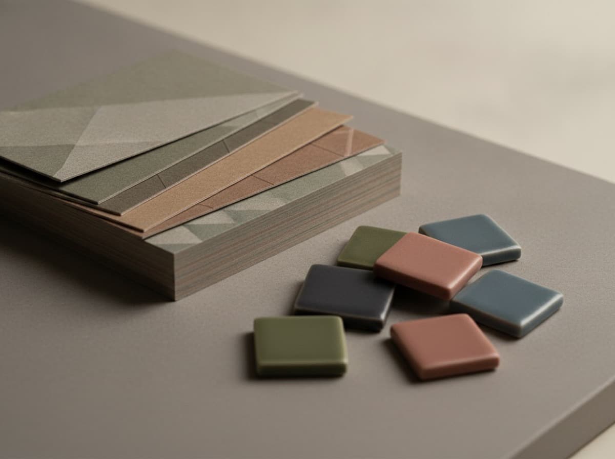
Business card colors work on two levels simultaneously: they communicate brand identity and they trigger psychological associations that influence how the recipient perceives you before they read a word. A midnight blue card conveys stability and authority; a bright orange card conveys energy and approachability; a matte black card conveys premium positioning and restraint. None of these associations are fixed — context and execution matter — but they are consistent enough that choosing a card color palette deliberately, rather than defaulting to white because it feels safe, is a meaningful brand decision. This guide explains what colors signal, how to build a palette that works for a professional card, and the production considerations that affect color on print.
What different colors communicate
Black — premium, exclusive, minimal. Black cards stand out in a pile of white cards and signal a brand that is confident enough in its offer to say nothing extra. Effective for luxury services, high-end consulting, creative studios, and fashion.
White and off-white — clean, precise, professional. White reads as neutral and lets other design elements (typography, logo) lead. Off-white or cream adds warmth and hints at craft; it's a common choice for lawyers, architects, and established consultants who want to signal reliability without boldness.
Navy and dark blue — trust, authority, stability. Blue is the default professional color in many industries (finance, law, corporate services) because it reliably signals reliability. Dark navy on a card is more sophisticated than mid-range blue and works beautifully with white or gold type.
Charcoal and dark grey — modern, understated authority. A cooler alternative to black that avoids black's absolute finality. Common in technology, design, and architecture.
Green — sustainability, growth, health. Light greens have an eco, wellness association; deep forest greens read as premium and classic, with associations of money and tradition. Strong for sustainability-focused brands, health and wellness, and financial services that want to communicate growth.
Terracotta and earth tones — warmth, craft, authenticity. Popular in design, food, hospitality, and lifestyle brands. Communicates a human, handmade quality that cool colors don't.
Red and orange — energy, urgency, boldness. Used sparingly (an accent rather than a full-card color), red drives attention. As a full-card color it can be aggressive; as a logo accent or single graphic element it's energetic and memorable.
Gold and metallic — success, luxury, premium. Foil stamping in gold or rose gold adds a metallic dimension that printed yellow or tan cannot replicate. Reserve metallic for elements that should read as premium signals — a logo, a name — rather than as decoration.
Purple — creativity, wisdom, luxury. Rarely used in professional cards, which makes it stand out. Works for creative, beauty, and high-end services when paired with sophisticated typography.
Industry conventions and when to break them
Some industries have strong color conventions that inform what "looks right" to clients in that space:
- Finance and law — navy, dark grey, white, and black with gold accents
- Healthcare and wellness — soft blue, green, white, and teal
- Technology — blue, grey, black, with bold accent colors
- Creative industries — more latitude; bold colors, black, or neutrals with distinctive typography
- Retail and hospitality — brand color is primary; warm tones common
Following convention reduces friction for a client who immediately recognizes the visual language of your industry. Breaking convention — a lawyer with a matte black card, a tech company with a warm terracotta palette — signals a different kind of confidence and may attract clients who are specifically looking for someone unconventional.
Building a practical card color palette
The most successful card palettes use two or three colors, not more:
- Background color — the dominant field (white, black, or a brand color)
- Primary text color — high contrast with the background (black on white, white on black or dark color)
- Accent color (optional) — one element, no more, in a brand color: the name, a rule, the logo, or an edge treatment
A fourth or fifth color introduces competition that rarely helps. Even if your brand has five brand colors, a business card is not a brand style guide — it's a 3.5 × 2 inch object meant to convey one clear impression.
Our design guide for business cards covers how to integrate color decisions with type hierarchy and layout.
Print considerations: color on physical cards
Colors shift between screen and print in ways that surprise designers who work primarily in digital. Two production rules keep color on a card predictable:
Work in CMYK from the start. Screens display in RGB; print uses CMYK ink. Converting an RGB design to CMYK at the point of submission can cause noticeable color shifts, especially in saturated colors. Our CMYK vs RGB guide explains how to manage this.
Understand how stock affects color. On coated gloss or matte-laminated stock, colors print saturated and vivid. On uncoated stock, ink absorbs into the fiber and colors appear slightly muted and warmer. The same CMYK value looks different on a coated card and a recycled uncoated card — request a physical proof or consult a color-accurate press proof when precise color matters.
Bottom line
Choose your card colors with the same intentionality you bring to any brand decision: define the psychological association you want to make, check whether your industry's color conventions are an asset or a constraint, build a two-to-three-color palette with clear hierarchy, and verify the colors in CMYK before submitting for print. A white card with black type and one accent color is often more powerful than a six-color design — the restraint communicates confidence.
Frequently Asked Questions
What color should a business card be?
There is no universally right answer, but white is not automatically the safest choice — it's simply the default. Dark backgrounds (black, navy) stand out in a pile of white cards. Choose a background color that matches your brand positioning: neutral and precise (white), premium and bold (black), trustworthy and stable (navy), or warm and authentic (earth tone).
What does a black business card say about you?
A matte black business card signals premium positioning, restraint, and confidence. It's common in luxury services, creative industries, and fashion. On a budget stock with flat printing it can look severe; on a thick stock with soft-touch finish or metallic type, it reads as genuinely high-end.
Should business cards be one color or multiple colors?
One to three colors. A strong card palette has a background, a primary text color in high contrast, and optionally one accent. More colors introduce visual competition that rarely improves clarity or memorability.
Do business card colors need to match my brand?
Yes, for brand consistency — but "match" doesn't mean "replicate every brand color." Use your primary brand color as the dominant or accent, and keep everything else simple. A card is a first impression, not a brand style guide.
Why do colors look different on my printed business cards?
Screen colors are in RGB (red-green-blue light); printed colors are in CMYK (cyan-magenta-yellow-black ink). Converting at print time can shift colors, especially bright reds, oranges, and vivid purples. Set your design file to CMYK and verify against a physical proof for critical colors.
What colors work for a luxury or premium business card?
Black, deep navy, dark forest green, and charcoal all read as premium backgrounds. Pair with white, cream, or metallic type. Adding gold or silver foil to a dark background is the most consistently effective premium card combination because the metallic finish can't be replicated by flat printing alone.
Get 10% off your first order
Join our list for practical printing guides, new finish ideas, and a welcome coupon for your first order.
No spam. Unsubscribe anytime.
Ready to bring this design to life?
Order Premium CardsNot sure which option fits? Ask Pro Card Crafters