Double-Sided Business Cards: How to Use the Back
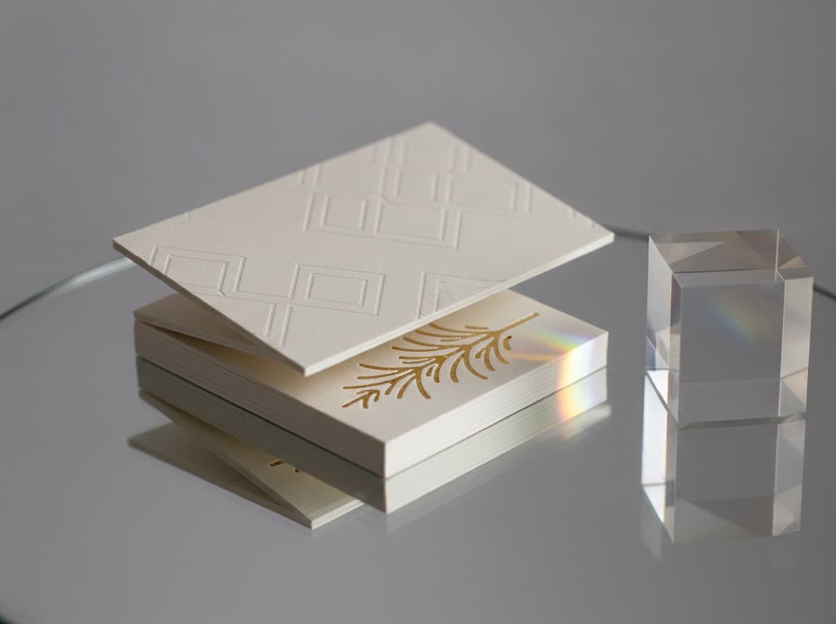
Double-sided business cards give you two faces to work with — a front that carries your identity and a back that can do almost anything else: provide context, add a QR code, carry a portfolio preview, offer a map, or simply extend the design with a color or pattern. The question isn't whether to print the back (the cost difference for two-sided printing is small and the added space is significant); the question is what the back should do. This guide covers the best uses for the reverse side of a business card, layout principles for both sides, and how to make sure front and back work together rather than against each other.
Why use the back of a business card?
The back of a card is often left blank for one of two reasons: the designer ran out of ideas, or the person ordering assumed blank was the default. Neither is a good reason. A blank back is a missed opportunity for three reasons:
- Context — the front carries who you are; the back can carry why it matters. A brief tagline, a specialty, or a one-line proof of your positioning adds meaning without cluttering the front.
- Function — a QR code, a portfolio URL, a map to your location, or a scheduling link on the back makes the card useful after the handoff.
- Design continuity — a color block, a pattern, or a large logo on the back makes the physical card more memorable when someone flips it over.
Best uses for the back of a card
QR code linking to a vCard or landing page — the single most functional use of the back. A code that saves your contact directly to the recipient's phone makes the card more useful than any alternative back content. See our QR code guide for sizing and contrast requirements.
Portfolio preview or work sample — for designers, photographers, architects, and other visual professionals, a single strong image on the back demonstrates your work without requiring anyone to visit your website. Use one image only, not a collage.
Tagline or specialization — "Contract brand identity for startups," "Estate planning attorney," "Interior design for hospitality." A one-line specialization on the back answers the question "but specifically, what do you do?"
Services list — for practitioners with multiple offerings, a brief (four to six items maximum) services list on the back adds functional value. Keep it short; a comprehensive menu belongs on the website.
Map or location — for retail, medical, hospitality, and service businesses where location drives visits, a simple map or address prominence on the back is directly functional.
Social proof or credential — a key credential, award, or a short testimonial quotation. Use sparingly; overclaiming on a card is worse than saying nothing.
Pure design element — a solid-color back, a brand pattern, or a large typographic element. This is high-impact if the front is minimal and the back color or pattern contrasts sharply with the front. It makes the card feel considered rather than printed.
Layout principles for double-sided cards
Front: Identity information with clear hierarchy — name first, then title, then contact. This is not the place to explain what you do or add supplementary content. See our design guide for front-side hierarchy rules.
Back: One primary purpose. Don't crowd the back with a QR code, a tagline, a services list, and a social handle. Choose one thing and give it room. A back with five elements will be read less carefully than a back with one.
Visual relationship: The front and back don't need to be identical, but they should feel like the same object. A white front with black type and a solid-color back in your brand color is a common, effective formula. A heavily typeset front paired with a full-bleed photographic back can work if the image is strong and relevant.
Production considerations
Bleed and safe zone apply to both sides — any color or image that goes to the edge of the back must extend 3mm into the bleed area, and all content must be at least 3mm from the trim edge. This applies identically to front and back.
Finish can be different per side — some printers offer a matte front with spot UV on a specific element and a different finish on the back. More complex to spec but useful for cards where the back has a photographic image that benefits from gloss while the front stays matte.
Orientation — if the card is horizontal on the front, consider whether the back information is designed to be read in the same orientation or flipped (head-to-head or head-to-foot). Most cards are printed head-to-head; specify if your back design requires a different orientation.
What not to put on the back
- A duplicate of the front — redundant information that wastes the space
- A generic inspirational quote unrelated to your brand — reads as filler
- A long paragraph of biography — a business card is not a resume
- More than six items in any list — exceeds what can be read quickly
- Low-resolution images — a blurry portfolio image is worse than no image; see our resolution guide for print-quality requirements
Bottom line
Print two sides. Decide on one primary purpose for the back — a QR code, a design element, a specialization, or a preview of your work — and give it the space it needs to do its job. The back of a business card costs almost nothing to print and is an asset that a blank card throws away.
Frequently Asked Questions
What is the best thing to put on the back of a business card?
The most functionally useful choice is a QR code linking to a hosted vCard or personal landing page. For visual professionals, a portfolio preview image. For service businesses, a brief specialization or services list. For brand-first design, a solid-color block or large logo creates a memorable impression.
Does printing both sides of a business card cost significantly more?
No. Double-sided printing is standard, and the incremental cost over single-sided is small — typically a modest per-unit increase that disappears at higher quantities. The added space is valuable; the additional cost is negligible.
Should the back of a business card be the same orientation as the front?
Usually yes — landscape front, landscape back. If the back content (a QR code, image, or large text) is designed to be read in a different orientation, specify this when ordering. Most presses default to head-to-head (flipping horizontally along the long edge).
Can the back of a business card have a different finish than the front?
Some printers offer selective finishing — for example, matte on the front and gloss on the back, or spot UV on the front only. It adds complexity and cost. A consistent finish (matte or soft-touch on both sides) is simpler and usually more elegant.
Is a blank back of a business card unprofessional?
Not inherently — many minimal cards deliberately leave the back blank as a design statement. The problem is leaving it blank by default rather than by decision. If you choose blank because it suits the aesthetic, fine. If you leave it blank because you didn't think about it, you've wasted half the card.
What size should a QR code be on the back of a business card?
A minimum of 0.75 inches × 0.75 inches (19mm), with adequate white space around it. The back gives you more room to work with than the front, so there's no reason to use the minimum — 1 inch × 1 inch is a comfortable target.
Get 10% off your first order
Join our list for practical printing guides, new finish ideas, and a welcome coupon for your first order.
No spam. Unsubscribe anytime.
Ready to bring this design to life?
Order Premium CardsNot sure which option fits? Ask Pro Card Crafters