Soft-Touch (Suede) Business Cards: The Complete Guide
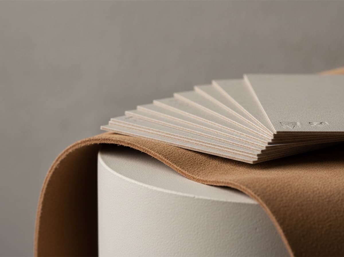
Soft-touch business cards are cards finished with a thin matte laminate that feels like suede or velvet — warm, smooth, and slightly grippy rather than slick. The soft-touch coating mutes glare, deepens dark colors, and adds a tactile "wow" the moment someone picks the card up, which is exactly why it has become a go-to premium finish. If you want a card that reads as high-end before a word is spoken, soft-touch lamination is one of the most reliable ways to get there.
What exactly is a soft-touch finish?
Soft-touch (sometimes marketed as "suede," "velvet," or "silk-touch") is a laminate film applied to the printed sheet under heat and pressure. Unlike a standard matte coating that only knocks down shine, the soft-touch film has a microscopically textured surface that your fingertips read as soft and cushioned. The effect is as much about feel as it is about looks.
Two things happen at once. Visually, the finish is a deep, even matte with almost no reflection, so colors look rich and slightly desaturated in a sophisticated way. Physically, the surface has a low-friction "drag" that makes the card feel thicker and more substantial than its actual weight. That sensory combination is why soft-touch cards tend to get handled longer and remembered better.
Soft-touch vs. plain matte lamination
People often confuse the two, but they are not the same coating:
- Plain matte laminate reduces gloss and resists fingerprints, but the surface still feels like film — smooth and a little cool to the touch.
- Soft-touch laminate goes further, adding the velvety hand-feel. It costs a bit more and is more prone to showing scuffs, but the tactile payoff is significant.
If your goal is simply a non-glossy look, plain matte may be enough. If the goal is a premium, memorable feel, soft-touch is worth the upgrade. For a broader look at how coatings compare side by side, our paper and coating breakdown is a good companion read.
Why choose soft-touch for a business card?
Soft-touch earns its keep in situations where perception matters and the card is meant to be kept. A few scenarios where it shines:
- Luxury and creative brands. Designers, photographers, architects, boutique consultancies, and high-end hospitality all benefit from a card that signals craft.
- Executive and relationship-driven roles. When a single card might sit on a desk for months, the tactile difference keeps your name in front of someone longer.
- Dark or bold color schemes. Blacks, navies, deep greens, and jewel tones look their best under soft-touch because the finish absorbs glare instead of bouncing it back.
The finish also pairs beautifully with accent techniques. A soft-touch base with a small premium finishes accent — say, a foil logo or a raised spot gloss — creates a satisfying contrast between the matte "canvas" and the shiny detail. That contrast is a big part of why the combination feels so premium.
How does soft-touch feel and hold up over time?
The hand-feel is the headline, but durability is a fair question. Here is the honest picture.
Fingerprints and smudges: Soft-touch resists oily fingerprints far better than gloss, which is a real everyday advantage. You can hand the card around a networking event without it looking greasy.
Scuffs and scratches: This is the tradeoff. Because the surface is soft and matte, it can pick up shiny scuff marks or "burnish" lines if it rubs against keys, other cards, or a rough wallet. On very dark colors these marks are more visible than on lighter designs. It is not a fragile finish, but it is not bulletproof either.
Water and handling: The laminate itself is water-resistant and adds rigidity, so the card generally survives pockets and bags well. The main thing to protect against is abrasion, not moisture.
Ways to reduce scuffing
- Choose a slightly thicker stock so the card resists flexing, which reduces surface stress. Our thickness guide explains how weight affects durability.
- Avoid enormous solid-dark backgrounds if the card will live loose in a bag; even a subtle pattern or texture hides scuffs better than flat black.
- Consider a protective accent finish, like a spot gloss over key elements, which adds a harder wear surface exactly where fingers land most.
What designs work best on soft-touch?
Soft-touch rewards restraint and contrast. Because the base is so matte, any glossy, foil, or raised element pops dramatically against it — so you can do a lot with a little.
Color and ink
Dark, saturated colors are the natural fit. Deep blacks in particular look almost like ink-dipped fabric under soft-touch. Lighter pastels also work and take on a chalky, refined quality. Just remember that all colors read slightly muted compared to how they look on screen, so if a vivid pop is essential, plan for it or reserve that pop for a foil accent.
Accent pairings that look expensive
- Foil stamping over soft-touch is a classic. The metallic shine against velvety matte is a strong combination — see our foil-stamped cards guide for color and placement ideas.
- Raised or flat spot UV gives a subtle sheen you feel more than see. The contrast between matte and gloss is the whole point; our spot UV explainer covers raised vs. flat.
- Embossing or debossing presses shape into the soft surface for a tactile double-hit; the embossing vs. debossing comparison helps you pick.
Typography and legibility
The matte surface is friendly to fine type — there is no glare to fight — so small text stays readable. Keep contrast strong (light text on dark, or dark on light) and avoid mid-tone text on mid-tone backgrounds, which can get muddy under a low-reflection finish. If networking is your primary use case, our guide to networking card design covers layout choices that make cards easier to act on.
What stock and specs pair well with soft-touch?
Soft-touch is a laminate, so it can go on a range of stocks, but the pairing matters.
| Consideration | Recommendation | |---|---| | Stock weight | Heavier stocks feel most in line with the premium hand-feel | | Color | Dark and saturated shades show the finish off best | | Sides | Applied to one or both sides; both sides is most common for a cohesive feel | | Accents | Foil, spot gloss, emboss/deboss all pair well |
A quick note on weight and coating interaction: because soft-touch adds a small amount of rigidity and perceived thickness, you can sometimes get a premium feel without going to the very heaviest stock. Still, most people find the finish sings on thicker cards. If you are weighing uncoated premium options instead, compare the tactile character of cotton vs. standard cardstock — cotton offers a different kind of softness that is worth understanding before you commit.
What about cost and turnaround?
Soft-touch lamination is a premium finish, so expect it to cost more than an uncoated or standard-gloss card. The exact difference depends on quantity, stock, and whether you add accents like foil. As a general principle, per-card cost drops as quantity rises, so a soft-touch run often becomes more economical the more you print.
Turnaround also depends on specifics. A soft-touch-only card typically prints on standard timelines, while adding specialty accents (foil, spot UV, embossing) can extend the schedule because of the extra passes involved. If you have a hard deadline, decide on your finish combination early rather than adding accents late. And because tactile finishes are hard to judge on screen, it is always worth reviewing a proof and, where possible, a physical sample before committing to a large run.
Bottom line
Soft-touch business cards deliver an outsized impression for a modest upgrade: a velvety, glare-free surface that makes colors richer and cards more memorable. They pair especially well with dark palettes and shiny accents like foil or spot gloss, with the main tradeoff being visible scuffing on very dark, heavily handled cards. If you want a card that feels premium the instant it changes hands, soft-touch is one of the smartest finishes to choose.
Frequently Asked Questions
What is the difference between soft-touch and matte business cards?
Both reduce glare, but soft-touch adds a distinct velvety, suede-like hand-feel that plain matte does not have. Plain matte still feels like smooth film, while soft-touch has a cushioned, slightly grippy texture. Soft-touch usually costs a little more and shows scuffs more readily, but it feels noticeably more premium.
Do soft-touch business cards scratch or scuff easily?
They resist fingerprints very well but can pick up shiny scuff marks from abrasion, especially on large, dark solid areas. Choosing a sturdier stock, breaking up big dark backgrounds, and adding a spot-gloss accent over high-contact areas all help. In normal wallet or cardholder use they hold up fine.
Can you add foil or spot UV to a soft-touch card?
Yes, and the pairing is one of the most popular premium combinations. The shiny foil or gloss stands out dramatically against the matte, velvety base. Keep in mind that adding these accents can increase both cost and turnaround because they require extra production passes.
Are soft-touch cards more expensive than regular cards?
They typically cost more than uncoated or standard-gloss cards because the laminate is a premium film applied under heat and pressure. The gap narrows at higher quantities, since per-card cost generally falls as the run grows. Adding accents like foil will raise the price further.
What colors look best with a soft-touch finish?
Deep, saturated colors — blacks, navies, forest greens, and jewel tones — look richest because the finish absorbs glare and deepens the ink. Light pastels also take on an elegant, chalky quality. Remember that all colors appear slightly muted versus screen, so reserve any bright pop for a foil or gloss accent.
Get 10% off your first order
Join our list for practical printing guides, new finish ideas, and a welcome coupon for your first order.
No spam. Unsubscribe anytime.
Ready to send your file to print?
Order Business CardsNot sure which option fits? Ask Pro Card Crafters